Understanding Time in Space: Improving Timeline Understandability for Uncrewed Space Systems

Abstract
Timelines are critical in space exploration. Timelines facilitate planning, resource management, and automation of uncrewed missions. As NASA and other space agencies increasingly rely on timelines for autonomous spacecraft operations, ensuring their understandability and verifiability is essential for mission success. However, interdisciplinary design teams face challenges in interpreting timelines due to variations in cultural and educational backgrounds, leading to communication barriers and potential system mismatches. This work-in-progress research explores time-oriented data visualizations to improve timeline comprehension in space systems. We contribute (1) a survey of visualization techniques, identifying patterns and gaps in historic time-oriented data visualizations and industry tools, (2) a focus group pilot study analyzing user interpretations of timeline visualizations, and (3) a novel method for visualizing aggregate runs of a timeline on a complex system, including identification of key features for usability of aggregate-data visuals. Our findings inform future visualization strategies for debugging and verifying timelines in uncrewed systems. While focused on space, this research has broader implications for aerospace, robotics, and emergency response systems.
Keywords and phrases:
Human-Ceneterd Design, Time-Oriented Data Visualization, Uncrewed Spacecraft Operations, Formal MethodsCopyright and License:
![[Uncaptioned image]](x1.png) © Elizabeth Sloan and Kristin Yvonne Rozier; licensed under Creative Commons License CC-BY 4.0
© Elizabeth Sloan and Kristin Yvonne Rozier; licensed under Creative Commons License CC-BY 4.0
2012 ACM Subject Classification:
Human-centered computing Empirical studies in visualization ; Human-centered computing Visualization theory, concepts and paradigmsFunding:
This work is supported by the NASA Cooperative Agreement Number 80NSSC24M0199. This work is partially supported by the National Science Foundation under Grant No. 2152117. Any opinions, findings, and conclusions or recommendations expressed in this material are those of the author(s) and do not necessarily reflect the views of the National Science Foundation.Editors:
Leonie Bensch, Tommy Nilsson, Martin Nisser, Pat Pataranutaporn, Albrecht Schmidt, and Valentina SuminiSeries and Publisher:
 Open Access Series in Informatics, Schloss Dagstuhl – Leibniz-Zentrum für Informatik
1 Introduction
Timelines are used extensively in space exploration. On the International Space Station, timelines are used by ground controllers and crew members to manage schedules, meet deadlines, plan future operations, manage automated systems, and monitor and plan resource usage [7, 10, 30].
Timelines are also essential for managing automated space mission operations [6]. In the future, NASA will use timelines to manage long-term uncrewed operations of the Lunar Gateway by adding tasks and goals to the Vehicle System Manager timeline [17, 13]. These timelines must be understandable and verifiable for uncrewed spacecraft to operate safely and avoid catastrophic events.
Individuals in space system design teams develop their mental models of time through cultural influences [5] and formal education. However, design teams’ inherently interdisciplinary nature introduces variations in educational backgrounds, which, alongside cultural differences, can lead to disparities in how team members perceive and interpret timelines [23, 22]. The disparities in understanding ultimately lead to ineffective communication and collaboration across design teams and could cause problems between system designs and users of the systems. Data visualization techniques enable patterns in data to be more easily recognized by humans, allowing a better understanding of data [8, 24] (see figure 1).
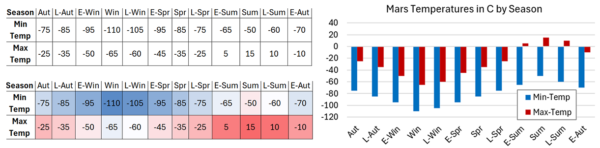
This work-in-progress paper presents ongoing research to enhance the understandability and usability of time-oriented data visualizations for space exploration, focusing on uncrewed space vehicles. This paper contributes 1) a short survey of time-oriented data visualizations, highlighting context-appropriate techniques for time-data visualization and pointing out areas for improvement in current visualization techniques used in industry tools (section 2). 2) An introduction to understanding a subset of users of timeline visualization techniques via a focus group pilot study, highlighting common trends in users’ understanding of visualizations and why those understandings may appear as trends in other users in future studies. Additionally, the pilot study ideates future visualization directions and why those techniques may be effective visualization strategies (section 3.1). 3) A first look at a new technique for visualizing aggregates of time-oriented data used for visualizing failure locations of multiple runs of a complex system (section 3.2).
2 Preliminaries
The work presented in this paper is part of a broader effort to enhance the safety of safety-critical systems by improving the accessibility and usability of tools and techniques in formal methods. This section briefly introduces formal methods and overviews the resources used to review time-oriented data. This section ends with notable patterns from the review and opinions for implementing and improving the patterns.
2.1 Formal Methods
Safety-critical systems are those in which failures can lead to catastrophic harm, including severe injury, loss of human life, mission failure, environmental damage, property destruction, or significant financial loss. Safety-critical systems require rigorous verification to ensure their correctness and reliability. Traditional verification methods, such as unit testing, fault injection, and stress testing, find problems in a system, but they cannot show that your system is free from problems [3] (i.e., you can find the problems that you are checking for, but not the problems that you do not expect).
Formal methods offer a more robust alternative by applying mathematical proofs and logic-based verification techniques to ensure that a system satisfies its specifications with provable soundness and completeness [33]. Formal methods are mandated by some government bodies in various certification procedures for uncrewed aircraft, supplementing traditional certification requirements for piloted aircraft [11].
Several formal methods and formal methods tools are designed to handle time-dependent systems, where timing constraints must be met for safe operation. For systems that rely on timelines, particularly in uncrewed space vehicles and other autonomous and semi-autonomous systems, such as underwater vehicles or search-and-rescue systems, timeline verification must ensure that conflicts do not arise that could lead to mission failure or catastrophic harm.
The specification of systems is one of the most critical and challenging aspects of the verification and validation of safety-critical systems [27]. Enhancing the understanding of effective visualization techniques can improve the creation and debugging of system specifications by providing human-friendly representations of otherwise highly technical and mathematical representations of system behaviors.
Runtime Verification
Runtime verification is a formal method for checking whether a system behaves as expected while running. Instead of analyzing the entire system simultaneously offline, Runtime Verification continuously monitors system executions against system requirements [28]. For example, in a satellite mission, a runtime monitor can track sensor data to detect anomalies, such as unexpected power drops. If a violation occurs, the monitor can trigger a response, such as switching to a backup power source, helping prevent mission failure in real-time [2].
2.2 Current Time-Oriented Data Visuals
The work presented in this preliminary survey on visualizing time-oriented data for space missions is based on the foundational research on visualizing time-oriented data by Aigner et al. [1] and an analysis of existing timeline visualization tools used in formal methods.
Historical Time-Data Visualizations
Aigner et al.’s work presents several types of data representations. We categorized them as linear, cyclical, and specialized. Linear time representations display data progressing in a single, continuous direction, which supports analysis of sequential events and long-term trends. In contrast, cyclical time representations emphasize patterns that repeat over consistent intervals (such as hours, days, or years) making them well-suited for identifying periodic behavior. Specialized data representations are those that do not follow linear or cyclical formats and are typically designed to support particular analytical needs or domains.
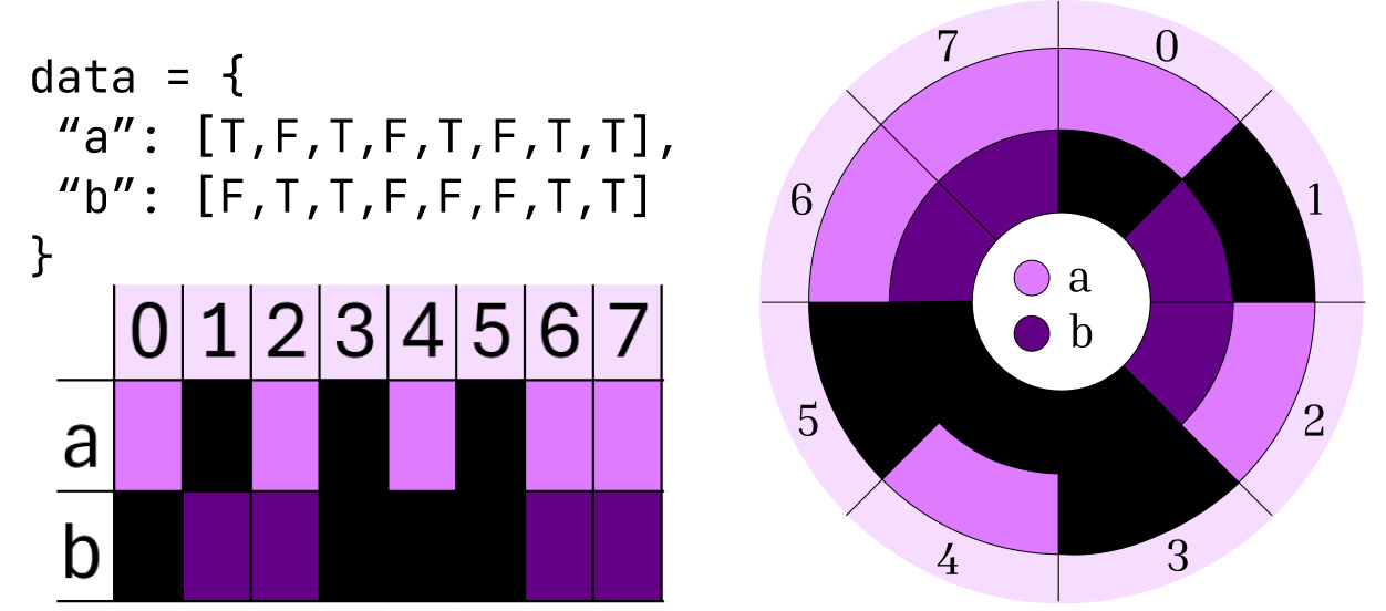
Systems engineering tends to adhere to a sequential representation of Boolean111“True” or “False” data values. data values, which can be visually represented as “on” or “off”. Linear representations are suitable for this type of system execution because they align with the temporal progression of events, allow for straightforward visualization of state changes over time, and support familiar interactions such as scrolling, zooming, and variable comparison. Linear timelines can be extended by appending or inserting time steps. In contrast, circular representations would require increasing the radius to accommodate additional data and maintain readability, potentially increasing visual and implementation complexity. See figure 2 for an example of Boolean data represented linearly and cyclically.
Current Visualization Techniques Used in Industry and Research
FRET [12] is NASA’s Formal Requirements Elicitation Tool. Fret turns the English language into formal requirements and displays Boolean values on a visual display similar to a guitar fretboard. The display is also similar to digital timing diagrams, where the line is up on a variable if it is True at that timestep and down if it is False. This potentially informs us that the users of FRET may be familiar with timing diagrams, which is an avenue to explore for visuals.
The Iowa State Applied Formal Methods class uses visuals to teach Linear Temporal Logic (LTL)222Linear Temporal Logic is a type of formal method that reasons about Boolean variables over a single timeline. and Computational Tree Logic333Computational Tree Logic is similar to LTL, but it handles timelines as many possible branches that can be taken at any time step.. The visuals taught in this course are similar to the visuals used in [26], which have circles and arrows pointing to the next circles on the right. The values of the propositions444Propositions are the semantic meanings of the Boolean variables. For example, r “rockets are cool,” means that r is replaced with “rockets are cool.” “Rockets are cool” is the proposition, and r is the Boolean variable. in the circles are depicted as “p” for “p is True” and “p” for “p is False”.
The Wikipedia page for LTL[32] has visuals for Linear Temporal Logic that have variables represented with symbols above dots with solid or dashed lines and arrows pointing to the next dot on the right. The proposition is present above the dot if it is True and not present if it is False.
WEST [9] displays Mission-Time Linear Temporal Logic (LTL over finite time bounds) and all possible satisfying assignments for variables over a timeline. It uses active checkboxes for True values and inactive checkboxes for False values. The timesteps are labeled, and the values to the right are forward time. This tool also has a regular expression visualization that separates the variables into comma-separated timesteps, using 1 for True values, 0 for False, and S for the value not mattering to satisfy a formula.
ltl2timeline [18] inputs an LTL formula and outputs a timeline. Each node contains the satisfying set of proposition assignments (“p” for “p is True”, “!p” for “p is False”), with arrows indicating the progression of time to the right. Branching paths represent formulas with multiple possible futures, and boxes denote points of infinite repetition in the timeline.
Principles of Model Checking [4] shows empty circles with true formulas over the circles and lines with arrows pointing to the right to the next circle.
Notable Patterns
All of the visuals displayed represent Boolean values of variables representing propositional statements. All representations of nodes evaluate to True under some propositional statement (i.e., “It is true that p is false at this time.”). All represent the progression of time as “to the right”. 5 out of 6 representations use circles of some kind to represent their Data nodes. All representations that use circles also represent the movement of time with a line and an arrow.
Applying Design Techniques to Observed Patterns
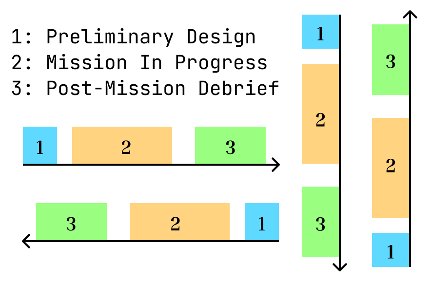
Having arrows pointing to the next node is redundant on timelines with no branches because the direction of time progression does not tend to change once it is established. Timeline movement is the same direction that we are reading the words on a page (this may be the same for any reading direction, but that would need to be studied in future work). Unless it needs to be specified that the direction of time is changing (see figure 4 for an example), then there could be fewer symbols to display the movement. Figure 3 shows the difference between the two types of visualizations.

3 Current Progress and Findings
This section outlines two related studies done on timeline visualizations. The first is a pilot study for discovering commonalities and disparities in understanding between users of timeline visualization tools. The second is the first iteration of visualizing aggregate data for multiple runs of complex systems.
3.1 Pilot Study: Investigating the Understandability of Timeline Visualizations
A study by Knight et al. was done across two separate colleges, involving students from multiple backgrounds, including several individuals from the programming industry. Students were told to write a program from a single specification. The individuals were not informed that others had the same specification. The programs were then subjected to test cases and evaluated for correctness. The study found that regardless of college, background, expertise, and experience, several of the same mistakes were made in creating the programs. Knight et al.’s study demonstrates the concept that this investigation is based on: Regardless of the region of learning, background, or experience, there are potentially common deficits and beliefs among individuals in a field of study [15].
The work in progress presented in this section is the pilot study for finding commonalities in understanding timelines and answering the larger question, “How do we best define usability for system engineers across disciplines?”. The primary objectives of this pilot study were: 1) To assess the impact of timeline direction on understandability: Does the orientation (e.g., left-to-right vs. top-to-bottom) influence how users interpret time-oriented data? 2) To evaluate how different visual representations affect comprehension: How do variations in shape, structure, and layout impact user interpretation and usability?
Beyond these specific research questions, the study also served as an ideation process for refining future studies on time-oriented visualization, helping the authors identify promising approaches and potential pitfalls in time-oriented visualization design.
Methodology
The pilot study was conducted as a focus group, allowing participants to engage in discussions and provide qualitative feedback on various timeline representations. The visualizations presented were created from visualization patterns discussed in section 2.
Participants were presented with multiple timeline representations and asked to evaluate their clarity, usability, and effectiveness in communicating time-dependent information. The study followed a standard focus group process to facilitate replication in future research:
-
1.
Introduction and Background: Participants were given an overview of the study and its objectives.
-
2.
Presentation of Timeline Visuals: Various visualizations were shown, including directional orientations and structural variations555The visuals used for the study can be found here: https://forms.gle/AC4HNuUgpUxpXeuSA. Personal information is not collected through this link..
-
3.
Group Discussion and Feedback: Participants shared their thoughts, highlighting aspects they found intuitive or confusing.
-
4.
Conclusion and Reflection: A debrief session allowed participants to articulate their overall impressions and suggest potential improvements.
Findings and Insights
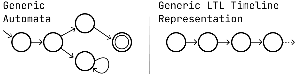
Common visualizations used in formal methods from section 2 were confusing, such as those that resembled automata (see figure 5). This makes sense from two different sides: 1) The people who originally created the visualizations for temporal logic timelines came from backgrounds that used automata [25], and the historical visualizations linger in today’s representations. 2) The people in the focus group also have backgrounds that involve the study of automata. Even though they work with both LTL and automata visualizations regularly and understand the context of both types of data, using similar visuals can be confusing regarding the intended meaning. This confusion may appear for other users because the intended demographics to be studied include people who have also most likely experienced automata in their formal education. Such confusion highlights the importance of designing timeline visualizations that are distinct from other visual representations commonly used in formal methods and systems engineering.
Discussing multiple visualization types encouraged participants to generate new ideas and reinforced visualization techniques they had found useful in other contexts. This collaborative approach encouraged deeper reflection on usability and prompted the identification of effective timeline representations. One participant commented about how their vision disabilities affect how they view timelines on screens and suggested user interface visualizations that have made their work easier for other applications such as having multiple options for visualization that could be selected for users in a settings menu, such as changing color pallets, timeline directions, and node shapes. For scalability, a suggestion that was positively received among the participants is that for larger data sets, when zoomed out, the data would be abstracted and less detailed so as not to overwhelm the user, and the details would return when zoomed in.
Limitations and Future Work
The two main limitations to this study are 1) Single research method: While valuable for qualitative insights, a focus group does not provide quantitative measures of usability or performance. 2) Limited participant diversity: The study was conducted with a small group (about 8 people) from a single research field, meaning the results are inherently biased toward their particular training and experiences. Expanding the study to include more participants and participants from different disciplines and professional backgrounds will be necessary for generalizability.
Future work will expand upon these findings by conducting larger-scale user studies with a more diverse participant pool. Demographics to be explored include any individuals who will work with these timeline systems either as designers or users, including (but not limited to) computer scientists, mathematicians, mechanical and electrical engineers, and visual and user experience designers. Future work will also incorporate quantitative usability metrics such as task-load analysis, and refining visualization techniques based on this and future studies, as well as more research on visualization techniques currently being used that were not considered for this study, such as [16, 20, 19, 31, 21].
3.2 Aggregating Timeline Verification Data for Remote Space Systems
Timelines uploaded to remote, uncrewed systems, such as those planned for NASA’s Lunar Gateway, must be verified to ensure they are conflict-free and do not pose risks to mission success. Given the complexity of such systems, the consequences of executing a single timeline cannot be determined with certainty due to the numerous variables present at any given time. One approach to verifying the reliability of a timeline before deployment is to simulate its execution under a wide range of possible conditions. Since these conditions could encompass hundreds or thousands of variations, understanding the aggregate results of multiple runs is essential for evaluating the robustness of a timeline.
Aggregate analysis of timeline simulations is critical in remote system operations, where immediate intervention is not possible. Once a timeline is uploaded to a distant uncrewed system, such as a spacecraft, any errors may persist for a significant duration due to round-trip communication delays [13]. Therefore, it is essential to identify potential issues before deployment. For instance, if failures consistently occur at a specific time step across all simulations, pinpointing the failure’s location and cause is invaluable for debugging. Conversely, if all possible executions result in successful operation without severe consequences, this outcome should be clearly conveyed to engineers. Such analysis helps determine whether problems stem from flaws in the timeline itself or from underlying system issues, ultimately supporting safer and more reliable mission planning.
Current Progress
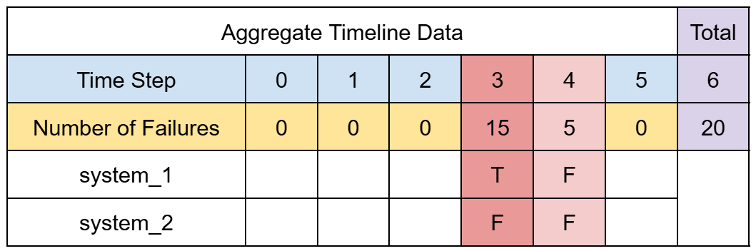
Several approaches to aggregating verification results have been explored to address this challenge, including bar graphs, numeric charts, and ideas taken from the preliminary studies done in section 2. The most promising method identified thus far is displaying the system data in a table highlighting the number of failures at given time steps, and emphasizing more failures at a time step with a heat-mapping. Figure 6 shows an example visualization of aggregated data.
Implementation
This approach uses R2U2, a runtime verification framework designed for safety-critical systems [14]. Timeline data is processed through R2U2, which generates verification results based on predefined specifications. These outputs are then structured into a data representation suitable for visualization; the current implementation uses .csv files. The visualization tool666the current version can be found here [29] interprets this structured data to highlight trends, recurring failures, and overall system behavior across multiple timeline executions.
Limitations and Future Work
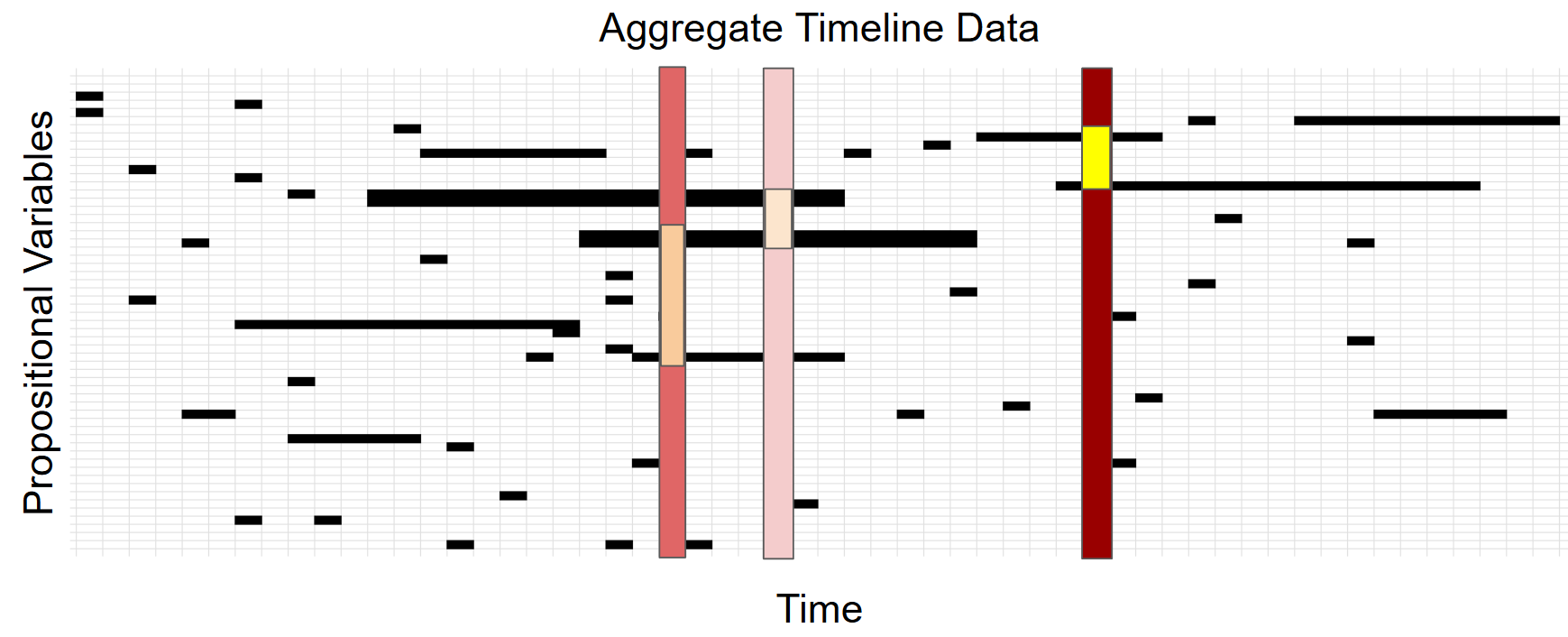
One limitation of the current approach is the challenge of efficiently displaying timeline data. The tabular representation may contain numerous empty cells, which can be beneficial for visualization by highlighting The tabular representation may contain numerous empty cells, which can be beneficial for visualization by reducing visual clutter, drawing attention to meaningful data points, and highlighting sparsity in variable activity over time (see figure 7). However, this format is not optimal for data storage, as it may introduce inefficiencies in handling large datasets. Additionally, navigating and identifying specific issues may become cumbersome if the timeline is too long. Future work will explore alternative visualization techniques that balance readability and data density, such as adaptive filtering, interactive zooming, or alternative representations that prioritize critical information without overwhelming the user.
Currently, this approach has not been tested on real-world mission data, nor has it been validated with large-scale datasets. Future work will focus on acquiring real-world datasets to further evaluate the effectiveness of the aggregation method. Additionally, usability studies with systems engineers will be conducted to assess how well these visualizations support debugging and decision-making in mission planning. The ultimate goal is to refine the visualization techniques to improve interpretability and ensure that timeline verification tools meet the practical needs of system engineers.
4 Conclusion
Timelines play a crucial role in space exploration, and their importance will only grow as missions become more automated and venture farther from Earth. The criticality of understanding timelines lies in the fact that once sent into uncrewed space systems, there is a round-trip delay before identifying and addressing any unforeseen issues with the timeline commands.
The patterns discovered in the literature review have been applied to an initial usability study, which revealed confusion in understanding due to overlaps in visualization techniques between areas of study. This work also takes an initial step in visualizing aggregated data of complex systems for understanding and debugging complex systems and verifying timelines before uploading them to uncrewed spacecraft. The visuals presented identify critical aspects for making the visuals useful for systems engineers.
While this work focuses on space systems, its findings and future work have broad applications in other fields where timeline verification and understandability are essential, such as designers of timeline systems for engineers and those working with uncrewed aerospace, underwater exploration, and emergency response vehicles. Future work for this research includes developing educational curricula that prepare individuals to work with these critical systems by identifying common (mis)understandings in timeline interpretation.
References
- [1] Wolfgang Aigner, Silvia Miksch, Heidrun Schumann, and Christian Tominski. Visualization of time-oriented data, volume 4. Springer, 2011. doi:10.1007/978-0-85729-079-3.
- [2] Alexis Aurandt, Phillip H Jones, and Kristin Yvonne Rozier. Runtime verification triggers real-time, autonomous fault recovery on the cysat-i. In NASA Formal Methods Symposium, pages 816–825. Springer, 2022. doi:10.1007/978-3-031-06773-0_45.
- [3] Christel Baier and Joost-Pieter Katoen. Principles of model checking. MIT press, 2008.
- [4] Christel Baier and Joost-Pieter Katoen. Principles of model checking. MIT press, 2008.
- [5] Richard W Brislin and Eugene S Kim. Cultural diversity in people’s understanding and uses of time. Applied Psychology, 52(3):363–382, 2003.
- [6] Steve Chien. A generalized timeline representation, services, and interface for automating space mission operations. In SpaceOps 2012, page 1275459. AIAA, 2012.
- [7] National Research Council, Commission on Engineering, Technical Systems, Aeronautics, Space Engineering Board, and Committee on the Engineering Challenges to the Long-Term Operation of the International Space Station. Engineering Challenges to the Long-Term Operation of the International Space Station. National Academies Press, 2000.
- [8] Resul Das and Mucahit Soylu. A key review on graph data science: The power of graphs in scientific studies. Chemometrics and Intelligent Laboratory Systems, 240:104896, 2023.
- [9] Jenna Elwing, Laura Gamboa-Guzman, Jeremy Sorkin, Chiara Travesset, Zili Wang, and Kristin Yvonne Rozier. Mission-time ltl (mltl) formula validation via regular expressions. In International Conference on Integrated Formal Methods, pages 279–301. Springer, 2023. doi:10.1007/978-3-031-47705-8_15.
- [10] James Fincannon, Ann Delleur, Robert Green, and Jeffrey Hojnicki. Load-following power timeline analyses for the international space station. In IECEC 96. Proceedings of the 31st Intersociety Energy Conversion Engineering Conference, volume 1, pages 185–190. IEEE, 1996.
- [11] Michael Fisher, Viviana Mascardi, Kristin Yvonne Rozier, Bernd-Holger Schlingloff, Michael Winikoff, and Neil Yorke-Smith. Towards a framework for certification of reliable autonomous systems. Autonomous Agents and Multi-Agent Systems, 35:1–65, 2021.
- [12] Dimitra Giannakopoulou, Anastasia Mavridou, Julian Rhein, Thomas Pressburger, Johann Schumann, and Nija Shi. Formal requirements elicitation with fret. In International Working Conference on Requirements Engineering: Foundation for Software Quality (REFSQ-2020), 2020.
- [13] David Hollaway, Elizabeth Taylor, and Julia Badger. When the eyes don’t have it: Autonomous control of deep space vehicles for human spaceflight. In ASCEND 2020, page 4163. AIAA, 2020.
- [14] Chris Johannsen, Phillip Jones, Brian Kempa, Kristin Yvonne Rozier, and Pei Zhang. R2u2 version 3.0: Re-imagining a toolchain for specification, resource estimation, and optimized observer generation for runtime verification in hardware and software. In International Conference on Computer Aided Verification, pages 483–497. Springer, 2023. doi:10.1007/978-3-031-37709-9_23.
- [15] J Knight, Nancy Leveson, and Lois St.Jean. A large scale experiment in n-version programming. In Proc. Of Ninth Annual Software Engineering Workshop, 1985. URL: https://www.cse.chalmers.se/edu/year/2011/course/EDA122/course-material-2011/A_large%20_scale_experiment_in_nvp.pdf.
- [16] Daniel Larraz, Arjun Viswanathan, Cesare Tinelli, and Mickaël Laurent. Beyond model checking of idealized lustre in kind 2. ACM SIGAda Ada Letters, 42(2):40–44, 2023.
- [17] Emma Lehnhardt, Tiffany Travis, and Dylan Connell. The gateway program as part of nasa’s plans for human exploration beyond low earth orbit. In 2024 IEEE Aerospace Conference, pages 1–6. IEEE, 2024.
- [18] Runming Li, Keerthana Gurushankar, Marijn JH Heule, and Kristin Yvonne Rozier. What’s in a name? linear temporal logic literally represents time lines. In 2023 IEEE Working Conference on Software Visualization (VISSOFT), pages 73–83. IEEE, 2023.
- [19] Leonardo Lima, Andrei Herasimau, Martin Raszyk, Dmitriy Traytel, and Simon Yuan. Explainable online monitoring of metric temporal logic. In International Conference on Tools and Algorithms for the Construction and Analysis of Systems, pages 473–491. Springer, 2023. doi:10.1007/978-3-031-30820-8_28.
- [20] Leonardo Lima, Jonathan Julián Huerta y Munive, and Dmitriy Traytel. Whymon: A runtime monitoring tool with explanations as verdicts. In International Symposium on Automated Technology for Verification and Analysis, pages 76–90. Springer, 2024. doi:10.1007/978-3-031-78750-8_4.
- [21] Nuno Macedo, Alcino Cunha, José Pereira, Renato Carvalho, Ricardo Silva, Ana CR Paiva, Miguel S Ramalho, and Daniel Silva. Sharing and learning alloy on the web. arXiv preprint arXiv:1907.02275, 2019.
- [22] Kevin Ezra Moore. Ego-perspective and field-based frames of reference: Temporal meanings of front in japanese, wolof, and aymara. Journal of Pragmatics, 43(3):759–776, 2011.
- [23] A Norman Donald. The design of everyday things. MIT Press, 2013.
- [24] Theodosios Pavlidis. Structural pattern recognition, volume 1. Springer, 2013.
- [25] Amir Pnueli. The temporal logic of programs. In 18th annual symposium on foundations of computer science (sfcs 1977), pages 46–57. ieee, 1977. doi:10.1109/SFCS.1977.32.
- [26] Kristin Y Rozier. Linear temporal logic symbolic model checking. Computer Science Review, 5(2):163–203, 2011. doi:10.1016/J.COSREV.2010.06.002.
- [27] Kristin Yvonne Rozier. Specification: The biggest bottleneck in formal methods and autonomy. In Working Conference on Verified Software: Theories, Tools, and Experiments, pages 8–26. Springer, 2016. doi:10.1007/978-3-319-48869-1_2.
- [28] Kristin Yvonne Rozier. From simulation to runtime verification and back: Connecting single-run verification techniques. In 2019 Spring Simulation Conference (SpringSim), pages 1–10. IEEE, 2019. doi:10.23919/SPRINGSIM.2019.8732915.
- [29] Elizabeth Sloan. Mous3. online. URL: https://github.com/ediggy/MOUS3.
- [30] Madjid Tavana. Intelligent flight support system (ifss): a real-time intelligent decision support system for future manned spaceflight operations at mission control center. Advances in Engineering Software, 35(5):301–313, 2004.
- [31] Oskar Wickström. Specifying state machines with temporal logic, 2021. URL: https://wickstrom.tech/2021-05-03-specifying-state-machines-with-temporal-logic.html.
- [32] Wikipedia contributors. Linear temporal logic — Wikipedia, the free encyclopedia, 2025. [Online; accessed 21-March-2025]. URL: https://en.wikipedia.org/w/index.php?title=Linear_temporal_logic&oldid=1280568340.
- [33] Jeannette M Wing. A specifier’s introduction to formal methods. Computer, 23(9):8–22, 1990.