Visual Text Analytics
Abstract
Text data is one of the most abundant types of data available, produced every day across all domains of society. Understanding the contents of this data can support important policy decisions, help us understand society and culture, and improve business processes. While machine learning techniques are growing in their power for analyzing text data, there is still a clear role for human analysis and decision-making. This seminar explored the use of visual analytics applied to text data as a means to bridge the complementary strengths of people and computers. The field of visual text analytics applies visualization and interaction approaches which are tightly coupled to natural language processing systems to create analysis processes and systems for examining text and multimedia data. During the seminar, interdisciplinary working groups of experts from visualization, natural language processing, and machine learning examined seven topic areas to reflect on the state of the field, identify gaps in knowledge, and create an agenda for future cross-disciplinary research. This report documents the program and the outcomes of Dagstuhl Seminar 22191 “Visual Text Analytics”.
Keywords and phrases:
Information visualization, visual text analytics, visual analytics, text visualization, explainable ML for text analytics, language models, text mining, natural language processingSeminar:
08.– 13. May, 2022 – https://www.dagstuhl.de/221912012 ACM Subject Classification:
Human-centered computing Visualization techniques ; Human-centered computing Visual analytics ; Human-centered computing Information visualization ; Computing methodologies Natural language processing ; Computing methodologies Machine learning ; Information systems Information systems applications ; Applied computing Document management and text processingCopyright and License:
1 Executive Summary
Christopher Collins (Ontario Tech – Oshawa, CA)
Antske Fokkens (Free University Amsterdam, NL)
Andreas Kerren (Linköping University – Norrköping, SE)
Chris Weaver (University of Oklahoma – Norman, US)
License: ![]() Creative Commons BY 4.0 International license © Christopher Collins, Antske Fokkens, Andreas Kerren, and Chris Weaver
Creative Commons BY 4.0 International license © Christopher Collins, Antske Fokkens, Andreas Kerren, and Chris Weaver
Introduction
Visualizing textual information is a particularly challenging area of information visualization and visual analytics research. The types of data processing and analytic algorithms differ greatly from tabular or geospatial data, and the visualization techniques have additional constraints to consider, including the provision of context for text fragments of similar or different size and structure, depicting embeddings and high dimensional representations, and ensuring legibility of text incorporated into visualizations. The wide variation in the data is accompanied by the difficulties in inferring the semantic meaning of ambiguous terms, or determining the referencing between subsequent statements.
This Dagstuhl Seminar succeeded in bringing together researchers from the visualization, natural language processing (NLP), and machine learning communities, with domain experts from several text-related research areas, to identify the most pressing and promising open problems for collaborative research. This truly interdisciplinary approach offered new opportunities to capitalize on existing knowledge and recent developments across all involved disciplines. Discussions in the seminar were comprehensive, focusing on visual text analytics with the goal to provide an application-oriented research agenda.
The seminar coalesced an international community of experts from different disciplines around a research roadmap for the next 5–10 years, as documented through working group reports. The seminar generated a series of research questions which serve as a call to action to the wider community. The unique and contained setting of Schloss Dagstuhl facilitated new cross-disciplinary collaborations and allowed us to lay the groundwork for productive future collaborations, including a planned special issue of the Information Visualization journal.
Seminar Themes
The following high-level themes were discussed during the seminar. The seminar allowed attendees to critically reflect on current research efforts, the state of field, and key research challenges today. Participants also were encouraged to demonstrate their system prototypes and tools relevant to the seminar topics. As a result of the first working groups, as well as impromptu demonstrations and discussions, the actual seminar discussion topics evolved and we established a second set of working groups halfway through the week, cf. Sect. 6.
-
Data Sources and Diversity What is the current landscape of the application fields and data domains? What are the data gaps? Can existing approaches be generalized?
-
Model Explainability and Interpretability Can we provide more sophisticated visualizations to study how language models learn or what information they represent?
-
Evaluation and Experimental Designs Which experimental methods best support the evaluation of techniques and processes for visualizing text information?
-
Interaction Design What design opportunities are unique to, or more pressing, for text data? How can interaction principles be applied to any underlying NLP as well?
-
Toolkits and Standards What success stories regarding existing text visualization approaches and systems can we learn from? What is needed?
-
TextVis Literacy Visual text analytics can be applied across a wide variety of domains. How do we make techniques easy to learn and to interpret correctly?
Outcomes
The Dagstuhl team performed an evaluation at the end of the seminar week. The results of this survey (scientific quality, inspiration to new ideas/projects/research/papers, insights from neighboring fields, …) were universally very good to excellent. Only a few single improvements were proposed by participants, for example, having longer breaks and mixing up the demo presentations with the other parts of the schedule. Another suggestion was to skip the intermediate group report session because it interrupted the group work.
At the end of the week the organizers agreed to proceed to arrange for a special issue of the journal Information Visualization, which will have an open call but with the intent to include any extended works resulting from the seminar. In addition, several working groups with more “position paper” style reports planed to submit these to well-read venues accepting of editorial works which motivate the research community.
Remaining Challenges in Visual Text Analytics
Not all topics identified during the seminar could be addressed in the working groups and might be left for a future Dagstuhl seminar on a similar subject area. In the following, we briefly list those topics and open problems (more are surely existing that are not mentioned here):
-
Interaction Design: Interaction methodologies as part of any visual text analytics approach were in the focus of several working groups. A more systematic classification and evaluation of interaction techniques that are unique for text data would be useful for future developments.
-
Toolkits and Standards: Even if many toolkits and existing standards were discussed in the seminar, a proper and comprehensive analysis of those is still missing that would be beneficial for users and developers of visual text analytics systems.
-
TextVis Literacy: This topic is important to broaden the use of visual text analytics techniques in general and should be studied deeper in the future.
-
Focus on Text Data Aspects: The consideration of data diversity, data fusion, and data organization in context of visual text analytics might be an interesting topic for further discussion.
-
Focus on Specific NLP and ML Methods: The increasing number of specific/novel analytical methods (such as transfer learning or others) raise the need for specific answers from the visual text analytics community.
Acknowledgments
We would like to thank all participants of the seminar for the lively discussions and contributions during the seminar as well as the scientific directorate of Dagstuhl Castle for giving us the possibility of organizing this event. Angelos Chatzimparmpas gathered the abstracts for the overview of the invited talks, the tool demos, and the working groups in Sect. 4, Sect. 5, and Sect. 6, respectively. Once more, we are thankful to all the attendees for agreeing to compose the abstract texts and timely provide them to us in order to write this executive summary. Last but not least, the seminar would not have been possible without the great help of the staff at Dagstuhl Castle. We acknowledge all of them and their assistance.
2 Table of Contents
3 Seminar Program and Activities
Christopher Collins (Ontario Tech – Oshawa, CA), Antske Fokkens (Free University Amsterdam, NL), Andreas Kerren (Linköping University – Norrköping, SE), and Chris Weaver (University of Oklahoma – Norman, US)
License: ![]() Creative Commons BY 4.0 International license © Christopher Collins, Antske Fokkens, Andreas Kerren, and Chris Weaver
Creative Commons BY 4.0 International license © Christopher Collins, Antske Fokkens, Andreas Kerren, and Chris Weaver
Participation and Program
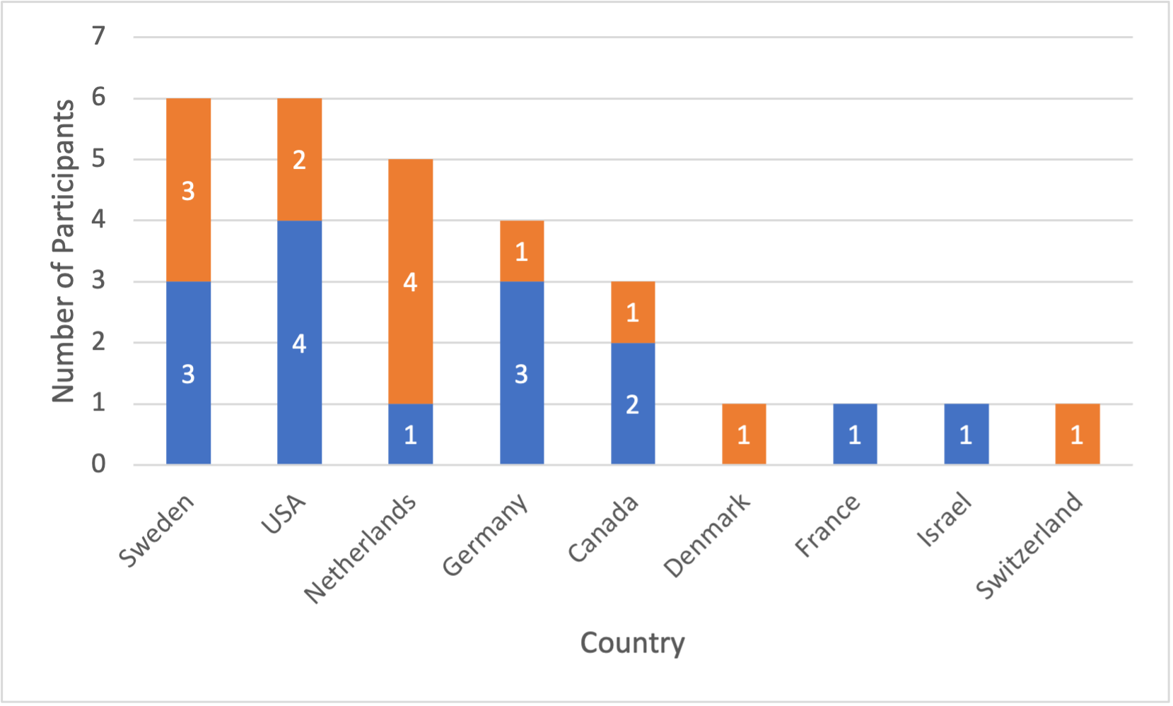
This seminar had 28 participants from 9 different countries. Most attendees came from Sweden, USA, and the Netherlands; more attendees came from Germany, Canada, and other European countries as shown in Figure 1. Eight participants have a primary background in linguistics or NLP/ML, and the rest are information visualization and visual analytics experts.
The agenda was focused on providing time for open discussion. Before the seminar, a survey was conducted to collect ideas for discussion topics and open questions from all participants, as well as to solicit initial volunteers for project demonstrations. To engage the two main groups of participants with the richness of the interdisciplinary field, we invited two introductory talks: one on (text) visualization given by Kostiantyn Kucher and one on NLP given by Antske Fokkens. These were intended to contextualize the two fields for the benefit of the attendees from the other field, to give everyone the same general understanding of the combined research space. Following this, two participants, Narges Mahyar and Shimei Pan, gave a joint talk summarizing and reflecting on the survey results from the visualization and NLP perspectives, respectively. The introductory talks and survey summary and reflection set the groundwork for a collaborative brainstorming activity about working group topics. This discussion finalized the working groups for the week, each of which contained at least one member from visualization and NLP.
Working group discussions through the week were interspersed with report back sessions, tool demos, and mini talks in brief plenary sessions twice daily. These opportunities brought the group together to discuss progress and gave diversity to the agenda to keep the event interesting.
| Monday | Tuesday | Wednesday | Thursday | Friday |
|
Opening Remarks (organizers)
Self-Introductions |
Meeting (logistics)
Breakout Groups (first groups) |
Meeting (logistics)
Breakout Groups (first groups) |
Meeting (logistics)
Breakout Groups (second groups) |
Meeting (logistics)
Group Reporting (second groups) |
| Introductory Talks (InfoVis & NLP, 2 talks) | Breakout Groups (first groups) |
Breakout Groups (first groups)
Group Reporting (first groups) |
Breakout Groups (second groups) |
Continued Publication &
Closing Remarks |
|
Review of Survey
Discussion of Breakout Groups |
Breakout Groups (first groups) |
Initial Group Reporting (second groups)
Breakout Groups (second groups) |
||
|
Discussion of Breakout Groups (cont.)
Demo Session (4 talks) |
Initial Group Reporting (first groups)
Demo Session (4 talks) |
Social Event
(Saar river tour, brewery visit) |
Breakout Groups (second groups) Demo Session (4 talks) |
Activities
Introductory Talks
The titles and presenters of the introductory talks for each application domain are listed in the following. Abstracts for the individual talks can be found in Sect. 4.
-
Information Visualization
-
–
Kostiantyn Kucher and Andreas Kerren: Introduction to (Text) Visualization
-
–
-
Natural Language Processing
-
–
Antske Fokkens: NLP: A Very Brief, Free-Style and Improvised Introduction
-
–
Tool Demos
In addition, a number of speakers gave a tool demo on a theme related to the research questions of the seminar. In sum, 12 demos were given during the seminar (cf. Sect. 5 for details):
-
Hendrik Strobelt: LMdiff: A Visual Diff Tool to Compare Language Models
-
Jean-Daniel Fekete: Cartolabe: Visualization of Large Scale Publications Data
-
Nicole Sultanum: Text Visualization and Close Reading for Journalism with Storifier
-
Yoav Goldberg: The SPIKE Extractive Search Tool
-
Johannes Knittel: Real-Time Visual Analysis of High-Volume Social Media Posts
-
Mennatallah El-Assady: LingVis.io
-
Kostiantyn Kucher: ALVA: Active Learning and Visual Analytics for Stance Classification
-
Richard Brath: Visualizing with Text
-
Angelos Chatzimparmpas: t-viSNE: Interactive Assessment and Interpretation of t-SNE Projections
-
Narges Mahyar: Supporting Serendipitous Discovery and Balanced Analysis of Online Product Reviews with Interaction-Driven Metrics and Bias-Mitigating Suggestions & CommunityPulse: Facilitating Community Input Analysis by Surfacing Hidden Insights, Reflections, and Priorities
-
Pantea Haghighatkhah: Story Trees: Representing Documents using Topological Persistence
-
Tatiana von Landesberger: Network of Names: Visual-Interactive Exploration and Labeling of Entity Relationships
The content of these talks, given for all seminar attendees, raised further key issues and helped the groups to discuss their individual theme from various perspectives.
Breakout Groups
As already mentioned above, the program included breakout sessions on seven specific topics, i.e., seven working groups discussed one topic at a time in parallel sessions. The themes were based on topics discussed in the original seminar proposal as well as topics that emerged in the first session on Monday afternoon. The detailed working group reports are presented in Sect. 6. In the following, we list the different groups:
-
1.
A Critical Reflection on Uncertainty Localization and Propagation in Text Visualization
-
2.
Annotators and their Data
-
3.
Visual Representations of Text
-
4.
Model Explainability and Interpretability
-
5.
Bias and Bias Mitigation
-
6.
Embedding Representation
-
7.
Evaluation and Experimental Designs
4 Overview of Invited Talks
4.1 Introduction to (Text) Visualization
Kostiantyn Kucher (Linnaeus University – Växjö, SE) and Andreas Kerren (Linnaeus University – Växjö, SE)
License: ![]() Creative Commons BY 4.0 International license © Kostiantyn Kucher and Andreas Kerren
Creative Commons BY 4.0 International license © Kostiantyn Kucher and Andreas Kerren
Researchers, practitioners, and the general public interested in making sense of text data face issues as the scale of the respective data and the complexity of the respective tasks grow, especially when relying on close reading techniques only. The state-of-the-art computational methods for text analysis demonstrate very impressive results, but they are not always available or self-sufficient for particular tasks and applications, and making sense of the outputs of such methods is often an issue on its own. The methods and solutions offered within the fields of information visualization and visual analytics are thus highly relevant for numerous scenarios involving text data [23].
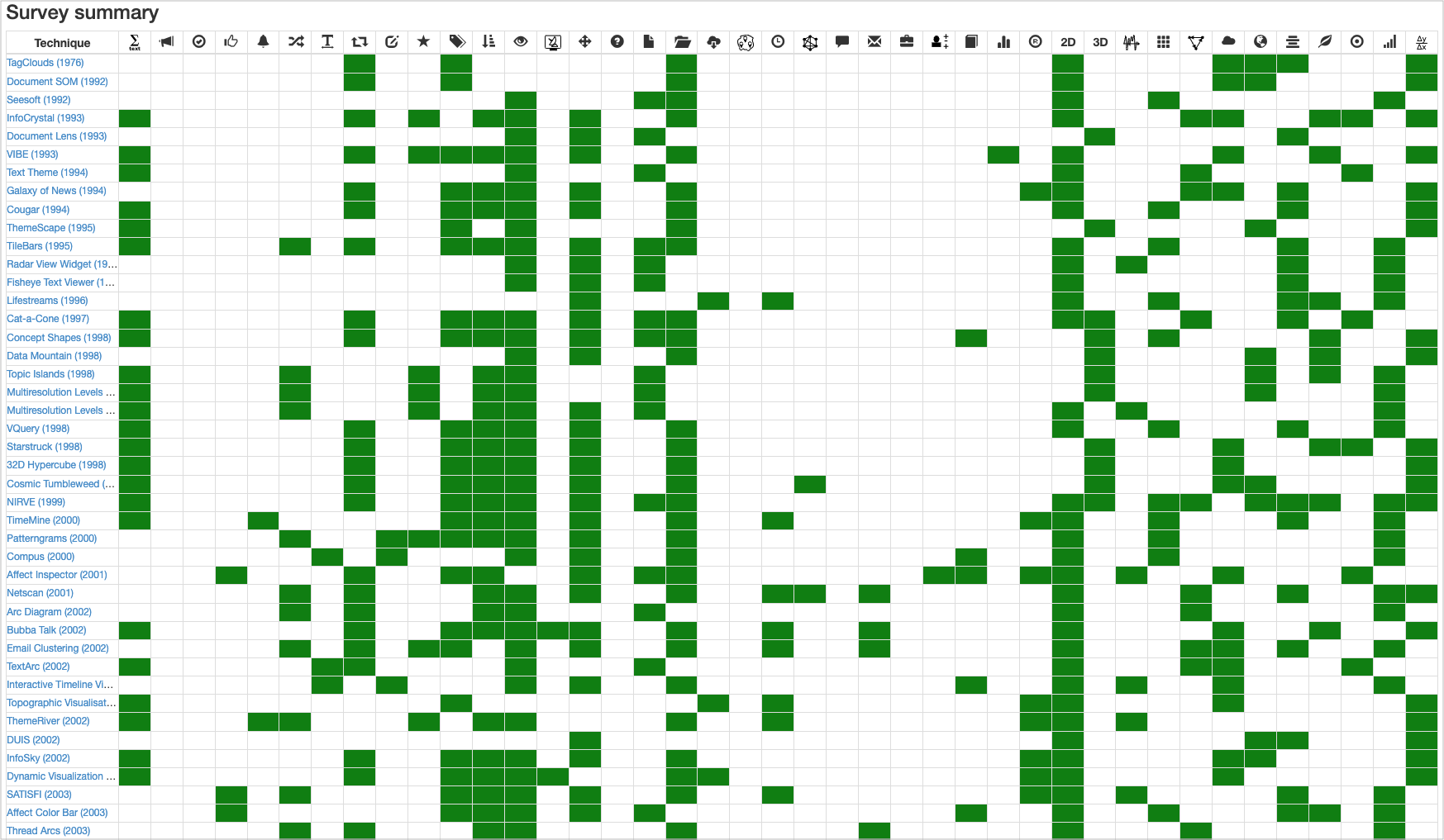
This talk provides a brief introduction to the respective fields with the intended audience of experts in linguistics, computational linguistics, and machine learning with the intention of establishing the common ground with visualization experts. The more general concepts and approaches are supplemented with the discussion of design spaces and particular examples in text visualization and visual text analytics, including the categorization used by the TextVis Browser online survey (cf. Figure 7).
References
- [1] Kostiantyn Kucher and Andreas Kerren. Text visualization techniques: Taxonomy, visual survey, and community insights. In Proceedings of the 2015 IEEE Pacific Visualization Symposium, PacificVis ’15, pages 117–121. IEEE, 2015.
4.2 NLP: A Very Brief, Free-Style and Improvised Introduction
Antske Fokkens (Free University Amsterdam, NL)
License: ![]() Creative Commons BY 4.0 International license © Antske Fokkens
Creative Commons BY 4.0 International license © Antske Fokkens
This presentation provided an introduction to the latest development of NLP for the members of the visual analytics community. Most invitees had worked with text and language technology before, but not everyone had been exposed to the latest developments around large language models and how they are used.
The first part of the talk mainly served as a reminder for everyone: what is NLP trying to do, in general, regardless of how it is doing this? Why is language difficult (and interesting)? How is the field organized and what are examples of tasks? What approaches were possible in the field until relatively recently (before deep learning became dominant)? With a side note that outside of academia, there are many situations where these “old” methods are preferred. I call this part a “reminder” since I assumed this part of the presentation should sound at least familiar to everyone.
The second part provided a brief introduction to neural networks, starting with those architectures that have been popular in the field: CNNs, BiLSTMs, and typical input representations, such as word embeddings and why these can be so successful compared to more traditional feature representations. After these basics, contextualized language models were introduced in the form of a brief explanation of the idea behind BERT’s architecture and how this contextualized language model is trained. I also provided an overview of ways in which language models are trained for specific task, in terms of the input and output representations that are used. Language models raised some questions, in particular in terms of how they deal with language change (which can go fast) and other idiosyncrasies in language use. The answer is that there are ways of dealing with variations in language use, but that it remains the case that machine learning systems, no matter how fancy they get, cannot learn what they have not seen in some way in the data. Though this may seem a trivial thought, both developers and users of such systems sometimes seem to forget things. We ended the presentation with an overview of current research challenges and interests where visual analytics could be useful.
5 Tool Demos
5.1 LMdiff: A Visual Diff Tool to Compare Language Models
Hendrik Strobelt (MIT-IBM Watson AI Lab – Cambridge, US), Benjamin Hoover (MIT-IBM Watson AI Lab – Cambridge, US), Arvind Satyanarayan (MIT CSAIL – Massachusetts Institute of Technology, US), and Sebastian Gehrmann (Google Research – Harvard University, US)
License: ![]() Creative Commons BY 4.0 International license © Hendrik Strobelt, Benjamin Hoover, Arvind Satyanarayan, and Sebastian Gehrmann
Creative Commons BY 4.0 International license © Hendrik Strobelt, Benjamin Hoover, Arvind Satyanarayan, and Sebastian Gehrmann

While different language models are ubiquitous in NLP, it is hard to contrast their outputs and identify which contexts one can handle better than the other. To address this question, we introduce LMdiff [1] (cf. Figure 9), a tool that visually compares probability distributions of two models that differ, e.g., through fine-tuning, distillation, or simply training with different parameter sizes. LMdiff allows the generation of hypotheses about model behavior by investigating text instances token by token and further assists in choosing these interesting text instances by identifying the most interesting phrases from large corpora. We showcase the applicability of LMdiff for hypothesis generation across multiple case studies. A demo is publicly available 101010http://lmdiff.net.
References
- [1] Hendrik Strobelt, Benjamin Hoover, Arvind Satyanaryan, and Sebastian Gehrmann. LMdiff: A visual diff tool to compare language models. In Proceedings of the 2021 Conference on Empirical Methods in Natural Language Processing: System Demonstrations, EMNLP ’21, pages 96–105. Association for Computational Linguistics, 2021.
5.2 Cartolabe: Visualization of Large Scale Publications Data
Philippe Caillou (INRIA Saclay – Orsay, FR), Jonas Renault (INRIA Saclay – Orsay, FR), Jean-Daniel Fekete (INRIA Saclay – Orsay, FR), Anne-Catherine Letournel (INRIA Saclay – Orsay, FR), and Michèle Sebag (INRIA Saclay – Orsay, FR)
License: ![]() Creative Commons BY 4.0 International license © Philippe Caillou, Jonas Renault, Jean-Daniel Fekete, Anne-Catherine Letournel, and Michèle Sebag
Creative Commons BY 4.0 International license © Philippe Caillou, Jonas Renault, Jean-Daniel Fekete, Anne-Catherine Letournel, and Michèle Sebag
Cartolabe 111111https://cartolabe.fr is an online visualization tool designed to visualize large collections of publication data as maps, such as arXiv 121212https://arxiv.org/ (2.5 million documents) and HAL 131313https://hal.archives-ouvertes.fr/ (1 million documents), the French scientific articles repository. Cartolabe [1] tackles several issues related to NLP and visualization. It offers a flexible NLP pipeline to build new maps that can be used to explore the best possible transformations to turn documents into high-dimensional vectors. It offers a complete visualization pipeline that shows a multidimensional projection of millions of documents and allows exploring them through search, pan & zoom.
It is meant to be used by NLP researchers to explore their corpora, or by visualization researchers to improve the visual representations and interactions. The main challenge it faces, along with text visualization, is finding methods to measure the quality of the NLP pipeline to decide if one pipeline is better than another one. Evaluation of NLP pipelines related to human tasks remains an open problem. Cartolabe is open source and can be found at Inria’s Gitlab 141414https://gitlab.inria.fr/cartolabe.
References
- [1] Philippe Caillou, Jonas Renault, Jean-Daniel Fekete, Anne-Catherine Letournel, and Michèle Sebag. Cartolabe: A web-based scalable visualization of large document collections. IEEE Computer Graphics and Applications, 41(2):76–88, March–April 2021.
5.3 The SPIKE Extractive Search Tool
Shauli Ravfogel (Bar-Ilan University – Ramat Gan, IL), Hillel Taub-Tabib (Allen Institute for AI – Sarona, IL), and Yoav Goldberg (Bar-Ilan University – Ramat Gan, IL)
License: ![]() Creative Commons BY 4.0 International license © Shauli Ravfogel, Hillel Taub-Tabib, and Yoav Goldberg
Creative Commons BY 4.0 International license © Shauli Ravfogel, Hillel Taub-Tabib, and Yoav Goldberg
I presented the SPIKE system [1] (see Figure 4), which is an implementation of a paradigm that we call “extractive search”. It combines the traditional search mechanism with rich syntactic and semantic annotations and grep-like “capture slots” over the query, thus allowing to not only locate information, but also to extract and aggregate focused pieces of information, thus creating knowledge. The extractive search paradigm enables domain experts to perform various kinds of text-mining operations over a corpus using a query language, without the need to program, and to perform corpus exploration. For example, a user may search for a CHEMICAL that is mentioned in the same paragraph as a given disease name (for example, COVID-19), and with the same sentence as the word forms treat, treatment, or treated. By designating the CHEMICAL entity as a capture slot, the result of the query will be a list of mentioned chemicals, ranked by their frequencies. These chemicals correspond to COVID-19 treatments from the literature. Similarly, a user my search for the word “lymphoma” together with the word “therapy” and ask to expand the word therapy to its linguistic context, and then to capture the result, resulting in a ranked list of lymphoma therapies from the literature. Clicking on one of the extracted items focuses the list of results to only mentions of that item, allowing the user to verify the evidence for each result of interest.

References
- [1] Shauli Ravfogel, Hillel Taub-Tabib, and Yoav Goldberg. Neural extractive search. In Proceedings of the 59th Annual Meeting of the Association for Computational Linguistics and the 11th International Joint Conference on Natural Language Processing: System Demonstrations, pages 210–217. Association for Computational Linguistics, 2021.
5.4 Text Visualization and Close Reading for Journalism with Storifier
Nicole Sultanum (University of Toronto, CA), Anastasia Bezerianos (INRIA Saclay – Orsay, FR), and Fanny Chevalier (University of Toronto, CA)
License: ![]() Creative Commons BY 4.0 International license © Nicole Sultanum, Anastasia Bezerianos, and Fanny Chevalier
Creative Commons BY 4.0 International license © Nicole Sultanum, Anastasia Bezerianos, and Fanny Chevalier
At times, interesting datasets come in the form of unstructured text. Data journalists go over these datasets to provide digestible takeaways and to bring important framings to light. Analysis strategies can vary a lot from story to story, but they all take up significant time; and good timing is critical in journalism. While text visualization tools have been helpful at expediting these analyses, journalistic analysis is very broad, and therefore, challenging, for any single tool to support. As such, we proposed a more generalizable approach that makes reading easier and faster to do, instead of making assumptions on desired journalist insights.
In this demo, we presented Storifier [1] (cf. Figure 5), a text visualization tool created in close collaboration with Ouest France, a large francophone news office. It is designed to span multiple levels of detail, from a list of frequent and relevant terms, to semantically grouped snippets organized by relevance and time, to full documents, for a complete contextual overview of snippets and evidence tracking. This tool was used in practice by one of our journalist collaborators and led to the publication of a news story.

References
- [1] Nicole Sultanum, Anastasia Bezerianos, and Fanny Chevalier. Text visualization and close reading for journalism with storifier. In Proceedings of the 2021 IEEE Visualization Conference, VIS ’21, pages 186–190. IEEE, 2021.
5.5 Real-Time Visual Analysis of High-Volume Social Media Posts
Johannes Knittel (Universität Stuttgart, DE), Steffen Koch (Universität Stuttgart, DE), Tan Tang (State Key Lab of CADCG – Zhejiang University, CN), Wei Chen (State Key Lab of CADCG – Zhejiang University, CN), Yingcai Wu (State Key Lab of CAD&CG – Zhejiang University, CN), Shixia Liu (Tsinghua University, CN), and Thomas Ertl (Universität Stuttgart, DE)
License: ![]() Creative Commons BY 4.0 International license © Johannes Knittel, Steffen Koch, Tan Tang, Wei Chen, Yingcai Wu, Shixia Liu, and Thomas Ertl
Creative Commons BY 4.0 International license © Johannes Knittel, Steffen Koch, Tan Tang, Wei Chen, Yingcai Wu, Shixia Liu, and Thomas Ertl
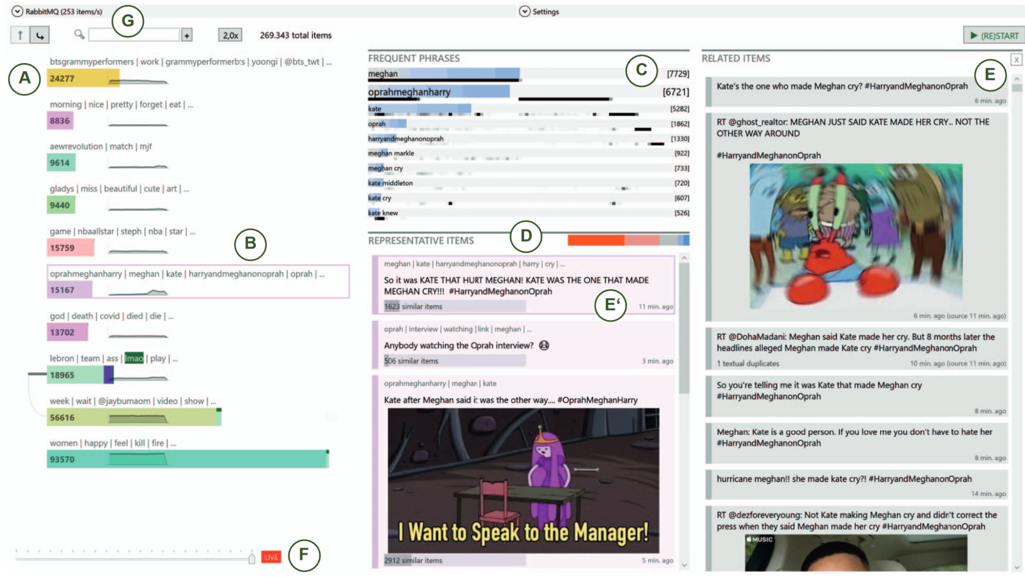
Breaking news and first-hand reports often trend on social media platforms before traditional news outlets cover them. The real-time analysis of posts on such platforms can reveal valuable and timely insights for journalists, politicians, business analysts, and first responders, but the high number and diversity of new posts pose a challenge. In this demo [1], we presented an interactive system (Figure 6) that enables the visual analysis of streaming social media data on a large scale in real-time. It is based on a new dynamic clustering algorithm that is both efficient and visually explainable. The system provides a continuously updated visualization of the current thematic landscape as well as detailed visual summaries of specific topics of interest. The parallel clustering strategy allows us to provide an adaptive stream with a digestible but diverse selection of recent posts related to relevant topics. We also integrate familiar visual metaphors that are highly interlinked for enabling both explorative and more focused monitoring tasks. Users can gradually increase the resolution to dive deeper into particular topics. In contrast to previous work, our system also works with non-geolocated posts and avoids extensive preprocessing such as detecting events.
References
- [1] Johannes Knittel, Steffen Koch, Tan Tang, Wei Chen, Yingcai Wu, Shixia Liu, and Thomas Ertl. Real-time visual analysis of high-volume social media posts. IEEE Transactions on Visualization and Computer Graphics, 28(1):879–889, January 2022.
5.6 LingVis.io
Mennatallah El-Assady (ETH Zürich, CH), Fabian Sperrle (Universität Konstanz, DE), Rita Sevastjanova (Universität Konstanz, DE), and Wolfgang Jentner (Universität Konstanz, DE)
License: ![]() Creative Commons BY 4.0 International license © Mennatallah El-Assady, Fabian Sperrle, Rita Sevastjanova, and Wolfgang Jentner
Creative Commons BY 4.0 International license © Mennatallah El-Assady, Fabian Sperrle, Rita Sevastjanova, and Wolfgang Jentner
URL: https://lingvis.io/
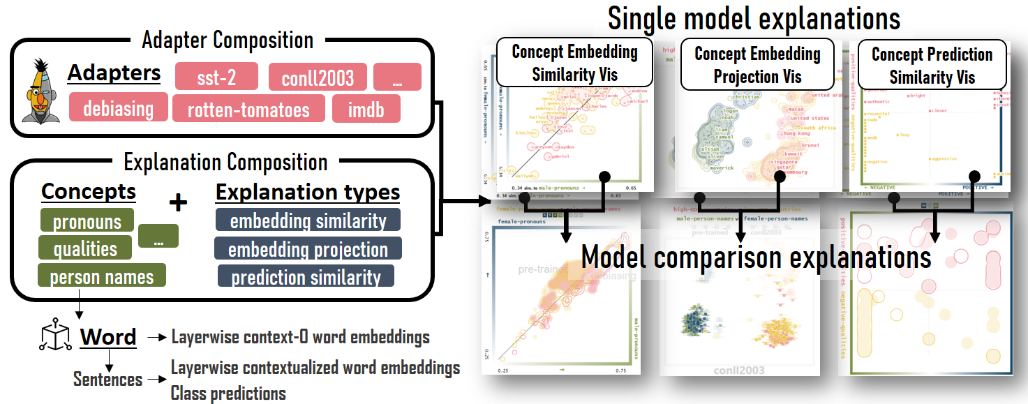
LingVis.io [2] (see Figure 16) is a modular framework for the rapid-prototyping of linguistic, web-based, visual analytics applications. Our framework gives developers access to a rich set of machine learning and natural language processing steps, through encapsulating them into microservices and combining them into a computational pipeline. This processing pipeline is autoconfigured based on the requirements of the visualization front-end, making the linguistic processing and visualization design detached, independent development tasks. I presented the framework, which continues to support the efficient development of various human-in-the-loop, linguistic visual analytics research techniques and applications. Concrete demos can be found below:
-
LMFingerprints: Visual Explanations of Language Model Embedding Spaces through Layerwise Contextualization Scores [1] (Figure 8). Demo available online 171717https://lmfingerprints.lingvis.io/.
-
Explaining Contextualization through Word Self-Similarity [3] (Figure 9). Demo publicly available 181818https://embeddings-explained.lingvis.io/.
-
Visual Comparison of Language Model Adaptation (Figure 10). Demo can be found online 191919https://adapters.demo.lingvis.io/.


References
- [1] LMFingerprints: Visual explanations of language model embedding spaces through layerwise contextualization scores. Computer Graphics Forum, 41(3):295–307, June 2022.
- [2] Mennatallah El-Assady, Wolfgang Jentner, Fabian Sperrle, Rita Sevastjanova, Annette Hautli-Janisz, Miriam Butt, and Daniel Keim. lingvis.io – a linguistic visual analytics framework. In Proceedings of the 57th Annual Meeting of the Association for Computational Linguistics: System Demonstrations, ACL ’19, pages 13–18. Association for Computational Linguistics, 2019.
- [3] Rita Sevastjanova, Aikaterini-Lida Kalouli, Christin Beck, Hanna Schäfer, and Mennatallah El-Assady. Explaining contextualization in language models using visual analytics. In Proceedings of the 59th Annual Meeting of the Association for Computational Linguistics and the 11th International Joint Conference on Natural Language Processing (Volume 1: Long Papers), ACL-IJCNLP ’21, pages 464–476. Association for Computational Linguistics, 2021.
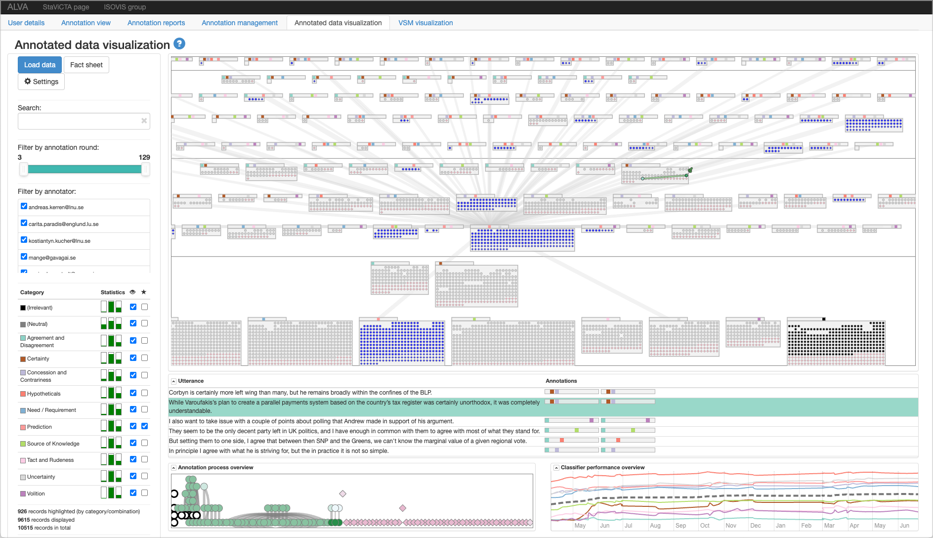
5.7 ALVA: Active Learning and Visual Analytics for Stance Classification
Kostiantyn Kucher (Linnaeus University – Växjö, SE), Carita Paradis (Lund University, SE), Magnus Sahlgren (Swedish Institute of Computer Science and Gavagai AB, SE), and Andreas Kerren (Linnaeus University – Växjö, SE)
License: ![]() Creative Commons BY 4.0 International license © Kostiantyn Kucher, Carita Paradis, Magnus Sahlgren, and Andreas Kerren
Creative Commons BY 4.0 International license © Kostiantyn Kucher, Carita Paradis, Magnus Sahlgren, and Andreas Kerren
This talk provides a brief overview of ALVA [1] (see Figure 11), a visual analytics approach designed to facilitate the entire process of training a text classifier for the problem of multi-label stance classification. ALVA implements the functionality of annotation process management, annotation user interface, and integration with an active learning approach for selecting batches of yet unlabeled utterances (sentences) to include in the next annotation round. In order to allow the experts in linguistics and computational linguistics to explore the current contents of the annotated data, ALVA includes an interactive visual interface consisting of multiple views and controls. The overview of individual annotations is provided with a novel visual representation titled CatCombos, which groups the annotations with the same combinations (sets) of categories in separate blocks. Furthermore, ALVA supports visual inspection of the annotation process data (including intra- and inter-annotator agreement scores, for instance) and the performance of the classifier over the course of the active learning process.
References
- [1] Kostiantyn Kucher, Carita Paradis, Magnus Sahlgren, and Andreas Kerren. Active learning and visual analytics for stance classification with ALVA. ACM Transactions on Interactive Intelligent Systems, 7(3), October 2017.
5.8 Visualizing with Text
Richard Brath (Uncharted Software – Toronto, CA)
License: ![]() Creative Commons BY 4.0 International license © Richard Brath
Creative Commons BY 4.0 International license © Richard Brath
Direct depiction of text is often very limited in visualizations. The foundations of visualization were built on statistics, cartography, and perceptual psychology, with no consideration of text. Often text is just transformed into statistical data and plotted as a visualization. On the other hand, many examples of text embedded into graphics, art and visualizations can be seen. For example in the artworks at Dagstuhl, such as subway maps, heatmaps, medieval baneroles, and a number quilt by Jill Knuth – which use visualization-like techniques to encode information. Extending the visualization design space to use more text attributes and text elements allows for a wider range of encoding and expressing literal data in visualizations. Examples (and demos) shown include characterizations instead of word clouds; microtext line charts, set membership indicated by typographic attributes, rhyme patterns, and dictionary-like hierarchies instead of visualization hierarchies such as treemaps (see Figure 12). Live demos are available online 202020https://richardbrath.wordpress.com/books-and-chapters-by-richard-brath/visualizing-with-text-book-companion-web-site/#Demos.


5.9 t-viSNE: Interactive Assessment and Interpretation of t-SNE Projections
Angelos Chatzimparmpas (Linnaeus University – Växjö, SE), Rafael Messias Martins (Linnaeus University – Växjö, SE), and Andreas Kerren (Linnaeus University – Växjö, SE)
License: ![]() Creative Commons BY 4.0 International license © Angelos Chatzimparmpas, Rafael M. Martins, and Andreas Kerren
Creative Commons BY 4.0 International license © Angelos Chatzimparmpas, Rafael M. Martins, and Andreas Kerren

Several dimensionality reduction (DR) techniques exist with the goal of identifying similarities in multi-dimensional data and conveying them to users. These methods intend to produce a low-dimensional representation of high-dimensional data that preserves as much of its local and/or global structure as feasible. Consequently, a distinct group of instances could be visualized as a well-separated cluster of points in either two or three dimensions. A well-known DR algorithm is t-Distributed Stochastic Neighbor Embedding (t-SNE), which became popular because of its usefulness in creating low-dimensional representations that accurately capture complex patterns from the high-dimensional space. However, the intrinsic complexity of t-SNE has generated questions about the reliability of the results and the high level of difficulty in understanding them. Indeed, t-SNE projections might be challenging to comprehend or even deceptive, thus undermining the credibility of the extracted insights. Furthermore, understanding the specifics of t-SNE and the rationale for certain patterns in its output can be demanding, especially for those unfamiliar with DR.
In this demo, we presented t-viSNE [1] (see Figure 13), a web-based tool for the visual investigation of t-SNE projections that allows analysts to examine their quality and meaning from various perspectives, such as the effects of hyperparameters, distance and neighborhood preservation, densities and costs of particular neighborhoods, and correlations between dimensions and visual patterns. We deliver an open-source tool with multiple coordinated views for exploring t-SNE projections interactively. The utility and applicability of t-viSNE are illustrated via usage scenarios using real-world datasets. We also conducted a comparative user study to evaluate our tool’s effectiveness.
References
- [1] Angelos Chatzimparmpas, Rafael M. Martins, and Andreas Kerren. t-viSNE: Interactive assessment and interpretation of t-SNE projections. IEEE Transactions on Visualization and Computer Graphics, 26(8):2696–2714, August 2020.
5.10 Supporting Serendipitous Discovery and Balanced Analysis of Online Product Reviews with Interaction-Driven Metrics and Bias-Mitigating Suggestions
Mahmood Jasim (University of Massachusetts – Amherst, US), Christopher Collins (Ontario Tech – Oshawa, CA), Ali Sarvghad (University of Massachusetts – Amherst, US), and Narges Mahyar (University of Massachusetts – Amherst, US)
License: ![]() Creative Commons BY 4.0 International license © Mahmood Jasim, Christopher Collins, Ali Sarvghad, and Narges Mahyar
Creative Commons BY 4.0 International license © Mahmood Jasim, Christopher Collins, Ali Sarvghad, and Narges Mahyar

Customers of online products often depend on product reviews to make data-driven purchase decisions. These product reviews – free-form text comments from previous customers that highlight their opinions and evaluations of online products – are often considered the most influential factor behind sales and attitudes towards a product. While customers might have different strategies to navigate reviews to make their decisions, those who prefer to comprehensively explore and analyze product reviews often struggle to do so due to the abundance of reviews available and the limited amount of time to accrue insights from them. As such, these customers are often unable to evaluate all available alternatives in-depth, which often results in incomplete exploration and understanding of the underlying product reviews prior to making purchase decisions.
In this demo, I presented Serendyze [1] (Figure 14), a text analytics system for supporting serendipitous discovery and analysis of online product reviews. The system includes two interventions – Exploration Metrics that can help readers understand and track their exploration patterns through visual indicators and a Bias Mitigation Model that intends to maximize knowledge discovery by suggesting sentiment and semantically diverse reviews. These interventions are intended to support serendipitous discovery and analysis to help readers cover the reviews more comprehensively and tease apart valuable insights from reviews in a balanced way.
To evaluate our approach, we asked 100 crowd workers to use Serendyze to make purchase decisions based on product reviews. Our evaluation suggests that exploration metrics enabled readers to efficiently cover more reviews in a balanced way, and suggestions from the bias mitigation model influenced readers to make confident data-driven decisions. In the paper, we discuss the role of user agency and trust in text-level analysis systems and their applicability in domains beyond review exploration.
References
- [1] Mahmood Jasim, Christopher Collins, Ali Sarvghad, and Narges Mahyar. Supporting serendipitous discovery and balanced analysis of online product reviews with interaction-driven metrics and bias-mitigating suggestions. In Proceedings of the 2022 CHI Conference on Human Factors in Computing Systems, CHI ’22. Association for Computing Machinery, 2022.
5.11 CommunityPulse: Facilitating Community Input Analysis by Surfacing Hidden Insights, Reflections, and Priorities
Mahmood Jasim (University of Massachusetts – Amherst, US), Enamul Hoque (York University – Toronto, CA), Ali Sarvghad (University of Massachusetts – Amherst, US), and Narges Mahyar (University of Massachusetts – Amherst, US)
License: ![]() Creative Commons BY 4.0 International license © Mahmood Jasim, Enamul Hoque, Ali Sarvghad, and Narges Mahyar
Creative Commons BY 4.0 International license © Mahmood Jasim, Enamul Hoque, Ali Sarvghad, and Narges Mahyar

Increased access to online engagement platforms has created a shift in civic practice, enabling civic leaders to broaden their outreach to collect a larger number of community input, such as comments and ideas. However, sensemaking of such input remains a challenge due to the unstructured nature of text comments and ambiguity of human language. Hence, community input is often left unanalyzed and unutilized in policymaking.
In this demo, I presented CommunityPulse [1] (Figure 15), an interactive system that combines text analysis and visualization to scaffold different facets of community input. To design the system, we conducted a formative study where we interviewed 14 civic leaders to understand their practices and requirements. We identified challenges around organizing the unstructured community input and surfacing community’s reflections beyond binary sentiments. Our evaluation with another 15 experts suggests CommunityPulse’s efficacy in surfacing multiple facets such as reflections, priorities, and hidden insights while reducing the required time, effort, and expertise for community input analysis.
References
- [1] Mahmood Jasim, Enamul Hoque, Ali Sarvghad, and Narges Mahyar. CommunityPulse: Facilitating community input analysis by surfacing hidden insights, reflections, and priorities. In Proceedings of the Designing Interactive Systems Conference 2021, DIS ’21, pages 846–863. Association for Computing Machinery, 2021.
5.12 Story Trees: Representing Documents using Topological Persistence
Pantea Haghighatkhah (TU Eindhoven, NL), Antske Fokkens (Free University Amsterdam, NL), Pia Sommerauer (Free University Amsterdam, NL), Bettina Speckmann (TU Eindhoven, NL), and Kevin Verbeek (TU Eindhoven, NL)
License: ![]() Creative Commons BY 4.0 International license © Pantea Haghighatkhah, Antske Fokkens, Pia Sommerauer, Bettina Speckmann, and Kevin Verbeek
Creative Commons BY 4.0 International license © Pantea Haghighatkhah, Antske Fokkens, Pia Sommerauer, Bettina Speckmann, and Kevin Verbeek

The primary emphasis of topological data analysis (TDA) is the inherent shape of (spatial) data. As a result, it could be considered an effective way to investigate spatial representations of linguistic data (embeddings), which have recently become a prominent component of NLP. In this demo, we presented TDA as a means to express document structure – which is a method so-called story trees [1]. Story trees are hierarchical representations produced via persistent homology using semantic vector representations of sentences (see Figure 16). They may be used to recognize and vividly picture key elements of a storyline. Finally, we also demonstrated their capabilities by using story trees to generate extractive summaries for news stories.
References
- [1] Pantea Haghighatkhah, Antske Fokkens, Pia Sommerauer, Bettina Speckmann, and Kevin Verbeek. Story trees: Representing documents using topological persistence. In Proceedings of the Language Resources and Evaluation Conference, LREC ’22, pages 2413–2429. European Language Resources Association, 2022.
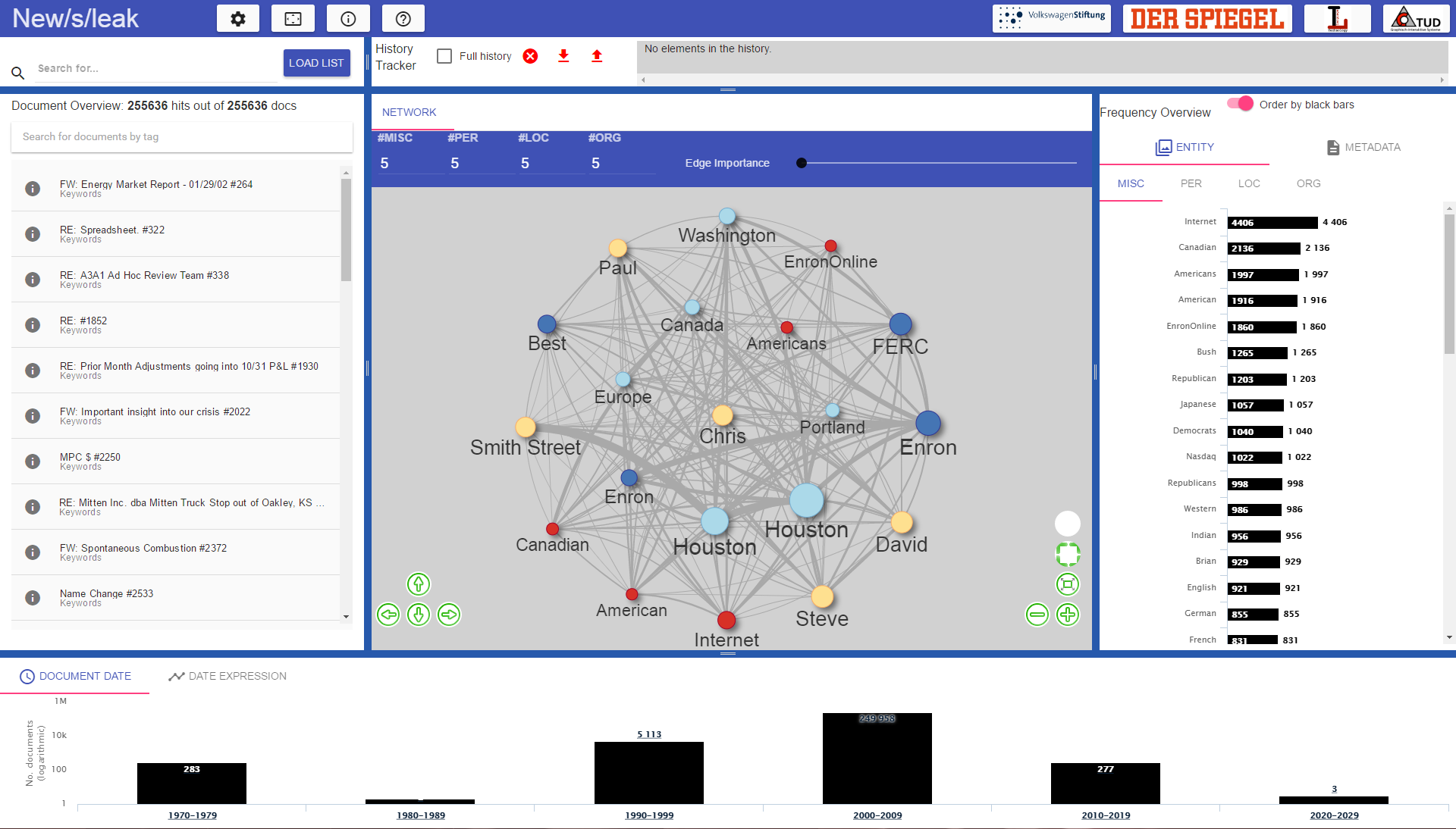
5.13 Network of Names: Visual-Interactive Exploration and Labeling of Entity Relationships
Artjom Kochtchi (Technische Universität Darmstadt, DE), Martin Müller (Technische Universität Darmstadt, DE), Kathrin Ballweg (Technische Universität Darmstadt, DE), Tatiana von Landesberger (Technische Universität Darmstadt, DE), Seid M. Yimam (University of Hamburg, DE), Uli Fahrer (University of Hamburg, DE), Chris Biemann (University of Hamburg, DE), Marcel Rosenbach (Spiegel-Verlag, DE), Michaela Regneri (Spiegel-Verlag, DE), and Heiner Ulrich (Spiegel-Verlag, DE)
License: ![]() Creative Commons BY 4.0 International license © Artjom Kochtchi, Martin Müller, Kathrin Ballweg, Tatiana von Landesberger, Seid M. Yimam, Uli Fahrer, Chris Biemann, Marcel Rosenbach, Michaela Regneri, and Heiner Ulrich
Creative Commons BY 4.0 International license © Artjom Kochtchi, Martin Müller, Kathrin Ballweg, Tatiana von Landesberger, Seid M. Yimam, Uli Fahrer, Chris Biemann, Marcel Rosenbach, Michaela Regneri, and Heiner Ulrich
We present a visual analytics system [3] that enables to explore and annotate relationships between named entities extracted from large document collections. The relationships are visualized in a node-link diagram. Search, show important and expand on demand strategy is used to explore the relationships of interest to the user. Novel degree of interest (DOI) function enables to explore user-specified types of relationships (as in our more recent publication [2], see Figure 22). Visual and textual user-edited annotations are provided that are supported by algorithmic completion.
References
- [1] Artjom Kochtchi, Tatiana von Landesberger, and Chris Biemann. Networks of names: Visual exploration and semi-automatic tagging of social networks from newspaper articles. In Proceedings of the 16th Eurographics Conference on Visualization, EuroVis ’14, pages 211–220. Eurographics Association, 2014.
- [2] Martin Müller, Kathrin Ballweg, Tatiana von Landesberger, Seid M. Yimam, Uli Fahrer, Chris Biemann, Marcel Rosenbach, Michaela Regneri, and Heiner Ulrich. Guidance for multi-type entity graphs from text collections. In Proceedings of the EuroVis Workshop on Visual Analytics, EuroVA ’17, pages 1–6. Eurographics Association, 2017.
6 Working Groups
This section describes results from each of the seven working groups and identifies the attendees contributing to each group. The names of those people who reported for the working groups are underlined.
6.1 WG: A Critical Reflection on Uncertainty Localization and Propagation in Text Visualization
Bettina Speckmann, Carita Paradis, Jean-Daniel Fekete, Mennatallah El-Assady,
Narges Mahyar, Pantea Haghighatkhah, and Vasiliki Simaki
License: ![]() Creative Commons BY 4.0 International license © Bettina Speckmann, Carita Paradis, Jean-Daniel Fekete, Mennatallah El-Assady, Narges Mahyar, Pantea Haghighatkhah, and Vasiliki Simaki
Creative Commons BY 4.0 International license © Bettina Speckmann, Carita Paradis, Jean-Daniel Fekete, Mennatallah El-Assady, Narges Mahyar, Pantea Haghighatkhah, and Vasiliki Simaki
Our group discussed the uncertainty propagation pipeline for visual text analytics. In our first attempt to clarify what we identify as uncertainty and what we consider artifacts and errors, we came up with the following definition:
“Uncertainty refers to epistemic232323https://en.wikipedia.org/wiki/Epistemology situations involving imperfect or unknown information242424https://en.wikipedia.org/wiki/Information, which may come from different sources. If it comes from data, we have no control over it; if it comes from the process, we may/may not know the imperfection.”
Our discussion resulted in distinguishing artifacts as a consequence of the realm and something that can be corrected. Errors as deliberate and systematic problems that can not be corrected.
Then, we used dimensionality reduction as a use case to depict two levels of uncertainty that can be propagated in the pipeline; (1) the internal pipeline uncertainty; and (2) the external semantic uncertainty. Both levels directly impact the perceived and interpreted uncertainty at the end of the pipeline. In the following, we describe the different types of uncertainty we identified based on their occurrence in the pipeline (Figure 18).
(1) Semantic uncertainty: As Figure 18 shows, the first type of uncertainty that we identified in our discussion is located at the text production level. We named it semantic uncertainty on the part of the producer, with the speaker expressing uncertainty about his/her sayings, opinions, facts, or ideas, and it is usually communicated with the use of markers like may, not sure, might, could, e.g., I am not sure how to get there [19].
(2) Comprehension uncertainty: The second type of uncertainty that we identified is located at the data capturing and annotation level, and we named it comprehension uncertainty. Uncertainty issues at this level can be caused during the data collection process, with representativeness, balance, noise, and bias being the main factors causing uncertainty. But uncertainty is caused during the data annotation process, as text ambiguity, vague or generic annotation guidelines and the annotators’ different perceptual systems can lead to different annotation decisions and thus more uncertainty about the reliability of the annotated data. For instance, in The fruit is too soft for me there is uncertainty on the part of the annotator with respect to the meaning of soft whether it is about the texture, the touch, or the smell of the fruit. There is uncertainty in the example of What is your position? With respect to the interpretation of position whether it is about a job, a posture, or an opinion [12, 18, 17].
(3) Encoding uncertainty: The labeled data is then mapped to a data structure, which could be a lossy representation of the input, resulting in encoding uncertainty.
(4) Transformation uncertainty: The encoding typically represents the data as embedding vectors in a high-dimensional space. These get transformed through NLP models that are either exclusively considering the internal data from the pipeline, or additionally rely on external resources, such as in language modeling or externalizing expert knowledge and feedback. The NLP models introduce transformation uncertainty into the pipeline.
(5) Representation uncertainty: The output of NLP models is another set of high-dimensional vectors that are usually represented on a visual interface through dimensionality reduction. Generating the visualizations introduces representation uncertainty.
(6) Interpretation uncertainty: Finally, at the last stage of the pipeline the receiver or analyst inspecting the visualization is interpreting the data through the lens of the visual design, their interpretation uncertainty is due to the mindset of the receiver (user).

6.1.1 Related work
How uncertainty in text vis is different that uncertainty visualization in general?
Prior work has addressed the importance of visualizing uncertainty (E.g., [7, 9, 10, 13, 16]). However, we argue that text visualization needs more careful consideration for uncertainty, its sources, and potential ways to visualize them [3, 3, 11].
The uncertainty in text visualization comes from many origins. First, we need to consider that text is an imperfect representation of human thoughts, therefore encoding thoughts in a text by nature produces artifacts. Another issue is that people come with different understanding and interpretations of the text. Hence, one single text input can result in multiple interpretations which not only affect the interpretation of the receiver but also annotators, because they might have various interpretations. The Text Encoding Initiative (TEI) Guidelines [5], designed to define best practices to encode textual sources with a rich vocabulary of annotations, mention several mechanisms for encoding uncertainty, such as “levels of certainty” and “precision” in the chapter “Certainty, Precision, and Responsibility”, and encoding for text segments such as “unclear”, “gap” for the transcription of text or speech. All of these textual or linguistic uncertainties are idiosyncratic and intrinsic to our languages, texts, and speech structures. The TEI also allows encoding alternative interpretations for the same text segment (using the <choice> element), as well as marking visible errors (<sic>) and possible corrections (<corr>). These annotations can become very rich and a currently not supported in a consistent way by visualization systems; they are mostly ignored.
Multidimensional Projection
Visualizing large document corpora is often done using multidimensional project techniques (also called dimensionality reduction techniques) such as t-SNE [20] or UMAP [15]. These techniques start by computing a distance between documents, such that two related documents are closer than two less related documents. There are many methods to compute the distances, from the older “bag of words” to the more recent ones using deep learning such as doc2vec, Bert, and GPT-3. From these distances, the projection methods represent a document as a point that should be placed in a 2D position such that the distances between the documents are proportional to the distances between the points. The projection methods are very effective at computing an overview but they also introduce geometric distortions and topological artifacts, and this is unavoidable. Therefore, visualizations of high-dimensional data through projections should provide mechanisms to inform users about the artifacts and, if possible, overcome them. In general, when two points are close, the documents they represent are similar, but sometimes, two points are “false neighbors”. Conversely, sometimes, two points should be close by because the documents they represent are similar, but they end up being far away, they are “missing neighbors”. These two artifacts cause misleading interpretations without visual warnings [1].
More generally, visualizations based on multidimensional projections are the last step of a longer analytical pipeline that can inject errors, uncertainty, distortions, and various kinds of artifacts that will end up in the final visualization. If they are not explicitly managed by the visualization technique, they lead to errors and a lack of trust [7]. Visualizing artifacts and uncertainty lead to different techniques that can sometimes be combined but always complexify the visual representation and the interaction.
Visualizing Artifacts
There have been a few articles on techniques for visualizing topological artifacts created by multidimensional projections. Overall, projections maintain local and global geometry and topology but always produce local errors (artifact). These artifacts, when not noticed, lead to errors or uncertainty. For example, a point close to a dense group could be part of the dense group (the cluster) if faithfully located, or can be erroneously located too close and misleads the user.
Therefore, a visualization should at least inform users of these possible errors, preferable indicate where (areas) where they do not happen and, if possible, allow resolving them. Currently, few visualization systems inform users of possible artifacts, and almost none provide techniques to overcome them, especially for a large number of points. Addressing that problem is very important for text visualization in particular, but also for multidimensional visualization in general. Aupetit [1] and Heulot et al. [8] have proposed a few techniques for small amounts of data. Martins et al. [14] for larger amounts but they are not understandable by large audiences.
In addition to artifacts due to the projections, uncertainty can be also intrinsic to data coming out of the NLP pipeline. The simplest form would be a scalar value associated with each point expressing its degree of certainty. In that case, simple visualization methods can be used, such as “Value Suppressing Uncertainty Palettes” by Correl et al. [6].
References
- [1] Michaël Aupetit. Visualizing distortions and recovering topology in continuous projection techniques. Neurocomputing, 70(7):1304–1330, 2007. Advances in Computational Intelligence and Learning.
- [2] Eric P. S. Baumer, Mahmood Jasim, Ali Sarvghad, and Narges Mahyar. Of course it’s political! A critical inquiry into underemphasized dimensions in civic text visualization. Computer Graphics Forum, 2022. To appear.
- [3] Eric P. S. Baumer and Micki McGee. Speaking on behalf of: Representation, delegation, and authority in computational text analysis. In Proceedings of the 2019 AAAI/ACM Conference on AI, Ethics, and Society, AIES ’19, pages 163–169. Association for Computing Machinery, 2019.
- [4] Jason Chuang, Daniel Ramage, Christopher Manning, and Jeffrey Heer. Interpretation and trust: Designing model-driven visualizations for text analysis. In Proceedings of the SIGCHI Conference on Human Factors in Computing Systems, CHI ’12, pages 443–452. Association for Computing Machinery, 2012.
- [5] TEI Consortium. TEI P5: Guidelines for electronic text encoding and interchange. http://www.tei-c.org/Guidelines/P5/, 2022.
- [6] Michael Correll, Dominik Moritz, and Jeffrey Heer. Value-suppressing uncertainty palettes. In Proceedings of the 2018 CHI Conference on Human Factors in Computing Systems, CHI ’18, pages 1–11. Association for Computing Machinery, 2018.
- [7] Miriam Greis, Jessica Hullman, Michael Correll, Matthew Kay, and Orit Shaer. Designing for uncertainty in HCI: When does uncertainty help? In Proceedings of the 2017 CHI Conference Extended Abstracts on Human Factors in Computing Systems, CHI EA ’17, pages 593–600. Association for Computing Machinery, 2017.
- [8] Nicolas Heulot, Michaël Aupetit, and Jean-Daniel Fekete. ProxiLens: Interactive exploration of high-dimensional data using projections. In Proceedings of the EuroVis Workshop on Visual Analytics using Multidimensional Projections, VAMP ’13. The Eurographics Association, 2013.
- [9] Jake M. Hofman, Daniel G. Goldstein, and Jessica Hullman. How visualizing inferential uncertainty can mislead readers about treatment effects in scientific results. In Proceedings of the 2020 CHI Conference on Human Factors in Computing Systems, CHI ’20, pages 1–12. Association for Computing Machinery, 2020.
- [10] Jessica Hullman. Why authors don’t visualize uncertainty. IEEE Transactions on Visualization and Computer Graphics, 26(1):130–139, January 2020.
- [11] Mahmood Jasim, Enamul Hoque, Ali Sarvghad, and Narges Mahyar. CommunityPulse: Facilitating community input analysis by surfacing hidden insights, reflections, and priorities. In Proceedings of the Designing Interactive Systems Conference, DIS ’21, pages 846–863. Association for Computing Machinery, 2021.
- [12] Steven Jones, M. Lynne Murphy, Carita Paradis, and Caroline Willners. Antonyms in English: Construals, Constructions and Canonicity. Studies in English Language. Cambridge University Press, 2012.
- [13] Matthew Kay, Tara Kola, Jessica R. Hullman, and Sean A. Munson. When (ish) is my bus? User-centered visualizations of uncertainty in everyday, mobile predictive systems. In Proceedings of the 2016 CHI Conference on Human Factors in Computing Systems, CHI ’16, pages 5092–5103. Association for Computing Machinery, 2016.
- [14] Rafael M. Martins, Danilo Barbosa Coimbra, Rosane Minghim, and Alexandru C. Telea. Visual analysis of dimensionality reduction quality for parameterized projections. Computers & Graphics, 41:26–42, June 2014.
- [15] Leland McInnes, John Healy, and James Melville. UMAP: Uniform manifold approximation and projection for dimension reduction. arXiv preprint arXiv:1802.03426, 2018.
- [16] Lace Padilla, Matthew Kay, and Jessica Hullman. Uncertainty Visualization, pages 1–18. John Wiley & Sons, Ltd, 2021.
- [17] Carita Paradis. Conceptual spaces at work in sensory cognition: Domains, dimensions and distances. In Applications of Conceptual Spaces, pages 33–55. Springer, 2015.
- [18] Carita Paradis. Meanings of words: Theory and application, pages 274–294. De Gruyter, 2015.
- [19] Vasiliki Simaki, Carita Paradis, Maria Skeppstedt, Magnus Sahlgren, Kostiantyn Kucher, and Andreas Kerren. Annotating speaker stance in discourse: The Brexit Blog Corpus. Corpus Linguistics and Linguistic Theory, 16(2):215–248, 2020.
- [20] Laurens van der Maaten and Geoffrey Hinton. Visualizing data using t-SNE. Journal of Machine Learning Research, 9(86):2579–2605, 2008.
6.2 WG: Annotators and their Data
Alex Endert, Angelos Chatzimparmpas, Christofer Meinecke, Christopher Collins, José Angel Daza Arévalo, Maria Skeppstedt, Ross Maciejewski, and Tatiana von Landesberger
License: ![]() Creative Commons BY 4.0 International license © Alex Endert, Angelos Chatzimparmpas, Christofer Meinecke, Christopher Collins, José Angel Daza Arévalo, Maria Skeppstedt, Ross Maciejewski, and Tatiana von Landesberger
Creative Commons BY 4.0 International license © Alex Endert, Angelos Chatzimparmpas, Christofer Meinecke, Christopher Collins, José Angel Daza Arévalo, Maria Skeppstedt, Ross Maciejewski, and Tatiana von Landesberger

Textual datasets come in varying sizes and are found across a large number of application domains. In many instances, there are no corpora of sufficient sizes for state-of-the-art machine learning algorithms to be effectively applied. This problem is even more acute for low-resource and under-resourced languages, and one major bottleneck is often the need for annotating and hand-curating a training dataset. A solution for these areas is to use pre-trained language models and then to fine-tune a large pre-trained model or apply transfer learning to the specific task or language; however, this still requires some data annotation. For specialized domains, it would be important to leverage the expert knowledge and incorporate it into the models instead of trying to only treat the annotator as a person that provides labels to the data. Given these challenges, there is an overarching need for interactive tools that can support domain experts in annotation, model development, model comparison and model transfer. Despite a large number of possibilities available to visualize and explore a text collection on which you aim to apply NLP models, it is still common to blindly use the available annotation resources (which sometimes are scarce) to label the data according to the specific task you have in mind.
Some questions we (Figure 19) had in this space were how to support the injection of expert knowledge into the labeling and annotation process. For example, labeling functions could be created to guide the first round annotation process using simple rules, but these labels would need to be refined and confirmed by someone familiar with the data. If the expert creates a rule that labels documents containing a specific word as “A”, but another rule would label this document “B”, how do we support the resolution of this conflict? What is the return on investment of work and time for the annotator to resolve these conflicts, in terms of improvement in trained model quality or the achievement of the ultimate task?
A more efficient approach could be to first explore the data. For instance:
-
In order to know which pre-trained language model would be most suitable to fine-tune/apply transfer learning to, in order to achieve the task aimed for.
-
In order to know if existing methods can be applied for generating pre-annotations of your data that the annotators can correct/adjust, speeding up the annotation process. E.g., to apply an existing machine learning model to the data, or to apply heuristic rules (stemming from the expert knowledge of the annotator) to the data, or to use a taxonomy/vocabulary for performing the aimed NLP task.
-
Also in the annotation process, visualization can help. E.g., if active learning is used for actively selecting data to annotate from a pool of unlabeled data, the state of the pool of unlabeled data could be visualized.
6.2.1 Improving the experience of annotation
Given the underlying annotation needs, we wanted to consider how to support data exploration and improve the process of data annotation, making it more enjoyable for the annotator. Considerations included gamification techniques, or showing the impact of the time and effort through visualizing the improvement of model quality and annotation coherence during the work. Ideally, we want to create a system that could perhaps visualize the expected impact of completing a particular annotation, in order to incentivize the human annotator to participate in the interactive active learning loop. This could be translated into three steps, when it might be possible to use visualization to support the annotator in exploring and annotating the text that is to be annotated.
Step 1: How well can an existing model be applied to your data? Try different models and visualize the areas in the texts (or the data points in the data) that are surprising to the model.
Step 2: How well can heuristics rules, stemming from the expert knowledge of the annotator be applied to your data? Will there be conflicting points in your labeling function that stem from these heuristic rules? How can the labeling, and the conflicting labeling decisions be visualized? Can weak supervision help you? We discussed a few concrete ideas of how sets and weak supervision [5] could be used for visualizing when different heuristic rules, annotator decisions, and the output of machine learning models conflict (see Sect. 6.2.2).
Step 3: How can the annotator be given control of the active learning process. For example, how can the classification certainty of an active learning model be visualized in order to let the annotator use their expert knowledge to be in charge of actively selecting what data to annotate? Visualize the data in different ways in order to guide the annotator in how to choose data points to annotate.
6.2.2 Project idea: Expert annotation tool
Even though general commercial labeling tools already exist, such as LabelStudio and Prodigy, we discussed the need for a tool that allows people who have particular expertise in their data to annotate and label meaningful words, phrases, syntactic patterns, and other items in their texts. Such a tool would differ from the traditional labeling tools in that experts often have knowledge about their data and the domain which they would like to communicate to the system and model. Doing so by repetitively adding and correcting categorical labels on words misses out on the opportunity to capture this information directly. For instance, people may have heuristics about the syntactic structure of specific sentences that imply meaning, paragraph lengths that help them detect authorship or intentional misspellings of words that reveal hidden meanings in the texts. A tool that allows people to translate such domain knowledge into heuristics, rules, or otherwise learned model parameters may be particularly helpful in cases where the data is small. For example, Mehta et al. [4] showed how close reading can be supported by a tablet interface that allows experts to annotate their text while reading. The system uses these annotations as a method for generating recommendations of relationships to additional unseen parts of the text. Kochtchi et al. [3] proposed a visual system for users to annotate relationships between named entities extracted from the text. The user-defined annotations are processed and annotation rules are automatically extracted and applied to unexplored parts of the text. In general, human-based annotation enrichments can be assisted by a visual analytics tool aiming to reduce the effort of generating label functions from scratch. This also requires high-quality annotations and the models. As models may be uncertain about labels or lead to conflicts in labels. This uncertainty and the conflicts need to be communicated and resolved. Ambiguities or uncertainties in labels (multi-labels) can be seen as overlapping sets [1] that could show which labels are problematic and whether there are any patterns in the problematic labels that would lead to new annotation rules [2]. On the other side, models could also be updated and improved based on human-injected knowledge using the visually-supported label function creation (cf. Figure 20). The comparison of the human vs. machine-produced models and the correction of the misalignment between them may be another open research opportunity.

References
- [1] Bilal Alsallakh, Luana Micallef, Wolfgang Aigner, Helwig Hauser, Silvia Miksch, and Peter Rodgers. The state-of-the-art of set visualization. Computer Graphics Forum, 35(1):234–260, February 2016.
- [2] Jürgen Bernard, Matthias Zeppelzauer, Michael Sedlmair, and Wolfgang Aigner. VIAL: A unified process for visual interactive labeling. The Visual Computer: International Journal of Computer Graphics, 34(9):1189–1207, September 2018.
- [3] Artjom Kochtchi, Tatiana von Landesberger, and Chris Biemman. Networks of names: Visual exploration and semi-automatic tagging of social networks from newspaper articles. In Proceedings of the 16th Eurographics Conference on Visualization, EuroVis ’14, pages 211–220. Eurographics Association, 2014.
- [4] Hrim Mehta, Adam Bradley, Mark Hancock, and Christopher Collins. Metatation: Annotation as implicit interaction to bridge close and distant reading. ACM Transactions on Computer-Human Interaction, 24(5), November 2017.
- [5] Alexander Ratner, Stephen H. Bach, Henry Ehrenberg, Jason Fries, Sen Wu, and Christopher Ré. Snorkel: Rapid training data creation with weak supervision. The VLDB Journal, 29(2):709–730, May 2020.
6.3 WG: Visual Representations of Text
Andreas Kerren, Antske Fokkens, Barbara Plank, Chris Weaver, Kostiantyn Kucher, Nicole Sultanum, Tatiana von Landesberger, and Yoav Goldberg
License: ![]() Creative Commons BY 4.0 International license © Andreas Kerren, Antske Fokkens, Barbara Plank, Chris Weaver, Kostiantyn Kucher, Nicole Sultanum, Tatiana von Landesberger, and Yoav Goldberg
Creative Commons BY 4.0 International license © Andreas Kerren, Antske Fokkens, Barbara Plank, Chris Weaver, Kostiantyn Kucher, Nicole Sultanum, Tatiana von Landesberger, and Yoav Goldberg
Language is complex. NLP provides ways to extract information from different levels of text (paragraph level, sentence level, phrase or entity level, etc.). We are interested in displaying related pieces of information (related paragraphs, related sentences, or related phrases) in a way which exposes their similarities and allows aggregations over similar content – in this regard, besides the more general work on text visualization or information visualization, we can consider the approaches for representing text alignment in particular [12], for instance. However, similarity phenomena are complex [2], and textual items can relate to each other in multiple different aspects, and in multiple layers of similarity. In addition, the order of similarity may not be linear. We distinguish two main forms of similarity. The first is linguistic similarity, which refers to two expressions exhibiting the same linguistic phenomenon (e.g., containing negation or a specific syntactic structure). The second is referential similarity (which can vary from the same referent, e.g., a specific department in a university, to referents of the same type, e.g., an educational institution). We first outline the challenges involved in visualizing this and then provide an overview of potential starting points based on prior work in information visualization and visual analytics.
6.3.1 Linguistic similarity
Computational linguistics has a tradition in creating rich evaluation sets (e.g., Lehmann et al. [7]). Recently, interest in tests that are carefully designed to cover specific linguistic phenomena has regained interest in the community, e.g., the introduction of checklists for evaluation [9]. Such datasets can provide valuable insights into which phenomena have been learned by a model and which not. The downside of looking at carefully designed sets is that it is not necessarily clear how representative they are for naturally occurring data. We have benchmark data that has been created by annotating naturally occurring samples for most tasks, but these are small and it is often hard to tell how representative they are when using models in the “real world”.
The best of both worlds would therefore be to combine the two and investigate various linguistic phenomena in real-world data. Additionally, it can be informative to explore the actual occurrence of various phenomena to gain insight into whether the success or failure of models to deal with them correctly matters for real world applications. If we can identify and show what phenomena actually occur, we can also gain insight into whether existing benchmarks are sufficiently similar to the data we intend to apply our models to and, thus, whether reported results are indicative of how the model will perform on our data. Visualizations that would support such exploration of data would therefore be highly beneficial for the field.
6.3.2 Referential similarity
As an example, consider a set of sentences describing people’s academic achievements. Items in such a set may include:
-
1.
Alice obtained her PhD in Computational Linguistics from Saarbrucken University.
-
2.
Bob majored from MIT Business School with a Business Administration Master’s degree.
-
3.
Cam has a PhD from MIT.
-
4.
Dan has a Master’s degree in Business Administration from Saarbrucken Business School.
One point of similarity between these sentences is their topic, and, more narrowly, the event they describe (a person obtaining some degree from some academic institution). They also share various forms of linguistic similarity such as syntax, for instance, all sentences are in active form, all have a prepositional clause starting with “from”, etc.
But there are also other levels of similarity. For example, the obtained degree in items (1) and (3) is both a “PhD”, and in items (1) and (2) and (4) is both “Master’s”. Moreover, both Master’s degrees are degrees in “Business Administration”, although the syntactic structure in which this information is realized differs: “Business Administration Master’s degree” vs. “Master’s degree in Business Administration”.
Similarly, the institution slot is similar between items (1) and (4) (“Saarbrucken University”) and between items (2) and (3) (“MIT”). However, note that the institution can also be grouped differently, noting the similarity between (2) and (4), which are both “Business School”. If we had also a sentence about a person obtaining a degree from LMU, it would have been similar to items (1) and (4) if we were to consider the country in which the academic institution is based. We can also consider grouping the person who obtained their degree by, for example, their gender. Note that this introduces a notion of ambiguity or under-specification: the gender of “Cam” in sentence (3) cannot be determined based on the text alone. The topic of Cam’s degree is also not specified. Visualizations that support exploring similarity at these levels can be of high value for non-technical end users as well as NLP experts. For non-expert users it is particularly important that the interface is intuitive and supports identifying potentially useful relations they are not a priori aware of.
The use cases include both corpus exploration on the individual text level (what is the structure of the individual items) as well on aggregations on the entire corpus level, and encompass either single arguments (“which German schools are represented in the corpus”) or collections of arguments (“show me all PhDs graduates in Business from Saarbrucken”).
6.3.3 Information visualization perspective
If we consider the traditional InfoVis Reference Model by Card et al. [4], the first two steps of the overall process/pipeline involve transforming raw data into “data tables”, which for our purposes of visual text analytics could be compared to the definition of facets/frames that should eventually be revealed by the visual representation. One issue of relying on this conceptual model in the context of dealing with text data is the richness, complexity, and ambiguity of text in comparison with the standard case of n-dimensional multivariate tabular data, which was the default case for the InfoVis Reference Model and general-purpose visualization tools.
The typical scenario of representing text data with (interactive) visual representations that we can find in the related work is driven by the particular choice of user tasks (both from the point of higher-level analytical concerns, such as revealing the main concepts, similarities, or opinions in the text data, or lower-level exploration concerns, such as providing overview or supporting navigation over a collection of text documents) and the available data. Here, we could consider an example such as PEARL by Zhao et al. [13] which focuses on the exploration of emotions expressed in a single user’s messages on Twitter – the visual representations used by this tool rely on the particular set of computational analyses which were selected according to the task, but also the particular data formats and the respective constraints and peculiarities. PEARL could thus be viewed as a specialized solution, but cannot be considered a general-purpose text visualization approach.
Jigsaw [10] is another meaningful example to partly illustrate some of the data framing concepts (and issues) for text data representation. It was created to support intelligence analysts in investigative work to uncover hidden patterns. Its underlying data structures contain relationships between entities (people, organizations, location) and documents, which can be visualized in different ways, via a multitude of views. Each Jigsaw view was purposefully designed to support a specific facet of the data, and multiple views are needed to provide complementary perspectives on the data. Compared to the expectations of NLP experts, the design of Jigsaw lacks the support for representing the relationships between entities across facets and at multiple levels of hierarchies and scales present in the data (e.g., the semantic hierarchies, the entity relations, the structural progression of content, etc.)—such a general visual text representation technique would be very valuable for experts and lay users alike for a variety of use cases.
Considering the generalizability spectrum, the solutions such as Voyant Tools 252525https://voyant-tools.org/ lie closer to the more general side, while providing support for several common linguistic analyses and rather lightweight visual representations, including word clouds [11], which seem to be appreciated by the general public and even users from particular knowledge domains, however, this representation is rather controversial with respect to the perceptual considerations and usability concerns, as studied in the related work [1, 5, 17], and it also does not address a number of possible higher- and lower-level tasks.
6.3.4 Towards flexible visual text analytics pipelines
The considerations mentioned above led us to another iteration of our discussion, with the deficiencies of the existing visual representations of text for complex, yet generic scenarios motivating the need to reconsider the underlying data structures, analyses, and tasks besides the visual encoding or interaction technique on their own.
One of models/frameworks that we found to be relevant to such scenarios is the multilayer network model, which recognizes that the complexity of relationships between entities in real-world applications is better embraced as several interdependent layers/levels rather than a simple graph approach usually used in network visualization. A recent book publication provides an overview of the current state of the art in this emerging field [8].
For example, each word or phrase in a sentence can have a type (location, person, organization, …). Each type can be seen as a layer within a multilayer network. Moreover, the types (e.g., locations) can be part of a hierarchy (e.g., city area state continent) that are also layers of the hierarchical structure. The similarity between the sentences can thus be seen as a multilayer network, where each aspect of the similarity is a type of element in the sentence. Each word or phrase in the sentence would be a node of the network and similarities would be connections between elements. The order of words/phrases forms a sequence which needs to be considered in the network visualization. Thus, the exploration of similarities and their semantics can be seen as an analogous exploration process in multilayer networks. The view on words, phrases, sentences, paragraphs, and documents relates to multi-scale exploration of networks. This opens interesting ideas and challenges from a visualization perspective.
One example of an existing visual analytic approach relevant to this discussion is FacetAtlas [3]. FacetAtlas embodies some of the principles of representing rich and complex information while allowing for dynamic exploration via a compact representation of multilayered concept networks extracted from text. Each layer represents a different facet, and relationships are computed via topic similarity; layers are superimposed and facet-level relationships are encoded as set overlaps.
Taking into account all such expectations from the experts and lay users, data models and computational approaches, and visual representation and interaction concerns, we envision one possible way forward as a flexible pipeline of data transformation and representation for text data (see Figure 21), which starts with capturing the facets and relationships on the data and domain-specific analyses side (which might include ordinal, n-ary, and heterogeneous relationships – which can also be related to the multi-layer network framework) and providing (parameterized) visual encodings that reveal the contents of these facets, but also patterns of interactions across these facets/frames.

References
- [1] Eric Alexander, Chih-Ching Chang, Mariana Shimabukuro, Steven Franconeri, Christopher Collins, and Michael Gleicher. Perceptual biases in font size as a data encoding. IEEE Transactions on Visualization and Computer Graphics, 24(8):2397–2410, August 2018.
- [2] Daniel Bär, Torsten Zesch, and Iryna Gurevych. A reflective view on text similarity. In Proceedings of the International Conference on Recent Advances in Natural Language Processing, RANLP ’11, pages 515–520. Association for Computational Linguistics, 2011.
- [3] Nan Cao, Jimeng Sun, Yu-Ru Lin, David Gotz, Shixia Liu, and Huamin Qu. FacetAtlas: Multifaceted visualization for rich text corpora. IEEE Transactions on Visualization and Computer Graphics, 16(6):1172–1181, November–December 2010.
- [4] Stuart K. Card, Jock D. Mackinlay, and Ben Shneiderman. Readings in Information Visualization: Using Vision to Think. Morgan Kaufmann Publishers Inc., 1999.
- [5] Cristian Felix, Steven Franconeri, and Enrico Bertini. Taking word clouds apart: An empirical investigation of the design space for keyword summaries. IEEE Transactions on Visualization and Computer Graphics, 24(1):657–666, January 2018.
- [6] Marti A. Hearst, Emily Pedersen, Lekha Patil, Elsie Lee, Paul Laskowski, and Steven Franconeri. An evaluation of semantically grouped word cloud designs. IEEE Transactions on Visualization and Computer Graphics, 26(9):2748–2761, September 2020.
- [7] Sabine Lehmann, Stephan Oepen, Sylvie Regnier-Prost, Klaus Netter, Veronika Lux, Judith Klein, Kirsten Falkedal, Frederik Fouvry, Dominique Estival, Eva Dauphin, Hervè Compagnion, Judith Baur, Lorna Balkan, and Doug Arnold. TSNLP: Test suites for natural language processing. In Proceedings of the 16th Conference on Computational Linguistics – Volume 2, COLING ’96, pages 711–716. Association for Computational Linguistics, 1996.
- [8] Fintan McGee, Benjamin Renoust, Daniel Archambault, Mohammad Ghoniem, Andreas Kerren, Bruno Pinaud, Margit Pohl, Benoît Otjacques, Guy Melançon, and Tatiana von Landesberger. Visual analysis of multilayer networks. Synthesis Lectures on Visualization, 8(1):1–150, 2021.
- [9] Marco Tulio Ribeiro, Tongshuang Wu, Carlos Guestrin, and Sameer Singh. Beyond accuracy: Behavioral testing of NLP models with CheckList. In Proceedings of the 58th Annual Meeting of the Association for Computational Linguistics, ACL ’20, pages 4902–4912. Association for Computational Linguistics, 2020.
- [10] John Stasko, Carsten Gorg, Zhicheng Liu, and Kanupriya Singhal. Jigsaw: Supporting investigative analysis through interactive visualization. In Proceedings of the 2007 IEEE Symposium on Visual Analytics Science and Technology, VAST ’07, pages 131–138. IEEE, 2007.
- [11] Fernanda B. Viégas and Martin Wattenberg. Tag clouds and the case for vernacular visualization. Interactions, 15(4):49–52, July 2008.
- [12] Tariq Yousef and Stefan Janicke. A survey of text alignment visualization. IEEE Transactions on Visualization and Computer Graphics, 27(2):1149–1159, February 2021.
- [13] Jian Zhao, Liang Gou, Fei Wang, and Michelle Zhou. PEARL: An interactive visual analytic tool for understanding personal emotion style derived from social media. In Proceedings of the 2014 IEEE Conference on Visual Analytics Science and Technology, VAST ’14, pages 203–212. IEEE, 2014.
6.4 WG: Model Explainability and Interpretability
Daniel A. Keim, Hendrik Strobelt, Johannes Knittel, Pia Sommerauer, Richard Brath, and Shimei Pan
License: ![]() Creative Commons BY 4.0 International license © Daniel A. Keim, Hendrik Strobelt, Johannes Knittel, Pia Sommerauer, Richard Brath, and Shimei Pan
Creative Commons BY 4.0 International license © Daniel A. Keim, Hendrik Strobelt, Johannes Knittel, Pia Sommerauer, Richard Brath, and Shimei Pan
In recent years, NLP has become data-driven with very large models such as BERT, and GPT-3 providing an unprecedented performance. The latest models have billions of variables and need enormous amount of data and computing resources for training. While results in general are of high quality, there are numerous applications where explainability is of high importance 262626https://medium.com/cortico/visualizing-toxicity-in-twitter-conversations-3cd336e5db81, such as medical diagnosis or bias detection 272727https://www.brookings.edu/research/detecting-and-mitigating-bias-in-natural-language-processing/ 282828https://www.reuters.com/article/us-amazon-com-jobs-automation-insight/amazon-scraps-secret-ai-recruiting-tool-that-showed-bias-against-women-idUSKCN1MK08G. We, a group of visualization researchers and NLP researchers (Figure 22), discussed when, why, and how interactive visualization has a valuable role in explaining NLP models (XAI4NLP), especially considering large pre-trained neural language models such as GPT-3. Explainability, interpretability, and model analysis offer slightly different perspectives on making neural models more transparent and interpretable 292929https://pair.withgoogle.com/explorables/fill-in-the-blank/.
There are many stakeholders with different levels of expertise and domain knowledge that can take advantage of XAI4NLP, but the goals and methods typically vary. We decided to consider this field from the perspective of different users who can be grouped by different goals. We identified three main target user groups (Figure 23): model architects and builders, researchers and domain experts, and general users and consumers that do not necessarily have any background in computer science and may not have deep data knowledge. Model architects and builders may not have extensive knowledge about the data their models are trained on, but they have strong expertise in which models to use when, and how they can be adapted for different target goals. Researchers, data scientists, and domain experts, on the other hand, can be placed on a broad spectrum of expertise. They range from computational linguistics and NLP experts with a detailed understanding of neural models, to experts with deep knowledge of domain-specific data, but little technical understanding. Average consumers, however, rarely know any specifics about data or models. When considering explainability using visualization, it is important to consider the goals and skills of each user group.
Different NLP approaches involve different opportunities and challenges for model interpretability (Figure 24). We decided to focus on three major approaches: The current state-of-the-art models tend to employ large-pre-trained language models and fine-tune them for particular tasks. However, other, more traditional architectures still exist. In our discussions we generally considered approaches that make use of neural models at some stage. For instance, traditional pipeline approaches can employ ‘black box’ neural models for particular steps in the pipeline, but are somewhat transparent in the sense that input and output can be inspected at various steps in the pipeline. Task-specific end-to-end models, however, cannot provide this transparency. The framework of pre-training and fine-tuning poses even more challenges, as the training data of pre-trained language models are extremely large and often not accessible. In some cases, the pre-trained models themselves are not available for inspection.
It is important to note that, for some tasks, there is little benefit in using interactive visualizations. For instance, visualizations typically rarely play a role in confirming hypotheses in a formal way, and for well-defined goals (e.g., text search) we may be better off using automatic methods or just basic visualizations. Interactive visualizations, though, are particularly helpful for exploring models and data, as well as for generating novel hypotheses. Beyond curiosity-driven research, NLP experts should be able to understand and predict how models behave when employed in real-world scenarios. In addition, visualizations support communicating results and insights to different audiences, to consumers as well as experts.
We discussed the importance of interacting with visualizations, particularly to scale the analysis of large NLP models (Figure 25). Analysts may either explore the data first using an overview visualizations, which allows interactive drill-downs for more specific analyses related to insights or hypotheses that they have gained thus far, or they may analyze or filter the data first and investigate a particular subset of the data and/or model. Furthermore, analysts may steer the model interactively to fit it to their needs, which allows for incorporating domain knowledge into the model.
Using text to visualize text is generally a useful technique, but we need additional means to scale this encoding (e.g., highlighting, filtering, aggregation). For large NLP models, we need multi-level scalable visualization techniques that are able to process and analyze massive amounts of training data, billions of parameters, and highly connected graphs.
We identified different points in the three different approaches at which different visualizations can be used.
Debiasing use case: Expert modelers may need to understand where bias is coming from, such as the model or training date, both of which are massive visualization challenges given the scale of data in large language models.
Labeling data use case: For constructing fine-tune models, such as classifiers, etc., data needs to be annotated by humans. Search, navigation, filtering and marking appropriate examples benefit from visualization techniques to show relevant text in detail as well as related examples to aid increasing the performance of the annotation task. Access to these same viusalizations aids downstream explainability and interpretability tasks to assess the annotations used to derive the model.
Model structure use case: Understanding model structure aids insights into relations, such as high-dimension vector spaces of word embeddings, or layers and nodes within a language model assuming there is access to the internals of the model.

References
- [1] Bilal Alsallakh, Allan Hanbury, Helwig Hauser, Silvia Miksch, and Andreas Rauber. Visual methods for analyzing probabilistic classification data. IEEE Transactions on Visualization and Computer Graphics, 20(12):1703–1712, December 2014.
- [2] Rie Kubota Ando and Tong Zhang. A framework for learning predictive structures from multiple tasks and unlabeled data. Journal of Machine Learning Research, 6(61):1817–1853, 2005.
- [3] Galen Andrew and Jianfeng Gao. Scalable training of L1-regularized log-linear models. In Proceedings of the 24th International Conference on Machine Learning, ICML ’07, pages 33–40. Association for Computing Machinery, 2007.
- [4] Mahzarin R. Banaji and Anthony G. Greenwald. Blindspot: Hidden Biases of Good People. Bantam, 2013.
- [5] Yonatan Belinkov, Nadir Durrani, Fahim Dalvi, Hassan Sajjad, and James Glass. What do neural machine translation models learn about morphology? arXiv preprint arXiv:1704.03471, 2017.
- [6] Yonatan Belinkov and James Glass. Analysis methods in neural language processing: A survey. Transactions of the Association for Computational Linguistics (TACL), 7:49–72, 2019.
- [7] Jürgen Bernard, Marco Hutter, Matthias Zeppelzauer, Dieter Fellner, and Michael Sedlmair. Comparing visual-interactive labeling with active learning: An experimental study. IEEE Transactions on Visualization and Computer Graphics, 24(1):298–308, January 2018.
- [8] Angie Boggust, Brandon Carter, and Arvind Satyanarayan. Embedding Comparator: Visualizing differences in global structure and local neighborhoods via small multiples. In Proceeding of the 27th International Conference on Intelligent User Interfaces, IUI ’22, pages 746–766. Association for Computing Machinery, 2022.
- [9] Tolga Bolukbasi, Kai-Wei Chang, James Y Zou, Venkatesh Saligrama, and Adam T Kalai. Man is to computer programmer as woman is to homemaker? Debiasing word embeddings. Advances in Neural Information Processing Systems, 29, 2016.
- [10] Richard Brath. Visualizing with Text. CRC Press, 2020.
- [11] Anamaria Crisan, Margaret Drouhard, Jesse Vig, and Nazneen Rajani. Interactive model cards: A human-centered approach to model documentation. In Proceedings of the 2022 ACM Conference on Fairness, Accountability, and Transparency, FAccT ’22, pages 427–439. ACM, 2022.
- [12] Fahim Dalvi, Avery Nortonsmith, Anthony Bau, Yonatan Belinkov, Hassan Sajjad, Nadir Durrani, and James Glass. NeuroX: A toolkit for analyzing individual neurons in neural networks. In Proceedings of the AAAI Conference on Artificial Intelligence, volume 33 of AAAI, pages 9851–9852, 2019.
- [13] Marina Danilevsky, Kun Qian, Ranit Aharonov, Yannis Katsis, Ban Kawas, and Prithviraj Sen. A survey of the state of explainable AI for natural language processing. In Proceedings of the 1st Conference of the Asia-Pacific Chapter of the Association for Computational Linguistics and the 10th International Joint Conference on Natural Language Processing, AACL ’20, pages 447–459. Association for Computational Linguistics, 2020.
- [14] Joseph F. DeRose, Jiayao Wang, and Matthew Berger. Attention flows: Analyzing and comparing attention mechanisms in language models. IEEE Transactions on Visualization and Computer Graphics, 27(2):1160–1170, February 2021.
- [15] Sebastian Gehrmann, Hendrik Strobelt, and Alexander Rush. GLTR: Statistical detection and visualization of generated text. In Proceedings of the 57th Annual Meeting of the Association for Computational Linguistics: System Demonstrations, ACL ’19, pages 111–116. Association for Computational Linguistics, 2019.
- [16] Anthony G. Greenwald, Debbie E. McGhee, and Jordan L. K. Schwartz. Measuring individual differences in implicit cognition: The implicit association test. Journal of Personality and Social Psychology, 74(6):1464–1480, June 1998.
- [17] Marti A. Hearst, Emily Pedersen, Lekha Patil, Elsie Lee, Paul Laskowski, and Steven Franconeri. An evaluation of semantically grouped word cloud designs. IEEE Transactions on Visualization and Computer Graphics, 26(9):2748–2761, September 2020.
- [18] Florian Heimerl and Michael Gleicher. Interactive analysis of word vector embeddings. Computer Graphics Forum, 37(3):253–265, June 2018.
- [19] Florian Heimerl, Steffen Koch, Harald Bosch, and Thomas Ertl. Visual classifier training for text document retrieval. IEEE Transactions on Visualization and Computer Graphics, 18(12):2839–2848, December 2012.
- [20] Evan Hernandez and Jacob Andreas. The low-dimensional linear geometry of contextualized word representations. In Proceedings of the 25th Conference on Computational Natural Language Learning, CoNLL-EMNLP ’21, pages 82–93. Association for Computational Linguistics, 2021.
- [21] Minsuk Kahng, Pierre Y. Andrews, Aditya Kalro, and Duen Horng Chau. ActiVis: Visual exploration of industry-scale deep neural network models. IEEE Transactions on Visualization and Computer Graphics, 24(1):88–97, January 2018.
- [22] Johannes Knittel, Steffen Koch, and Thomas Ertl. PyramidTags: Context-, time- and word order-aware tag maps to explore large document collections. IEEE Transactions on Visualization and Computer Graphics, 27(12):4455–4468, December 2021.
- [23] Kostiantyn Kucher and Andreas Kerren. Text visualization techniques: Taxonomy, visual survey, and community insights. In Proceedings of the 2015 IEEE Pacific Visualization Symposium, PacificVis ’15, pages 117–121. IEEE, 2015.
- [24] Johannes Lang and Miguel A. Nacenta. Perception of letter glyph parameters for infotypography. ACM Transactions on Graphics (Proceedings of the SIGGRAPH 2022), 2022. To appear.
- [25] Jiwei Li, Xinlei Chen, Eduard Hovy, and Dan Jurafsky. Visualizing and understanding neural models in NLP. In Proceedings of the 2016 Conference of the North American Chapter of the Association for Computational Linguistics: Human Language Technologies, NAACL ’16, pages 681–691. Association for Computational Linguistics, 2016.
- [26] Yuxin Ma, Arlen Fan, Jingrui He, Arun Reddy Nelakurthi, and Ross Maciejewski. A visual analytics framework for explaining and diagnosing transfer learning processes. IEEE Transactions on Visualization and Computer Graphics, 27(2):1385–1395, February 2021.
- [27] Burt L. Monroe, Michael P. Colaresi, and Kevin M. Quinn. Fightin’ words: Lexical feature selection and evaluation for identifying the content of political conflict. Political Analysis, 16(4):372–403, February 2017.
- [28] Mohammad S. Rasooli and Joel Tetreault. Yara Parser: A fast and accurate dependency parser. arXiv preprint arXiv:1503.06733, 2015.
- [29] Clément Rebuffel, Marco Roberti, Laure Soulier, Geoffrey Scoutheeten, Rossella Cancelliere, and Patrick Gallinari. Controlling hallucinations at word level in data-to-text generation. Data Mining and Knowledge Discovery, 36(1):318–354, 2022.
- [30] Victor Sanh, Albert Webson, Colin Raffel, Stephen H. Bach, Lintang Sutawika, Zaid Alyafeai, Antoine Chaffin, Arnaud Stiegler, Teven Le Scao, Arun Raja, Manan Dey, M. Saiful Bari, Canwen Xu, Urmish Thakker, Shanya Sharma, Eliza Szczechla, Taewoon Kim, Gunjan Chhablani, Nihal V. Nayak, Debajyoti Datta, Jonathan Chang, Mike T.-J. Jiang, Han Wang, Matteo Manica, Sheng Shen, Zheng-Xin yong, Harshit Pandey, Michael Mckenna, Rachel Bawden, Thomas Wang, Trishala Neeraj, Jos Rozen, Abheesht Sharma, Andrea Santilli, Thibault Fevry, Jason A. Fries, Ryan Teehan, Tali Bers, Stella Biderman, Leo Gao, Thomas Wolf, and Alexander M. Rush. Multitask prompted training enables zero-shot task generalization. In Proceedings of the Tenth International Conference on Learning Representations, ICLR ’22, 2022.
- [31] Maarten Sap, Dallas Card, Saadia Gabriel, Yejin Choi, and Noah A. Smith. The risk of racial bias in hate speech detection. In Proceedings of the 57th Annual Meeting of the Association for Computational Linguistics, ACL ’19, pages 1668–1678. Association for Computational Linguistics, 2019.
- [32] Naomi Saphra and Adam Lopez. Understanding learning dynamics of language models with SVCCA. In Proceedings of the 2019 Conference of the North American Chapter of the Association for Computational Linguistics: Human Language Technologies, Volume 1 (Long and Short Papers), NAACL ’19, pages 3257–3267. Association for Computational Linguistics, 2019.
- [33] Hendrik Strobelt, Sebastian Gehrmann, Michael Behrisch, Adam Perer, Hanspeter Pfister, and Alexander M. Rush. Seq2seq-Vis: A visual debugging tool for sequence-to-sequence models. IEEE Transactions on Visualization and Computer Graphics, 25(1):353–363, January 2019.
- [34] Hendrik Strobelt, Sebastian Gehrmann, Hanspeter Pfister, and Alexander M. Rush. LSTMVis: A tool for visual analysis of hidden state dynamics in recurrent neural networks. IEEE Transactions on Visualization and Computer Graphics, 24(1):667–676, January 2018.
- [35] Tony Sun, Andrew Gaut, Shirlyn Tang, Yuxin Huang, Mai ElSherief, Jieyu Zhao, Diba Mirza, Elizabeth Belding, Kai-Wei Chang, and William Yang Wang. Mitigating gender bias in natural language processing: Literature review. In Proceedings of the 57th Annual Meeting of the Association for Computational Linguistics, ACL ’19, pages 1630–1640. Association for Computational Linguistics, 2019.
- [36] Ian Tenney, Dipanjan Das, and Ellie Pavlick. BERT rediscovers the classical NLP pipeline. In Proceedings of the 57th Annual Meeting of the Association for Computational Linguistics, ACL ’19, pages 4593–4601. Association for Computational Linguistics, 2019.
- [37] Ian Tenney, James Wexler, Jasmijn Bastings, Tolga Bolukbasi, Andy Coenen, Sebastian Gehrmann, Ellen Jiang, Mahima Pushkarna, Carey Radebaugh, Emily Reif, and Ann Yuan. The language interpretability tool: Extensible, interactive visualizations and analysis for NLP models. In Proceedings of the 2020 Conference on Empirical Methods in Natural Language Processing: System Demonstrations, EMNLP ’20, pages 107–118. Association for Computational Linguistics, 2020.
- [38] Ian Tenney, Patrick Xia, Berlin Chen, Alex Wang, Adam Poliak, R Thomas McCoy, Najoung Kim, Benjamin Van Durme, Samuel R. Bowman, Dipanjan Das, and Ellie Pavlick. What do you learn from context? Probing for sentence structure in contextualized word representations. arXiv preprint arXiv:1905.06316, 2019.
- [39] Jesse Vig. A multiscale visualization of attention in the transformer model. In Proceedings of the 57th Annual Meeting of the Association for Computational Linguistics: System Demonstrations, ACL ’19, pages 37–42. Association for Computational Linguistics, 2019.
- [40] Susan Zhang, Stephen Roller, Naman Goyal, Mikel Artetxe, Moya Chen, Shuohui Chen, Christopher Dewan, Mona Diab, Xian Li, Xi V. Lin, Todor Mihaylov, Myle Ott, Sam Shleifer, Kurt Shuster, Daniel Simig, Punit S. Koura, Anjali Sridhar, Tianlu Wang, and Luke Zettlemoyer. OPT: Open pre-trained transformer language models. arXiv preprint arXiv:2205.01068, 2022.
6.5 WG: Bias and Bias Mitigation
Alex Endert, Angelos Chatzimparmpas, Antske Fokkens, Chris Weaver, Christopher Collins, Ross Maciejewski, Shimei Pan, and Tatiana von Landesberger
License: ![]() Creative Commons BY 4.0 International license © Alex Endert, Angelos Chatzimparmpas, Antske Fokkens, Chris Weaver, Christopher Collins, Ross Maciejewski, Shimei Pan, and Tatiana von Landesberger
Creative Commons BY 4.0 International license © Alex Endert, Angelos Chatzimparmpas, Antske Fokkens, Chris Weaver, Christopher Collins, Ross Maciejewski, Shimei Pan, and Tatiana von Landesberger

This discussion focused on definitions and categorization of bias (e.g., social bias, system bias, cognitive bias, and sample bias) and methods to identify and mitigate all in the context of text analysis and visualization. We (Figure 26) discussed the data processing pipelines from the NLP community and the data visualization community as a lens through which to discuss areas where bias can appear. A fundamental point when talking about bias is that biases can be found or introduced in every step of the pipeline. Locating bias in the pipeline can be a challenge. There can be bias in the data, this can be amplified or even introduced by the model, by choices on how to visualize the data, the transformations of the data as part of the visualization and in the eye of the beholder interpreting the results. Another fundamental aspect is the question of whether bias is necessarily problematic, where the obvious answer is that it depends. It is a complex question when bias is problematic and what the ideal outcome or correction is when a problematic bias occurs [3]. This can only be addressed with input from various disciplines, from notably the humanities and social sciences as well as experts from the application domain. We agreed however that it is always good to know about bias so that we can discuss if this bias is useful or problematic, inevitable or something that can and should be fixed, or at least attempts made to mitigate it [4]. Therefore, we continued to focus on identifying and communicating bias. Several ideas for development were discussed. We mostly dived into the question of how to visualize bias in data and language models exploring prompt engineering and patterns in data.
6.5.1 Exploring social bias through prompts and completion
In large-scale NLP models (e.g., BERT, GPT-2), one mechanism to probe for biases is to utilize prompts to try and understand if the model was associating particular roles more frequently with certain protected classes (e.g., gender, ethnicity). However, this probing is often highly sequential and can be ad hoc. It does not necessarily have the capability to reveal hidden biases; instead, it may lead to only the discovery of expected biases (as opposed to unexpected biases). Current approaches for understanding if biases exist in such models include comparing completions for two prompts. Observing the visual comparison of the completions can illuminate potential biases when references are made in the text that indicate forms of social biases. However, these visual comparisons often lead to follow-up questions about specific words or phrases. Current tools do not support this iterative refinement and exploration. We discussed how visualization tools could be designed to foster this iterative exploration, including:

-
1.
Comparing multiple models trained on different datasets for a single prompt.
-
2.
Comparing multiple prompt completions for a single model.
-
3.
Visually constructing complex prompt completion templates through the use of SentenTree or WordTree visualization techniques.
-
4.
Visualizing the embedding space of prompts for a given model.
It is at this intersection where visualization could serve as an effective mechanism to support the exploration of biases.
-
1.
Can text visualization help us to identify problems in the training data (e.g., various types of biases throughout the complete pipeline)?
-
2.
Can text visualization facilitate prompt engineering?
-
3.
Can interactivity support identifying bias in large datasets?
-
4.
Can interactivity support framing perspectives and stances on bias?
-
5.
How can we detect, warn and communicate about potential bias shifts over time?
To that end, it would be imperative to explore which visualizations are suitable for:
-
Communicating bias detected by automatic data processing.
-
Identifying bias, its size, and aspects in the original dataset.
-
Discovering hidden and unknown bias in large corpora.
-
Comparing bias between models.
-
Steering models towards less bias.
-
Letting the user remove or mitigate bias (e.g., by selecting and checking datasets without bias).
-
Exploring the “path” of bias from a dataset, via model to visualization – source, size, amplification, and transformation of bias through the pipeline.
Throughout the design process, considerations of the user’s background (e.g., NLP experts or application domain professionals, e.g., social scientists) should be considered. Furthermore, the visual design must be careful not to suppress or amplify detected biases from the data and models. A key step to this is identifying which biases are caused by the data representations, visual representations, and cognitive biases of domain experts using the visualization [5, 1]. Another is understanding how biases are introduced, changed, removed, and even elicited in the design process and resulting pipelines (Figure 27). Finally, such designs would need to be systematically evaluated to explore the potential for unintended biases (pointer to evaluation group).
6.5.2 Project idea
Language models, such as GPT-3, can be used as a reflection upon and summary of a large corpus of text (and also the behavior of different models). We discussed using such models to compare various collections of texts, for example, training multiple instances of the model across a variety of related corpora, in order to compare the completions the variously trained models would make. Previous work [2] has explored the comparison of corpora of tweets mentioning “China virus” to those using the term “SARS Cov-2” by looking at the variety of completions generated by the models when given carefully selected prompts. One of the challenges of this type of research is to design the prompts that are used to generate the completions. This requires some domain knowledge and expertise in prompt design, as some prompts will limit the completion space significantly. For example “Dr. Fauci is a _” limits the space significantly more than “Dr. Fauci is _”. How do we support the exploration of the prompt space in an interactive manner? We discussed a design in which a prompt could be used to generate a set of N (e.g., 1000) completions across multiple models. These completion sets could be turned into vectors in which each unique completion is given a cell and the cell is filled with the probability of the completion for the given model 303030https://pair.withgoogle.com/explorables/fill-in-the-blank/. The distance between these completion vectors could represent how different (or biased) the models are on the given prompt. Given a set of possible prompts, they could be evaluated through such a pipeline to help guide an investigator toward which prompts are most likely to show a signal across models. One avenue for generating such a list of prompts could be to create a sentence with an open “slot” and a rule for its completion. For example “[NAME] is a _”. The NAME slot here could be filled by mining the input training data for the top N names in the collection. This would generate N prompts which could be fed through each language model, generating the completion vectors in order to compare. In an interactive loop, one could choose a prompt, view the completions across models, then use those completions as starting points to generate new prompt rules as shown in Figure 28.

References
- [1] Yongsu Ahn and Yu-Ru Lin. FairSight: Visual analytics for fairness in decision making. IEEE Transactions on Visualization and Computer Graphics, 26(1):1086–1095, January 2020.
- [2] Philip Feldman, Sim Tiwari, Charissa S. L. Cheah, James R. Foulds, and Shimei Pan. Analyzing COVID-19 tweets with transformer-based language models. arXiv preprint arXiv:2104.10259, 2021.
- [3] Sorelle A. Friedler, Carlos Scheidegger, and Suresh Venkatasubramanian. The (im)possibility of fairness: Different value systems require different mechanisms for fair decision making. Communications of the ACM, 64(4):136–143, March 2021.
- [4] Archit Rathore, Sunipa Dev, Jeff M. Phillips, Vivek Srikumar, Yan Zheng, Chin-Chia Michael Yeh, Junpeng Wang, Wei Zhang, and Bei Wang. VERB: Visualizing and interpreting bias mitigation techniques for word representations. arXiv preprint arXiv:2104.02797, 2021.
- [5] Emily Wall, Leslie M. Blaha, Lyndsey Franklin, and Alex Endert. Warning, bias may occur: A proposed approach to detecting cognitive bias in interactive visual analytics. In Proceedings of the 2017 IEEE Conference on Visual Analytics Science and Technology, VAST ’17, pages 104–115. IEEE, 2017.
6.6 WG: Embedding Representation
Andreas Kerren, Bettina Speckmann, Carita Paradis, Christofer Meinecke,
Mennatallah El-Assady, Pantea Haghighatkhah, and Yoav Goldberg
License: ![]() Creative Commons BY 4.0 International license © Andreas Kerren, Bettina Speckmann, Carita Paradis, Christofer Meinecke, Mennatallah El-Assady, Pantea Haghighatkhah, and Yoav Goldberg
Creative Commons BY 4.0 International license © Andreas Kerren, Bettina Speckmann, Carita Paradis, Christofer Meinecke, Mennatallah El-Assady, Pantea Haghighatkhah, and Yoav Goldberg
Our group discussed the challenge of creating a faithful and static low-dimensional representation of embedding vectors in high dimensions (Rn). Such a representation should convey the topological and geometric artifacts of the projection in two dimensions by means of visual cues and markers. The discussion focused on creating an intuitive depiction of distortions that requires minimal interaction of the user. These condensed representations can always be extended with suitable interactions to convey other levels of insight on the embedding vectors.
6.6.1 Motivation
The NLP community makes extensive use of vector embeddings which relate to words, sentences, paragraphs, documents and other text elements. The vectors tend to be high dimensional (300 dimensions or more) and are often projected down to two dimensions for visualization purposes. Such visualizations then support tasks, for instance, identifying clusters in the data, inspecting the spatial structure of the space (which words/sentences relate to each other, and how are the relations organized globally), and identifying similar items or neighborhoods of similar items. Another use case is the debugging of learned representations [3].
In most related research, visualization systems use projections like PCA, t-SNE, or UMAP [5, 4]. However, projecting the high dimensional vectors to two dimensions is inherently a lossy process, and the resulting visualizations are often misleading in various ways, which in turn may lead researchers to incorrect conclusions. Interactive tools such as t-viSNE [2] can help to alleviate some of these issues, but interactivity also requires the user to know specifically what kind of distortion they are looking for. A static visualization that effectively shows additional information, which is usually lost in standard projection visualization, can go a long way in supporting more accurate interpretations of the results. In particular, a static visualization can be used to highlight the points in the visualization where an interactive exploration is required. What we aim for in our static design is to support this requirement.
6.6.2 Visualization error
There are two general types of errors that are caused by projection of embeddings to lower dimensions [1]. First is the geometric error that distorts the distances but keeps the neighborhood of points intact. Second is the topological error that disrupts both the neighborhood and the distances. Examples of geometric errors are stretching or compressing, which increase or decrease the distances between embeddings compared to the original space (see Figure 29, (a) and (b)). Examples of the topological errors are gluing or tearing, which merge neighborhoods or disrupt a neighborhood into multiple neighborhoods, respectively (Figure 29, (c) and (d)).
6.6.3 Noise in the original data
Based on our discussions, we find it valuable to study the nature of noise in the data. In order to be able to communicate how much the visualization of various clusters of the data can be trusted once projected into the two-dimensional space, we first need to be able to measure to what extent the clusters are well-formed since the distortions visible in the two-dimensional visualization can be both caused by the projection or by the inherent noise in the data.
6.6.4 Solution
Once we have a way to quantify the noise relative to the general geometry and topology of the data, we aim to proceed with the visualization aspect. Our solution is to use cartographic techniques to depict both geometric and topological distortions in 2.5 dimensions. We have composed a list of visual encodings to help communicate the distortions in the visualization of data (cf. Figure 30).
Compression error: In order to communicate the geometric distortions in the visualization caused by compression, we propose to use contour lines, which are often used to communicate height differences in cartography. The areas that are compressed can contain more contour lines, indicating that in the original space there is larger distances between points. The number of contour lines can communicate the extent to which an area is compressed.
Stretching error: The distortion caused by stretching can be communicated with lines connecting the areas that are stretched out in the visualization. The extent of stretch can be communicated by means of arrow heads placed on the line. More arrow heads indicate smaller original distance between two areas.
Gluing error: The gluing error is caused by two or more neighborhoods being mapped to the same position. We distinguish between the neighborhoods by visualizing them in overlaying layers. One can think of this as a multistory parking garage where every story is representing a different neighborhood in the original space.
Tearing error: The tearing of the same neighborhood into multiple neighborhoods is visualized by means of “ghost points” where we duplicate the separated points with a more transparent visualization (ghost-like) and put them close to the points of the original neighborhood. Another way to represent this error in the visualization is to make use of color-coded “wormhole” shapes that indicate which neighborhoods are originally connected in the initial space.
References
- [1] Michaël Aupetit. Visualizing distortions and recovering topology in continuous projection techniques. Neurocomputing, 70(7):1304–1330, 2007. Advances in Computational Intelligence and Learning.
- [2] Angelos Chatzimparmpas, Rafael M. Martins, and Andreas Kerren. t-viSNE: Interactive assessment and interpretation of t-SNE projections. IEEE Transactions on Visualization and Computer Graphics, 26(8):2696–2714, August 2020.
- [3] Hila Gonen and Yoav Goldberg. Lipstick on a pig: Debiasing methods cover up systematic gender biases in word embeddings but do not remove them. In Proceedings of the 2019 Conference of the North American Chapter of the Association for Computational Linguistics: Human Language Technologies, Volume 1 (Long and Short Papers), NAACL ’19, pages 609–614. Association for Computational Linguistics, 2019.
- [4] Yingfan Wang, Haiyang Huang, Cynthia Rudin, and Yaron Shaposhnik. Understanding how dimension reduction tools work: An empirical approach to deciphering t-SNE, UMAP, TriMap, and PaCMAP for data visualization. Journal of Machine Learning Research, 22(201):1–73, 2021.
- [5] Martin Wattenberg, Fernanda Viégas, and Ian Johnson. How to use t-SNE effectively. Distill, 2016.
6.7 WG: Evaluation and Experimental Designs
Barbara Plank, Jean-Daniel Fekete, José Angel Daza Arévalo, Kostiantyn Kucher, Maria Skeppstedt, Narges Mahyar, Nicole Sultanum, and Vasiliki Simaki
License: ![]() Creative Commons BY 4.0 International license © Barbara Plank, Jean-Daniel Fekete, José Angel Daza Arévalo, Kostiantyn Kucher, Maria Skeppstedt, Narges Mahyar, Nicole Sultanum, and Vasiliki Simaki
Creative Commons BY 4.0 International license © Barbara Plank, Jean-Daniel Fekete, José Angel Daza Arévalo, Kostiantyn Kucher, Maria Skeppstedt, Narges Mahyar, Nicole Sultanum, and Vasiliki Simaki

The purpose of visual text analytic approaches in most cases is to support the users in accomplishing their tasks and achieving their goals that involve text data, computational methods, and visual/interactive techniques. In order to ensure that the proposed visual text analytic tool indeed supports the users in their work and behaves in a reliable, predictable manner, the designers of such approaches must consider the respective evaluation/validation concerns [10]. The choice of appropriate evaluation techniques and experimental designs is not a trivial issue, though, and it presents a number of open challenges.
Our group focused on the issues of evaluation and experimental design and it featured an equal number of participants with a background in visualization and NLP, which helped us with the identification of concerns and concepts related to all parts of the (visual) text analytic pipeline that affect the choice of evaluation methods. Our discussion started with a short round of introductions and interests with respect to the group topics, and then we proceeded with a brainstorming session using notes from individual participants. We analyzed the contents of the collected notes and organized them into several main groups/categories (see Figure 31), which were then discussed in smaller subgroups and eventually with other group participants.
6.7.1 Verification and validation in the context of language/text data ambiguity and lack of single ground truth
Text data is rich and ambiguous, and there is no single canonical data representation or universally accepted interpretation. Ambiguity can be found in the text at several levels, from the grammatical level (e.g., run/run) to the semantic and conceptual level (relations between concepts and what the concepts mean, e.g., let’s go to the bank). Ambiguity in language may lead to different interpretations of the text by the annotators, which may affect their decisions. But even in cases where annotators have a similar or even identical understanding/interpretation of the text, their annotation decisions may still differ in the end due to, for instance, their different backgrounds and world perception.
In the cases where the divergence between the annotators’ decisions is high, the task can be more closely specified (and/or simplified) and the annotation guidelines can be further refined, until a desired level of inter-annotator agreement (IAA) [2] is reached. Traditionally, high IAA implies higher data quality (in terms of reproducibility of data labeling). But due to the nature of language itself and the various meanings that exist, assuming high agreement (and by consequence, a single ground truth) is at best an idealization—this neglects genuine disagreement that can provide valuable insights about language use and interpretation. For some text interpretation tasks, too restrictive guidelines might even hide the fact there is no real ground truth for this particular task.
There are many examples of visualizations that create an overview of the results of text annotations, in particular for visualizing the co-occurrence of different annotation categories. Approaches range from using standard visualization techniques (e.g. bar charts, scatter plots, Sankey and chord diagrams, and treemaps [11] to develop new visualization techniques specific to the text annotation task [12]. To the best of our knowledge, however, user interfaces for showing the difference in annotation categories between different annotators mainly focus on (i) individual annotation instances (e.g., Yimam et al. [14]), or (ii) IAA-statistics for the annotators, such as matrices showing the inter-annotator agreement for pairs of users (e.g. Grosman et al. [8]). That is, the aim of these visualizations is not to provide the user with an overview of the differences in annotation choices. This is natural, as these interfaces typically are created for curators who use them for annotation adjudication [4]. That is, curators who aim at merging each conflicting annotation into the one correct annotation and not at exploring the annotated dataset in order to gain insights into the reasons for disagreement, for instance, insights into what extent there is a single ground truth for the annotation task.
We believe that visual text analytics provides opportunities for mutual benefits of research within NLP and text visualization to provide insights into the nature of the disagreement. In addition to visualizing disagreement between annotators in terms of labeling divergences, there are additional factors that contribute to disagreement and could be visualized. For instance, the annotators could be given the opportunity to not only annotate, but also specify the level of uncertainty for the annotation, or to opt-out of annotating an instance due to it being too difficult. Also the time it takes for the annotators to make an annotation decision could be gathered as an information type showing the difficulty of the task.
6.7.2 Concerns for text vis evaluation and experimental design: Audience, tasks, scale, models
An NLP system and its visualizations should be evaluated in light of these four dimensions: target audience (who?), list of tasks to support (what for?), scales to consider in the tasks (linguistic objects of interest), and models supporting the tasks at the given scales (how?).
Audience: We start with the end-user who defines what they want to perform in the system (goals). We can define different User groups (from larger to smaller in terms of the system knowledge and expected functionality): Debugger or Developer of the system, Linguist or NLP Expert in charge of the modeling, Domain Specialist using the system with no particular knowledge of NLP or CS, and General User, where each member of a group has the ability to perform the tasks of their own group and the smaller groups contained within. Considering the use of visual text analytic approaches for applications with real-world data and real-world implications [3], the importance of carefully considering the intended audience and their goals for the design and evaluation of visual text analytics cannot be overstated.
Tasks: We then define the tasks that will achieve each of the users’ goals. A task is the combination of a User+Verb and attributes; it can lead to a side effect (change in the visualization) or to a result (list of items). For example, overview (depends on the visual representation, no parameter), query, search (return a list of items), cluster (visualize groups and return a list of groups), etc. In addition to such general prototypical tasks, specialized tasks can be domain-specific, but also specific to the linguistic model (aimed at the NLP specialist) or to the programmer, allowing the respective user to understand the internal data structure of the NLP and visualizations. These tasks are not useful for the domain expert or to a lay user, for instance. Further potential tasks can be identified in the previous works on the more general task taxonomies in information visualization and visual analytics (e.g., [1] and [5]) as well as the sources focusing on text visualization and visual text analytics, such as the work by Tofiloski et al. (2015), for instance.
Scale: Each task can be applied or affect the text at a different level of granularity: word, phrase, entities, tree structure (syntax), proposition (semantics), sentence, section, paragraph, document, and corpus.
Models: Layers of linguistic information are encoded and structured differently: parse tree, part-of-speech tags, XML-encoded text (metadata), stand-off annotation (e.g., relevant spans in text), topics, etc. The model influences the tasks in the sense that it allows some tasks to be done more or less accurately, and with diverse levels of uncertainty, quality, errors, and artifacts. The models also constrain the scale of possible tasks.
6.7.3 Trust in automation in the context of visual text analysis evaluation
Given the complex, multifaceted, and potentially ambiguous nature of text, there is a wide error range in NLP outcomes, as we cannot expect NLP systems to work perfectly in every circumstance, e.g., for each task and for each dataset. This is something users must take into account when leveraging text visual analytics systems for a particular problem, and is reflected in the extent users trust automated outcomes and take them into account. User trust is an evolving process [9], and it reflects perceived system performance over use and the risk associated with decision-making. For example, spelling and grammar correction in documents is a relatively mature problem with low impact for errors, and something users are generally comfortable delegating to automation. On the other hand, automatic summarization of patient records for clinical decision-making is an open research problem with significant consequences for wrong medical choices.
Apart from design considerations to foster adequate trust, from an evaluation perspective, it is also important to consider how trust can be measured, and whether it matches NLP capabilities. There are many challenging components to measuring adequate trust. It entails (a) an understanding of the limitation areas of NLP algorithms within a particular application, (b) assessing user perception of the limits of automated outcomes, (c) assessing how well user perception matches real capabilities of automation, and (d) how trust levels evolve over time. While there is research in understanding and designing for trust [13], including visual (text) analytic systems [7, 6], strategies for measuring trust are still not widely adopted in the evaluation of visual text analytics systems. Moving forward, we posit that the community should consider developing and fostering the use of standardized and easily applicable metrics and instruments (e.g. questionnaires) for measuring trust, which should be applicable at different stages of use (i.e., measurable over a period of time).
6.7.4 Systematic analysis and guidelines for evaluation of computational and human-centered aspects of visual text analytics
One of the challenges of evaluating visual text analytic approaches is related to the breadth and variety of concerns regarding computational and interactive, human-centered aspects of such approaches and tools. The efforts focusing on systematic analysis, categorization, and formulation of guidelines for evaluation (cf. the work by Isenberg et al. [10]) would thus be beneficial for researchers, practitioners, and end-users of such visual text analytic tools. Here, the topics and dimensions would include an interdisciplinary analysis/view and include both NLP/ML-focused aspects (e.g., the methods and measurements of intra- and inter-annotator agreement, or the measurements of NLP model performance for a given task beyond standard ML metrics such as accuracy or F1-score) as well as visualization and interaction-related aspects (e.g., the methods of usability measurement and long-term adoption observation). The concerns and dimensions of data annotation, computational models, text visualization approaches, and users’ trust discussed above are all highly relevant to such systematic analyses. While the complexity and variety of visual text analytic problems would most likely not allow us to recommend a single prescribed method for validation, the outcomes of the work on systematic analysis would result in a collection of guidelines that would benefit the research efforts and applications.
References
- [1] Robert A. Amar and John T. Stasko. Knowledge precepts for design and evaluation of information visualizations. IEEE Transactions on Visualization and Computer Graphics, 11(4):432–442, July–August 2005.
- [2] Ron Artstein and Massimo Poesio. Inter-coder agreement for computational linguistics. Computational Linguistics, 34(4):555–596, December 2008.
- [3] Eric P. S. Baumer, Mahmood Jasim, Ali Sarvghad, and Narges Mahyar. Of course it’s political! A critical inquiry into underemphasized dimensions in civic text visualization. Computer Graphics Forum, 2022. To appear.
- [4] Chris Biemann, Kalina Bontcheva, Richard Eckart de Castilho, Iryna Gurevych, and Seid Muhie Yimam. Collaborative web-based tools for multi-layer text annotation. In Handbook of Linguistic Annotation, pages 229–256. Springer, 2017.
- [5] Matthew Brehmer and Tamara Munzner. A multi-level typology of abstract visualization tasks. IEEE Transactions on Visualization and Computer Graphics, 19(12):2376–2385, December 2013.
- [6] Angelos Chatzimparmpas, Rafael M. Martins, Ilir Jusufi, Kostiantyn Kucher, Fabrice Rossi, and Andreas Kerren. The state of the art in enhancing trust in machine learning models with the use of visualizations. Computer Graphics Forum, 39(3):713–756, June 2020.
- [7] Jason Chuang, Daniel Ramage, Christopher Manning, and Jeffrey Heer. Interpretation and trust: Designing model-driven visualizations for text analysis. In Proceedings of the SIGCHI Conference on Human Factors in Computing Systems, CHI ’12, pages 443–452. Association for Computing Machinery, 2012.
- [8] Jonatas S. Grosman, Pedro H.T. Furtado, Ariane M.B. Rodrigues, Guilherme G. Schardong, Simone D.J. Barbosa, and Hélio C.V. Lopes. ERAS: Improving the quality control in the annotation process for natural language processing tasks. Information Systems, 93:101553, 2020.
- [9] Robert R. Hoffman, Matthew Johnson, Jeffrey M. Bradshaw, and Al Underbrink. Trust in automation. IEEE Intelligent Systems, 28(1):84–88, January–February 2013.
- [10] Tobias Isenberg, Petra Isenberg, Jian Chen, Michael Sedlmair, and Torsten Möller. A systematic review on the practice of evaluating visualization. IEEE Transactions on Visualization and Computer Graphics, 19(12):2818–2827, December 2013.
- [11] Ecem Kavaz, Anna Puig, Inmaculada Rodriguez, Mariona Taule, and Montserrat Nofre. Data visualization for supporting linguists in the analysis of toxic messages. Computer Science Research Notes, 3101:59–70, May 2021.
- [12] Kostiantyn Kucher, Carita Paradis, Magnus Sahlgren, and Andreas Kerren. Active learning and visual analytics for stance classification with ALVA. ACM Transactions on Interactive Intelligent Systems, 7(3), October 2017.
- [13] John D. Lee and Katrina A. See. Trust in automation: Designing for appropriate reliance. Human Factors, 46(1):50–80, March 2004.
- [14] Seid Muhie Yimam, Iryna Gurevych, Richard Eckart de Castilho, and Chris Biemann. WebAnno: A flexible, web-based and visually supported system for distributed annotations. In Proceedings of the 51st Annual Meeting of the Association for Computational Linguistics: System Demonstrations, pages 1–6. Association for Computational Linguistics, 2013.
7 Participants
-
Richard Brath – Uncharted Software – Toronto, CA
-
Angelos Chatzimparmpas – Linnaeus University – Växjö, SE
-
Christopher Collins – Ontario Tech – Oshawa, CA
-
José Angel Daza Arévalo – Free University Amsterdam, NL
-
Mennatallah El-Assady – ETH Zürich, CH
-
Alex Endert – Georgia Institute of Technology – Atlanta, US
-
Jean-Daniel Fekete – INRIA Saclay – Orsay, FR
-
Antske Fokkens – Free University Amsterdam, NL
-
Yoav Goldberg – Bar-Ilan University – Ramat Gan, IL
-
Pantea Haghighatkhah – TU Eindhoven, NL
-
Daniel A. Keim – Universität Konstanz, DE
-
Andreas Kerren – Linköping University, SE
-
Johannes Knittel – Universität Stuttgart, DE
-
Kostiantyn Kucher – Linnaeus University – Växjö, SE
-
Ross Maciejewski – Arizona State University – Tempe, US
-
Narges Mahyar – University of Massachusetts – Amherst, US
-
Christofer Meinecke – Universität Leipzig, DE
-
Shimei Pan – University of Maryland – Baltimore County, US
-
Carita Paradis – Lund University, SE
-
Barbara Plank – IT University of Copenhagen, DK
-
Vasiliki Simaki – Lund University, SE
-
Maria Skeppstedt – SE
-
Pia Sommerauer – Free University Amsterdam, NL
-
Bettina Speckmann – TU Eindhoven, NL
-
Hendrik Strobelt – MIT-IBM Watson AI Lab – Cambridge, US
-
Nicole Sultanum – University of Toronto, CA
-
Tatiana von Landesberger – Universität Köln, DE
-
Chris Weaver – University of Oklahoma – Norman, US
![[Uncaptioned image]](22191.jpg)