Visualization Empowerment:
How to Teach and Learn Data Visualization
Abstract
Data visualization is becoming an important asset for a data-literate, informed, and critical society. Despite the variety of existing resources to teach theories and practical skills in this domain, little is known about 1) how learning processes in the context of visualization unfold and 2) best practices for engaging and teaching data visualization to diverse audiences and in different contexts. This Dagstuhl Seminar invited practitioners, researchers, and teachers from the areas of visualization, design, education and cognitive psychology to explore these questions from multiple perspectives. Through a range of practical activities, talks, and discussions, we have begun characterizing and classifying teaching methodologies. We have redacted a pedagogical manifesto, and started formalizing the concept of improvisation with visualization in the context of teaching and learning. We have also interrogated creativity as an important aspect of visualization teaching and learning and explored links between data physicalization and visualization teaching activities. Across these different themes, we have begun to map out the challenges of visualization teaching and learning and the opportunities for research and practice in this area.
Keywords and phrases:
Information Visualization, Visualization Literacy, Data Literacy, EducationSeminar:
June 26–July 1, 2022, Dagstuhl Seminar 22261 – http://www.dagstuhl.de/222612012 ACM Subject Classification:
Human-centered computing Visualization theory, concepts and paradigms ; Human-centered computing Visualization design and evaluation methodsCopyright and License:
![[Uncaptioned image]](x1.png) Except where otherwise noted, content of this report is licensed under a
Creative Commons BY 4.0 International license
Except where otherwise noted, content of this report is licensed under a
Creative Commons BY 4.0 International license
1 Executive Summary
Benjamin Bach (University of Edinburgh, GB)
Samuel Huron (Télécom Paris, Institut Polytechnique de Paris, CNRS, FR)
Uta Hinrichs (University of Edinburgh, GB)
Sheelagh Carpendale (Simon Fraser University – Burnaby, CA)
License: ![[Uncaptioned image]](x2.png) Creative Commons BY 4.0 International license © Benjamin Bach, Samuel Huron, Uta Hinrichs, and Sheelagh Carpendale
Creative Commons BY 4.0 International license © Benjamin Bach, Samuel Huron, Uta Hinrichs, and Sheelagh Carpendale
This seminar set out to discuss timely issues and approaches to teaching and education in data visualization. The topic is of growing importance in a world where more and more content is being shared through online news and social media. Our mission as researchers, practitioners and educators in data visualization is to assure quality education for everyone engaging with visualization; this ranges from visualization designers, data scientists, school teachers, journalists, working professionals, students, as well as general public audiences. Teaching visualization is tricky for a range of reasons:
-
Data visalization is a skill that is only slowly starting to make its way into school curricula (at least in some countries);
-
While the range of visualization tools available makes it easy for almost anyone to create visualizations regardless of their technical background, it can be overwhelming to know where to start and to navigate this ever-growing and changing tool landscape;
-
Data visualization is a highly interdisciplinary field, influenced and moved forward by psychology, cognitive science, design, computer science, data science, art, and many more disciplines. As a result, learning objectives and teaching practices greatly vary;
-
There is currently no defined agreement on the learning goals and criteria for visualization literacy. For example, what defines a beginner, intermediate, professional in data visualization? What aspects of data visualization should be taught at different levels? And: how can we assess visualization skills?;
-
From a learner perspective, the motivation to pick up visualization as a skill is broad: some people “just” want to use a specific tool to get things done quickly, others pursue a design approach (no coding language required), others want to build systems for visualization (Computer Sciences), others go on and become educators or researchers;
-
Visualization is important in many domains and knowledge and specific solutions might be specific to these domains, rather than valid universally (e.g., color choices, symbolic conventions, level of interactivity);
-
There are a lot of tacit knowledge and skills involved in visualization which can be difficult to pin down and transform into learning activities.
In order to discuss these challenges and how to navigate them, we invited participants from academia and industry, including senior and junior thinkers.
Participants & Seminar Format
Given the highly interdisciplinary field of data visualization and visualization literacy, participants covered a range of expertises including the fields of design, computer science, human-computer interaction, education, graphics, and cognitive psychology. The 5-day seminar was run in a hybrid format with 28 participants joining us at Schloss Dagstuhl in-person, 7 participants joining us online synchronously from Europe, and 6 participants joining us asynchronously from North America. Two organizers were on-site at Schloss Dagstuhl, while two joined the seminar remotely (one synchronously and one asynchronously). One of the online organizers led the asynchronous North America group from Canada. All seminar participants (synchronous and asynchronous) met for a daily debriefing session at 5pm local (Dagstuhl) time to share their progress and discussions. The synchronous remote participants (Europe) joined different local discussion groups through online calls, which did work out surprisingly well – special thanks to the Dagstuhl technical team for the amazing help with the hybrid setup.
Seminar Structure & Activities
The seminar followed an open-ended approach with respect to the possible outcomes, to allow discussion topics to emerge and develop, based on participants’ expertise and interests. Discussions were sparked by brief talks and visualization activities led by selected participants.
The seminar talks included presentations on visualization teaching and learning with children, a syntactic analytical framework for visualization, engaging new students with visualization, using forums to engage students with visualization content, how to approach and streamline large-scale assessment of university students’ visualization projects, as well as an overview over a book project from a past Dagstuhl Seminar (find the complete list and abstracts of talks in Section 5).
From a practical end, the visualization activities invited seminar participants to actively engage in and experience a number of visualization teaching methods and techniques (see section 6 for more details). One activity invited participants to sketch their relation to the seminar topic in order to introduce participants to each other and to start immersing them into the seminar topic. Another activity asked participants to analyze a given visualization systematically. In one activity, we classified existing visualization activities that were submitted by participants prior to the seminar. Another activity took a speculative approach to visualization, inspiring critical visualization scenarios and designs through a card game.
There was ample time to discuss topics of interests through breakout groups which focused on topics related to
-
Teaching methods and taxonomies for educational activities;
-
Teaching creativity and criticality for visualization;
-
Data physicalization and how corresponding methods can be used for education and engagement;
-
Practical approaches to teaching visualization and the politics involved in teaching visualization;
-
Approaches to visualization teaching and creation inspired by improvisation in the arts, and eventually;
-
Grand challenges in visualization education.
From an organizer perspective, the seminar was a great success. All participants – both on-site and online – were extremely engaged, and we obtained very positive feedback. Participants appreciated the creative and open-ended nature of this seminar that invited for sharing and reflection of practices from different disciplines and perspectives. The seminar produced a long list of outcomes ranging from paper outlines and book projects, to collecting teaching manifestos and taxonomies, to grant projects and platforms for sharing teaching tools and resources. The plan emerged to establish a reoccurring international symposium around visualization education as part of the IEEE VIS conference, the largest annual conference on visualization with over 1000 participants. The individual working groups will move their individual goals forwards after the seminar. As organizers, we will coordinate between groups and support each of the projects as best as we can, e.g., through regular check-ins with the workgroup leaders as well as townhouse meetings with all Dagstuhl participants, e.g., once a semester. We all believe strongly that this Dagstuhl Seminar – the first formal event on visualization education besides smaller conference workshops – has created a strong momentum for visualization empowerment and education, and we are looking forward to sharing our outcomes on a dedicated website soon.
2 Table of Contents
3 The week at a glance
3.1 Monday
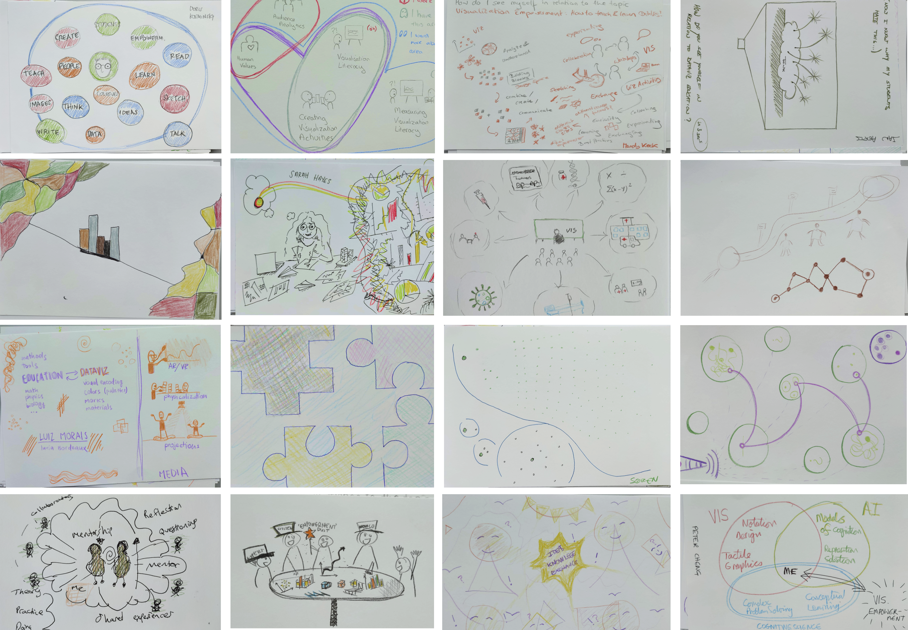
After introducing the seminar and presenting various organizational matters, the first day started with a sketching activity organized by Tatiana Losev from Simon Fraser University in Vancouver, Canada (Section 6.1). This activity acted as an icebreaker for participants start to get to know each other, and to initiate reflections on the seminar topic in a playful way. Participants were invited to sketch their relationship to the seminar topic, and to then use this sketch to introduce themselves in the form of a 1-minute presentation. Some participants sketched their relation to teaching and research in a literal, metaphorical or abstract way, others focused on the variety of themes and questions to be discussed, and again others created visual representations of their past curricula (see Figure 2). The activity brought to the fore an exciting diversity of viewpoints as well as the coverage of interest toward the topics of the seminar.
The sketching activity was followed by a brainstorming session that invited participants to identify high- and low-level topics around visualization empowerment and teaching, that they wanted to discuss during the seminar. This session was intended to initiate and fuel discussions that would take place in the form of smaller working groups throughout the week. Participants noted topics on sticky notes that we then collaboratively reviewed and grouped (see Figure 3). We identified a great diversity of themes including design creativity, physicalization, ethics, democratization, scalability of teaching, humanism, tools, hybrid and online teaching, teaching methods, community building, success stories and inspiration, learning goals, planning, contexts, and barriers, audiences (from practitioners to children), evaluation and assessment, measuring learning progress, interdisciplinarity, critical thinking, inclusivity, resources, and cataloging educational material.

We ranked topics in a voting activity, based on participants’ interests to discuss them. This led to the formation of initially four working groups: teaching methods, democratization, creativity, and physicalization.
-
The Teaching Methods Group (see Section 4.5) first focused on the diversity of challenges in visualization education. They explored possibilities of formalizing a multidimensional problem space to capture these challenges.
-
The Democratization Group (see Section 4.3) discussed practices, believes, intentions and biases that influence visualization teaching and creating with the aim to make visualization more accessible. Based on these discussions they decided to question the value behind our teaching activities.
-
The Creativity Group (see Section 4.1) focused on how to teach creativity and criticality in visualization; how one can be creative in teaching visualization, how one can teach creativity thought visualization, and eventually focused on an activity book for novice visualization designers.
-
The Physicalization Group (see Section 4.4) discussed how data physicalizations could be a mediator for teaching and learning activities, but also how it can be used to breach disciplines, and also how inclusive the physicalization can be for teaching and learning.
These working groups continued discussions throughout the week in different participant constellations. A number of participants shifted between groups to absorb different discussions, which proved to be useful for cross-dissemination across working groups.
At the end of the day, i.e., after some initial discussions and topic finding within the individual groups, each group briefed the entire seminar on their discussion and focus. The North America group joined to get updated on the European groups.
3.2 Tuesday
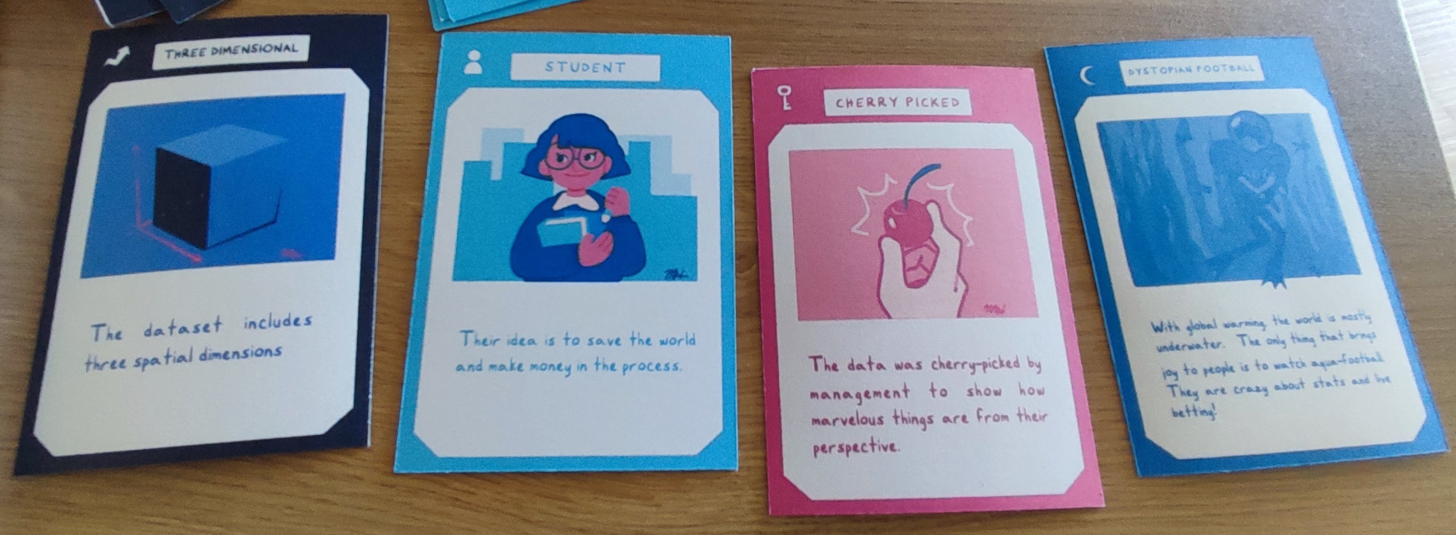
This day was mainly reserved for discussions within the individual working groups. “Over night”, the one organizer based in North America lead the North America discussion group which decided on the topic of Improvisation in visualization and what can be learned from improvisation in art for how to approach visualization (design). We started the day with a short briefing into the day schedule and asked people if they wanted to switch or split groups. Then, we had a series of short 5min talks from seminar participants Andrew Manches (education) providing a learning science perspective in his talk The potential of a more embodied approach to supporting children’s data understanding (Section 5.1); Andy Kirk (freelance visualization designer and educator), provided a non academic visualization trainer perspective “How I can help you? How can you help me?”(Section 5.2); eventually Peter Cheng brought a cognitive psychology perspective through his talk “Cognitive Science of Representational Systems” (Section 5.3). A joined question and answer session followed these talks. Then, participants broke out into their groups. At the beginning of the afternoon Wesley Willet ran a visualization activity “Visualization future card game”(Section 6.2).
Again, at the end of the day, all working groups met, including the North America group on ImproVISation to brief the other seminar participants.
3.3 Wednesday
We started the day, again, with four short 5min talks: Isabel Meirelles (visualization design) “Breaking the Monolith” (Section 5.4); Jason Dykes (cartography and visualization) about assessment of visualization teaching (Section 5.5); Jonathan Roberts (visualization) “From visioning to solution via sketching” (Section 5.6). Following these presentations a vibrant and spontaneous conversation happened among participants about the different assessment strategies in various teaching constraints. The discussion was so spontaneous and interesting it took most of the morning.
Before the afternoon socialization, Samuel Huron ran a visualization activity with all participants, aiming to classify visualization activities. Prior to the seminar, Samuel had invited participants to submit short descriptions of activities they do in their classes with their students. This collection was printed on small cards, one activity per card, and distributed among each working group. Each working group came up with a different classification scheme which is currently informing an ongoing discussion. There was no evening briefing with the North America group due to the socialization activity.
3.4 Thursday
During the morning talks, Fateme Rajabiyazdi shared some of the lessons learned in her class during the talk “Teaching visualization Free Form ”(Section 5.8). Doris Kosminsky discuss how can we empower mother with health data in Brazil in her talk “Reflections on learning and empowerment of those represented in health visualization”. Then Alexandra Diehl presented how Visguides 555https://visguides.org/ could be use for education. Visguides is an open community project to provide guidance and support on visualization design in a web forum (Section 5.7). Last Till Nagel presented the goal, reflect on the process and the design of the book Making with data (Section 5.9).
Mandy Keck proposed to create a pre-approved symposium at IEEE VIS conference, the major international forum for visualization with over 1000 attendees. The symposium would become a major outlet and forum for research around visualization education and learning. It would be a place for research, reflection, creation, and discussion of learning / teaching but also discussing higher-level issues in regards to human-centered approaches to visualization education and design, and build a permanent forum and community around these topics.
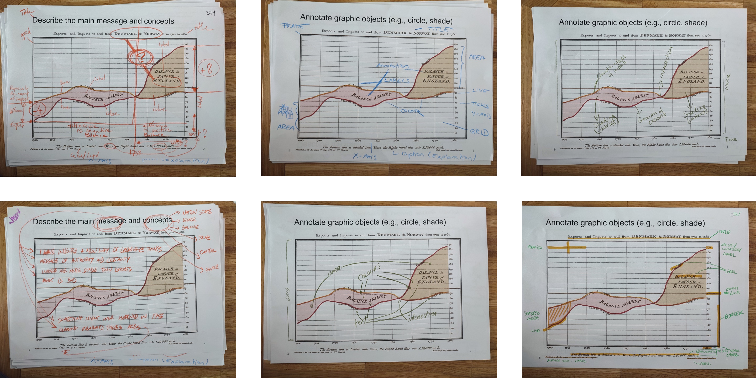
Later in the afternoon, Peter Cheng ran an activity to model the cognitive process of reading a visualization through annotating a visualization and then modeling the different cognitive steps of our reading procedure (Section 6.4).
The remainder of this day (morning, afternoon) was reserved for discussions within the working groups. The organizers encouraged goal-oriented thinking and to list and plan the different outcomes of each working group to be reported in the pre-dinner briefing session. Since some participant had to leave early on Friday morning, we started a general discussion about the individual outcomes of this seminar and how to organize working groups beyond the seminar.
3.5 Friday
We started the day by synthesizing and presenting on one page all the potential outcomes that were planned by the individual working groups. Then, Jason Dykes gave a short talk to introduce data visualization to an audience (Section 5.10). Then the group started a discussion to reflect on the seminar experience and outcomes. This discussion push up to open two other topics thread, one on grants, and one on writing a paper about the main challenges in information visualization teaching and learning. After the coffee break the remaining participants decided to outline collectively a paper on grand challenges in visualization education, effectively forming a sixth working group at the seminar.
4 Working Groups
4.1 Working group on creativity
Fateme Rajabiyazdi (Carleton University – Ottawa, CA), Rebecca Noonan (Munster Technological University – Cork, IE), Jonathan C. Roberts (Bangor University, GB), Christina Stoiber (FH – St. Pölten, AT), Andy Kirk (Visualising Data – Leeds, GB), Fanny Chevalier (University of Toronto, CA), Nathalie Riche (Microsoft Research – Redmond, US), Magdalena Boucher (FH – St. Pölten, AT), Alexandra Diehl (University of Zurich, CH), Benjamin Bach (University of Edinburgh, GB), Samuel Huron (Institut Polytechnique de Paris, FR)
License: Creative Commons BY 4.0 International license © Jonathan C. Roberts, Fateme Rajabiyazdi, Rebecca Noonan, Christina Stoiber, Andy Kirk, Fanny Chevalier, Nathalie Riche, Magdalena Boucher, Alexandra Diehl, Benjamin Bach, and Samuel Huron
This working group focused on creativity in visualization empowerment. Creativity is the use of people’s imagination to engender original ideas, to make and create something, be inventive, design new ideas or make different designs.
4.1.1 Discussed Problems
After introductions, we discussed our backgrounds. The creativity group brought together people with different experiences and situations. Our backgrounds are diverse: ranging from PhD students, researchers, early career academics, company directors, to senior researchers and academics. We teach to undergraduates, postgraduates and the public. Most of us sit in computing, mathematics, and engineering schools; while some are in industry. But more and more we are teaching and discussing with people from broader backgrounds, and noted specifically those in arts, design, humanities, social science and psychology.
We focused on three questions, around teaching creativity, being creative in the pedagogic process, and creativity in data-visualisation.
-
What is creativity and how can we teach it? This question focuses on the learner. Teaching creativity is not necessarily easy. We discussed many different ideas, from creativity and innovation, to inspiration. How (as a teacher) can we encourage, and help other people to be creative? What do we need to teach? What strategies do people need to learn? How can we get learners to be more creative and innovative? What processes can we use to help people to become creative? We discussed many skills that people can learn, from creating, design, elegance, imagination, aesthetics, elegance, harmony, flow, balance, beauty to storytelling.
-
How can teachers be creative when teaching data visualisation? This question focuses on the process. Being innovative and creative in teaching can help to engender excitement, it can encourage people to be creative (pushing them out of their comfort zone) and can help to improve the relationship between learner and teacher. What new ideas can we use in teaching? What tools, technologies and resources can we use? For instance, it is possible to teach creative thinking through sketching, use of LEGO, modeling clay, and so on.
-
What is creativity in data visualization? This question focuses on the broad challenges in data visualisation as a domain. Creativity can be applied to every part of data visualisation process, not just in pedagogic terms. For instance, it is possible to be creative in understanding and using data, in how we approach the visualisation design process, or how we interact with clients. Creativity can be achieved through any part of: research, specification, design, client-interaction, implementation, evaluation, maintenance, and so on.
4.1.2 Possible Approaches
We approached these challenges through discussion using shared online documents. We broadly worked through each of the questions in order. We used zoom, shared Google documents, and Miro board as a virtual white board. We approached the challenge in portions of a few hours. First, we discussed different ideas, took notes in the shared documents, placed sticky-notes on the Miro board (See Figure 6), and added links to external resources in the shared document. We shared our experiences, gave examples of how we used creative activities in our teaching, and bounced off ideas from each other. Second we summarized our ideas, created a short report and reported back to the other Dagstuhl participants.

There were several important discussions and outcomes, and ideas that we will work on after the Dagstuhl Seminar. The group discussed and proposed that there is a huge need for resources. Resources, ideas, inspirational creative activities, and so on, that can help teachers, learners, educators, researchers and developers be creative in visualization. We discussed different ways to collage resources, perhaps to write a book, create an online resource of difference creative recipes, organize a workshop, interview experts, and so on. We also realized that our collective knowledge and experience was important, and that we had many creative ideas that we felt would be useful for others to view.
4.1.3 Conclusions
Creative visualization, teaching creativity in visualisation, is an exciting area. People can be creative by creating different assets, videos/illustrations, can be “creative” in how they approach thing (e.g., exploring data, defining audiences), and people can be creative in how they approach and imagine new ideas in data visualization. The group discussion ended with a two stage plan. In the short instance the group wrote a long paper that summarizes activities (demonstrating the collective experience and shared examples that were discussed at Dagstuhl) [1]. In the long term, the group proposed to consider summarizing a broader set of creative data visualization activities, as a larger resource, such as a book and website.
References
- [1] Jonathan C. Roberts, et al. (2022, October). Reflections and Considerations on Running Creative Visualization Learning Activities. 4th IEEE Workshop on Visualization Guidelines in Research, Design, and Education 2022.
4.2 Working Group on Improvisation with Visualization
Émeline Brulé (University of Sussex, GB), Sheelagh Carpendale (University of Vancouver, CA), Dietmar Offenhuber (Northeastern University – -Boston, US), Charles Perin (University of Victoria, CA)
License: Creative Commons BY 4.0 International license © Émeline Brulé, Sheelagh Carpendale, Dietmar Offenhuber, and Charles Perin
Resources for data-visualization education often emphasize toolkits, frameworks, guidelines, outlining what a good visualization is and the building blocks to develop one. With this group, we asked: what if we were instead emphasizing improvisation and practice? We build on case-studies drawn from our own experiences, art education and performance to outline what impro-vis practices look like. We argue for centering such practices has the potential to widen what diverse audiences consider as data; the aesthetic and representation repertoire of students and data-viz practitioners; and strengthen research on the situated and improvisational aspects of visualization.
4.3 Working Group on Democratization & Manifesto
Georgia Panagiotidou (University College London, GB), Jagoda Walny (Canada Energy Regulator – Calgary, CA), Soren Knudsen (IT University of Copenhagen, DK), Uta Hinrichs (University of Edinburgh, GB), Wesley Willett (Univerity of Calgary, CA), Jason Dykes (City University London, GB), Tatiana Losev (Simon Fraser University – Burnaby, CA), Doris Kosminsky (University of Rio de Janeiro, BR), Samuel Huron (Institut Polytechnique de Paris, FR)
License: Creative Commons BY 4.0 International license © Georgia Panagiotidou, Jagoda Walny, Soren Knudsen, Uta Hinrichs, Wesley Willett, Jason Dyke, Tatiana Losev, Doris Kosminsky, and Samuel Huron
We are a group of visualization researchers from different countries, disciplines and generations. We came together to discuss “democratisation” in the context of teaching and learning in visualization. We found that “democratisation” existed in our common desire to empower the people with whom we interact to understand and use data in their lives. We thus set out to develop a shared vision: a manifesto of sorts that would guide us towards strategies to broaden data visualization skills, make them more common and accessible, and enable this empowerment. Instead of creating one common manifesto however, we ended up taking a different, more personal approach of what we understood by empowerment. Our perspectives highlighted our situated understandings, ranging from constructivist teaching and physicalization, to co-design and policy intervention. The variety in our approaches reflected the variety in our backgrounds, and the different situations through which we personally felt we could approach the task of strengthening visualization empowerment in others.
Inspired by this process, we created an exercise that helps visualization educators to elicit their personal reflections and make commitments for their teaching and learning. This exercise, which we named a “me-ifesto”, was eventually supported and co-authored by over 25 researchers present at the Dagstuhl. A “me-ifesto” paper, which described the exercise and our process, was then presented at the alt. VIS workshop collocated with the IEEE VIS 2022 in Oklahoma [1]. This working group moreover, has since transformed into a recurring meeting in which we, as visualization teachers (and learners), continue to reflect on the values we embed in our teaching both consciously and not.
References
- [1] Walny et al, “Me-ifestos for Visualization Empowerment in Teaching (and Learning?)”, alt.VIS workshop, IEEE VIS, 2022, Oklahoma City.
4.4 Working Group on Physicalization
Wolfgang Aigner (St. Pölten University of Applied Sciences), Peter Chen (University of Sussex, GB), Georgia Panagiotidou (UCL, GB), Sarah Hayes (Cork Institute of Technology, IR), Uta Hinrichs (University of Edinburgh, GB), Trevor Hogan (Cork Institute of Technology, IR), Tatjana Losev (Simon Fraser University, CA), Andrew Manches (University of Edinburgh, GB), Luiz Morais (Inria, FR), Till Nagel (Mannheim University of Applied Sciences), Rebecca Noonan (Cork Institute of Technology, IR)
License: Creative Commons BY 4.0 International license © Uta Hinrichs, Wolfgang Aigner, Peter Chen, Georgia Panagiotidou, Sarah Hayes, Trevor Hogan, Tatjana Losev, Andrew Manches, Luiz Morais, Till Nagel, and Rebecca Noonan
This working group focused on distinguishing data physicalization as an activity to support teaching and learning about data visualization – both computer-supported physical representations of data, and hand-made constructions of data. They explored the role of physicalization in learning settings and developed questions, identified gaps and ethical considerations for further research: How can we, as educators in data VIS, evaluate physicalization activities for classroom settings and public community settings? How might data physicalization, as both an activity and an output of a tangible artifact, facilitate teaching and learning? What are the benefits of using physicalizations as a mediator to bridge disciplines and connect different people and perspectives? They identified a need to determine learning outcomes for teaching physicalization with different audience groups ranging from children, post-secondary students, the public, and diverse communities of practice. This is important because the benefits and limitations of using physicalization for learning data visualization with sustainability, inclusivity and accessibility are underexplored in computer sciences. By mapping the space of data physicalization in the learning context, the physicalization research group aims to explore the potential and limitations of physicalization as an interactive activity, a tool, data output, and a process for learning and teaching.
4.5 Working Group on Teaching methods
Jan Aerts (Amador Bioscience – Hasselt, Hasselt University KU Leuven, BE), Wolfgang Aigner (FH St. Pölten, AT), Mashael Alkadi (University of Edinburgh, GB), Magdalena Boucher (FH St. Pölten , AT), Alexandra Diehl (Universität Zürich, CH), Christoph Huber (Hochschule Mannheim, DE), Mandy Keck (Univ. of Applied Sciences – Hagenberg, AT), Christoph Kinkeldey (HAW – Hamburg, DE), Søren Knudsen (IT University of Copenhagen, DK), Robert S Laramee (University of Nottingham, GB), Areti Manataki (University of St Andrews, GB), Isabel Meirelles (OCAD University, CA), Till Nagel (Hochschule Mannheim, DE), Laura Pelchmann (Universität Köln, DE)
License: Creative Commons BY 4.0 International license © Isabel Meirelles, Jan Aerts, Wolfgang Aigner, Mashael Alkadi, Magdalena Boucher, Alexandra Diehl, Christoph Huber, Mandy Keck, Christoph Kinkeldey, Søren Knudsen, Robert S Laramee, Areti Manataki, Till Nagel, and Laura Pelchmann
The Teaching Methods group worked on:
-
Identifying challenges that the group participants faced in their own teaching experiences. This resulted in an initial list that was later expanded given that a separate group formed on the last day to focus exclusively on challenges, now called Grand Challenges (Section 4.6). Our group’s initial list of challenges can include challenges about Learning & Teaching Resources, Self-guided Learning, Learning participants, Implementation and development, Vis prototyping, measuring, marking and evaluation, teaching methods, story-telling, critical-thinking skills, technology, online (remote) teaching, combining teaching and research, and sharing teaching materials and resources with the wider visualization teaching community. When conducting the activity on Activities, we marked our initial list of challenges based on Moon’s Handbook of Reflective and Experiential Learning [1].
-
Creating a multidimensional problem space towards identifying existent resources and gaps in teaching and learning methods. The discussion consisted in identifying key components in teaching and learning to define topics and dimensions. The work is currently in progress. During Dagstuhl, we created a framework/taxonomy for future use in identifying literature, activities, gaps, etc.
-
Systematizing the Role of development in Data Visualization Teaching. A subgroup in this working group worked on identifying key components required in implementation and evaluation as related to development in data vis.
References
- [1] Moon, Jennifer: A handbook of reflective and experiential learning: Theory and practice, Routledge, 2006
4.6 Working Group on Challenges
Benjamin Bach (University of Edinburgh), Jan Aerst, Andy Kirk, Madny Keck, Till Nagel, Areti Manataki, Soren Knudsen, Georgia Panagiotidou, Wesley Willet, Bob Laramee, Uta Hinrichs, Isabel Meirelles, Benjamin Bach, Doris Kosminsky, Tatiana Losev, Jagoda Walny, Luiz Morais, Fateme Rajabiyazdi, Alexandra Diehl, Wolfgang Aigner, Samuel Huron, Peter Cheng
License: Creative Commons BY 4.0 International license © Benjamin Bach, Jan Aerst, Andy Kirk, Madny Keck, Till Nagel, Areti Manataki, Soren Knudsen, Georgia Panagiotidou, Wesley Willet, Bob Laramee, Uta Hinrichs, Isabel Meirelles, Benjamin Bach, Doris Kosminsky, Tatiana Losev, Jagoda Walny, Luiz Morais, Fateme Rajabiyazdi, Alexandra Diehl, Wolfgang Aigner, Samuel Huron, and Peter Cheng
This group emerged spontaneously on Friday morning at the seminar closing session. It started after a question to keep collecting challenges. The group, comprising almost all of the seminar participants, collected around 30 challenges. Some challenges were based on the challenges already collected by the Teaching Methods working group. Others were entirely new. In the months after the seminar, we are still re-organizing these challenges and trying to come up with a suitable structure to describe these challenes. Many challenges are interwoven and otherwise related, e.g., teaching different audiences and hybrid teaching, or learning goals.
5 Overview of Talks
5.1 The potential of a more embodied approach to supporting children’s data understanding
Andrew Manches (University of Edinburgh – Edinburgh, GB, a.manches@ed.ac.uk)
License: Creative Commons BY 4.0 International license © Andrew Manches
Early Education has over two centuries’ experience of designing materials to help children learn abstract concepts – such as colored rods to help children learn numerical relationships. Yet the representational transparency of these materials depends upon existing knowledge of the learner. Representations often integrate a range of conceptual and cultural metaphors that are often known but taken for granted by adulthood.
Simply looking at colored rods will not enable a child to just “get” numbers. Pedagogy, clearly, is key. This captures many things (e.g., narrative, construction activities); my work focuses on interaction – how adults scaffold children’s interaction and learning with materials. In particular, I attend to the multimodality and bidirectionality of scaffolding. It is not just words but other modes such as facial expression, body posture, gaze and gesture that educators employ. Gestures are notably powerful in their capacity to provide schematic, dynamic, visuo-spatial representations coproduced with speech to bridge communication with our environment. And importantly, scaffolding is two-way: children also employ a range of modes to structure and manipulate the support they need. The importance of multimodality is further accentuated when considering emerging theories of what it means to know (and hence what children have “learnt”). Increasing evidence points to the embodied nature of cognition and how learning involves the internalization of body-based experiences, emphasizing the interwoven nature of emotional, social, physical, and cognitive dimensions. When communicating our understanding, we can activate these prior experiences – evident in the emotions and gestures we commonly produce in explanations (makes for a good observational activity at seminars like Dagstuhl).
Increasing attention to the significance of multimodality in how we think and interact has important implications for design as well as pedagogy. This may be greater recognition of existing activities and media (e.g., physicalization) or the potential for more body-based interaction with digital representations (e.g. tangibles, haptics, gesture recognition). More recently, my work has asked how we can tap into emerging theories of cognition and digital tools to help young children (3 years+) understand concepts of data. This is not just a conceptual challenge – children’s worlds are increasingly datafied- from how we measure their “progress” to the (smart) toys we give them. Here there is much potential. Young children understand and often articulate themselves and their interaction with the world (e.g., how old, noisy, tall, active, sleepy, or happy they are) – hence offering a design and learning opportunity through appropriately representing this personal information. Educators already do – colored rods to compare ages, stickers to quantify good behavior or classroom “noisemeters” to maintain sanity. Experts in the field of visualisation/physicalisation have much potential to create a new generation of embodied designs and activities that build upon this foundation.
5.2 How I can help you? How can you help me?
Andy Kirk (Visualising Data Ltd – GB)
License: Creative Commons BY 4.0 International license © Andy Kirk
In this lightning talk I introduced myself to members of the seminar, especially as I’m a non-academic participant so my work may be less than familiar to most. I presented an outline of how I may be able to help my fellow attendees. I opened with an overview of my “boundary spanning” activities, as a freelancer: I publish via my website and podcast series, I teach (academically) and research, I consult and design, I author and present. Above all, perhaps, I train professionals, outside of academia and across a diverse array of client organization types and industries. I described some of the key objectives and approaches I take to the challenge of teaching and learning, and how delighted I was to observe alignment with the seminar’s theme of “Visualization Empowerment”. Given my activities and career experiences, could I be of service to offer any guidance to others?
I then switched over to introduce some matters of interest that I am particularly keen to learn about over the seminar, and maybe get some help from others. Firstly, listing some of the current challenges I experience in the forum of public training: including carving out distinctions in teaching levels (basic >> advanced) for the same and different cohorts, how to teach the concept of elegance and instill journalistic curiosities. Secondly, and finally, issues that specifically affect training in private/client settings, including how to demonstrate (maybe prove?) success of visualisation in terms like ROI, how to encourage organizational readiness for cultural change, ambitions vs. reproducible pragmatism, and the challenges of educating across such a multi-disciplinary skillset.
5.3 Cognitive Science of Representational Systems
Peter Cheng (Sussex University, GB)
License: Creative Commons BY 4.0 International license © Peter Cheng
My approach to the design of information visualisations, and representational systems more generally, combines cognitive science with the analysis of the conceptual structure of the to-be visualized topic. To obtain theoretical and empirical leverage to formulate and test principles of representation design, I create novel diagrammatic systems for conceptually challenging topics and interactive graphical user-interfaces for information intensive decision-making systems. Generalizing over the creation and evaluation of many such systems, I make four claims: (1) STEM topics should be easy to learn; (2) compared to extant conventional visualizations, factor of 2 improvements in problem solving and learning are feasible when representations effectively re-codify knowledge; (3) knowledge re-codification should attempt to capture the conceptual structure of a topic in the graphical structure of the representation; (4) this yields representations that possess semantic transparency and syntactic plasticity.
5.4 Breaking the Monolith
Isabel Meirelles (OCAD University, CA)
License: Creative Commons BY 4.0 International license © Isabel Meirelles
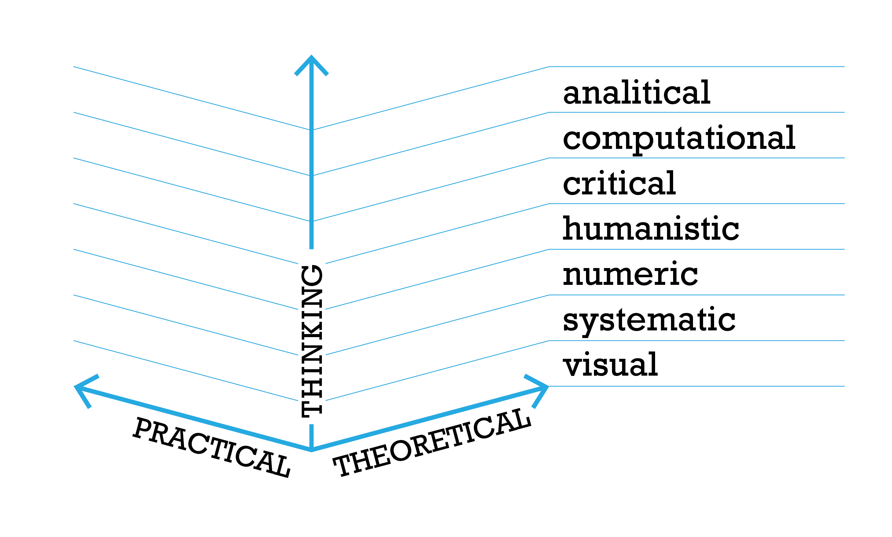
The talk invited a conversation about the challenges we encounter preparing students to contribute to data visualization practices. There is an unbalance of how skills are taught across disciplines (sciences, arts, humanities, etc). This unbalance affects education at all levels and disciplines. I would like to suggest that we tailor data visualization pedagogical strategies in a situated manner. For that I proposed a scaffold built around thinking processes positioned along the theoretical-practical axis (7). The thinking processes are derived from the literacies needed for data visualization and dependent on the setting and pedagogical goals of the course and needs of our learners (listed alphabetically): analytical, computational, critical, humanistic, numerical, systems, and visual (7). Educators can use the scaffold to identify areas of focus and whether they will approach through practical and/or theoretical means.
5.5 Jason Dykes tips about assessment
Jason Dykes (City University London, GB)
License: Creative Commons BY 4.0 International license © Jason Dykes
I made passionate plea to design assessments so that the teacher gets the information they need to make the best judgment that they can in the time they have. Few of my colleagues do this. Aim to use as little time as you (teacher) can to assess, in ways that are as efficient as possible. Aim to make it fun. Yes, really FUN and INFORMATIVE – how well are you teaching? What can your students do? Assessment is a creative design exercise and an informative teaching diagnostic – it helps to see it that way. What would you really like to see? You control this, so if you ask them to give you 400 hours of text to read, well, that’s your fault!
5.6 From visioning to solution, via sketching
Jonathan C. Roberts (Bangor University, GB, j.c.roberts@bangor.ac.uk)
License: Creative Commons BY 4.0 International license © Jonathan C. Roberts
What will your visualization look like? What will it do? How will it work? These are important questions for designers and especially learners to ask. Far too often learners, and experienced researchers, create visualisations without thinking what they are doing. Students are often, far to keen to just get coding. When they jump into their code they create solutions that may not be fit for purpose. And when they realize what they have created, it is too close to the deadline to change their mind and adapt it. This early enthusiasm is admirable, and should be encouraged and tapped. Indeed, with some forethought – by becoming more reflective at an early stage, and performing critical thinking – they will create something better. Through thinking and sketching they will be able to contemplate how their solution will work, think who will use it, even imagine a specific person using their tool.
In this lightening talk I presented the need for “visioning”. I proposed that sketching solutions can help people think through their ideas, externalize their thoughts, and project their minds to imagine people using their solution for real, and for its intended purpose.
So to achieve this act of visioning, I proposed that people need to understand their “goal”. The goal then helps to frame the challenge and define the focus. Their goal could be a task they want to fulfill or challenge to solve. In addition, and especially in an education setting, I proposed that these tasks (assessments) should be authentic in their design [1]. In other words, that the tasks should be challenges that they could find in their real life (perhaps when the students have a job after they graduate). Furthermore, the task should be individual to each student.
But learners need structure. They need methods to follow. To scaffold these vision sketches, I proposed a few techniques. The Five Design-Sheets [2, 3] method uses five sheets of paper, with five stages to help drive critical thinking. Alternatively, for specific tasks a single sheet of sketching and planning could be used. One method is the Critical Thinking sheet [4], which gets students to think about the goal, sketch what the solution would look like, list component parts, articulate algorithmic steps, and list tasks that they need to achieve in order to implement it. Figure 8 shows how a student, thinking about a random pattern generator, starts with a sketch that presents the vision of their solution, before implementing and iterating towards their solution in code.
References
- [1] Roberts J. C., Ritsos P. D., Jackson J. R., Headleand C.: The explanatory visualization framework: An active learning framework for teaching creative computing using explanatory visualizations. IEEE Transactions on Visualization and Computer Graphics 24, 1 (2018), 791–801. doi:10.1109/TVCG.2017.2745878.
- [2] Roberts J. C., Headleand C., Ritsos P. D.: Sketching designs using the five design-sheet methodology. IEEE Transactions on Visualization and Computer Graphics 22, 1 (Jan 2016), 419–428. doi:10.1109/TVCG.2015.2467271.
- [3] Roberts J. C., Headleand C. J., Ritsos P. D.: Five Design-Sheets – Creative design and sketching in Computing and Visualization. Springer International Publishing, 2017. doi:10.1007/978-3-319-55627-7.
- [4] Roberts J. C., Ritsos P. D.: Critical Thinking Sheet (CTS) for Design Thinking in Programming Courses. In Eurographics 2020 – Education Papers (2020), Romero M., Sousa Santos B., (Eds.), The Eurographics Association, pp. 17–23. doi:10.2312/eged.20201029.
5.7 VisGuides
Alexandra Diehl (University of Zürich, CH)
License: Creative Commons BY 4.0 International license © Alexandra Diehl
VisGuides, engaging the VIS community on democratic discussions
Building a community platform that is open, democratic, and inviting is a big challenge. I presented VisGuides, a democratic discussion forum co-created by several colleagues over Europe. The main goal of VisGuides is to create an open space for evidence-based discussions where we can explore and contest well-known practices and guidelines.
We have been using VisGuides as a collaborative educational tool to collect resources, experiences, and educational material. We want to invite the VIS community to join us in these efforts, share with them resources and collected material, and find new ways of rewarding them for their contributions.
5.8 Teaching visualization Free Form
Fateme Rajabiyazdi (Carleton University – Ottawa, CA, fateme.rajabiyazdi@carleton.ca)
License: Creative Commons BY 4.0 International license © Fateme Rajabiyazdi
In this presentation, I share my experiences and questions as a first-time data visualization instructor.
I offered a data visualization course to 14 graduate students. Students from different disciplines or backgrounds could join the class, pick their own dataset and choice of audience, and their developing platform. I used “Design Study “Lite” Methodology” [1] to outline the course, and here are some lessons learned. Having students from different disciplines helped students learn from other areas of study. It was rather difficult to tailor the content to this heterogeneous group. Having different datasets for visualizing was valuable as students could teach others from other disciplines about their world. The conversations between students helped share knowledge beyond the course outcomes. However, that required me to learn and assess different datasets which are not scalable! By having the option to choose their audience, students said they could target audiences beyond class. Visualization empowered students to better articulate their idea and communicate important insights about their data to their supervisors and peers. Flexibility in selecting tools for creating the visualization ensured that students could learn and apply visualization techniques regardless of programming knowledge. The assessment focused on evaluating the understanding of visualization techniques. However, it was difficult to deal with students switching between platforms halfway through the semester? From my perspective, students did not have a full understanding of the difficulty of learning to program or use a new (visualization) tool.
References
- [1] Uzma Haque Syeda, Prasanth Murali, Lisa Roe, Becca Berkey, and Michelle A. Borkin Design Study “Lite” Methodology: Expediting Design Studies and Enabling the Synergy of Visualization Pedagogy and Social Good. Proceedings of the 2020 CHI Conference on Human Factors in Computing Systems, 1–13. doi.org/10.1145/3313831.3376829.
5.9 Making with Data – Using an open structured template to document the creation of physical data objects
Till Nagel (Hochschule Mannheim, DE, t.nagel@hs-mannheim.de)
License: Creative Commons BY 4.0 International license © Till Nagel
Making with Data brings together a series of practical examples that highlight the diverse range of different ways in which people create physical data objects, showcasing the myriad considerations and decisions that are required to translate data into physical form. With this, our book introduces physicalization to a broad audience of learners, educators, makers, and researchers. Rather than illustrating one correct approach, the collection showcases the many ways in which people today are making with data – in the hope that these processes might inspire readers to make something new.
We started our collection process by interviewing participants at the Dagstuhl Seminar #18441 which informed the general direction of documenting practices and processes. Next, we created a template and over the years iteratively refined it by asking for a broader set of descriptive metadata, specifying the expected text length for each section, and most importantly giving more explicit prompts. We also asked the authors to document their projects in a very rich and visual way by providing high-resolution images from all steps of the creation process.
After we clustered the submissions into five thematic sections, we invited academic experts to write introductions for each in which they provide a personal and unique take on the value of creating physicalizations and help anchor the act of making with data in a different set of artistic, technical, and social practices.
Our approach for documenting the ideation and construction process of physical data objects can be adapted to related fields. We can imagine this open-structured template working similarly well for other forms of visualization creation. Furthermore, it resulted in a detailed dataset collecting diverse approaches to creation providing a range of opportunities for research, analysis, and sharing.
Making with Data is edited by Samuel Huron, Till Nagel, Lora Oehlberg, and Wesley Willet. The book will be published in fall 2022 as part of Routledge’s AK Peters Visualization Series edited by Tamara Munzner and Alberto Cairo.
5.10 Visual Robot Glyphs
Jason Dykes (University City of London, London, GB)
License: Creative Commons BY 4.0 International license © Jason Dykes

I showed some data robots (9). These multi-channel glyphs show characteristics of the names of a class of students, or the participants in a Dagstuhl Seminar. They are good for getting people to think about visual channels – how we can encode, the people behind the data – who are we representing, and designs that do not work – encoding is not enough. They also help introduce some issues associated with the ethics of visualization.
5.11 Reflective on VISusalization Learning Outcomings (VISLOs)
Jason Dykes (University City of London, GB)
License: Creative Commons BY 4.0 International license © Jason Dykes


This talk was on intended module learning outcomes and summarized some experiences of using approaches introduced by Jenny Moon in the 2000s. See Moon (2004). The key message, leading to VISualization Learning Outcomes (VISLOs, 10) is:
-
write base level learning outcomes that everyone must achieve;
-
then write aspirational outcomes that you hope tour best students will achieve;
-
then work out how you can assess these
-
then put all of your effort into helping students achieve the outcomes and do well in the assessment through your plan for teaching. #curriculumLast.
I suggest writing three part outcomes that involve: an action – on a thing – at a level. This works well for me, and helps create grading criteria as I have two points of reference. I asked people to log examples of VISLOs here – and was absolutely, totally, shockingly and painfully unsuccessful. But the opportunity remains: http://bit.ly/dagVISLO
6 Overview of Activities
6.1 Sketching Introductions: An ice-breaker
Tatiana Losev (Simon Fraser University, Vancouver, CA, Tatiana Losev@sfu.ca)
License: Creative Commons BY 4.0 International license © Tatiana Losev
On the first morning of the seminar, I facilitated Sketching Introductions, a 90-minute icebreaker activity that invites people to make personal visualizations through simple drawing. I invited everyone in the group to draw a quick sketch, then introduce themselves using their sketch – people drew with pens or colored pencils on paper to sketch their responses to the question, “How do I see myself in relation to the topic Visualization Empowerment: How to Teach and Learn Data Visualization?”
The group sketched for 7 minutes accompanied by background music, then everyone introduced their sketches in 1-minute introductions. The remote attendees presented their sketches on a shared digital whiteboard via videoconferencing. The in-person attendees projected their sketches to both the in-person and remote attendees. Though some people could not finish their introduction in 1 minute and required more time, everyone completed the activity, and the sketches were as distinct as the personal experiences that they depicted. Each introduction proposed personal approaches to teaching and learning in the VIS context. This icebreaker was a creative visualization activity that enabled group members to share and be introduced to the many perspectives to teaching and learning.
6.2 Visualization Futures Cards
Wesley Willett (University of Calgary, CA, wesley.willett@ucalgary.ca)
License: Creative Commons BY 4.0 International license © Wesley Willett
This Vis Futures activity demonstrated a sketching exercise that uses design fiction, collaboration, and creative ideation to encourage players to envision opportunities, use cases, and designs for future visualizations.
The activity uses a set of themed playing card prompts, which emerged from a 2020 workshop on Vis Futures 666https://visfutures.github.io/ at IEEE VIS. Using the Situation Lab’s The Thing From the Future 777http://situationlab.org/project/the-thing-from-the-future/ (a similar sketching game focused on more general future ideation) as a template, the attendees a set of roughly 40 attendees spent several hours proposing, designing, and playtesting a diverse set of different visualization-specific design prompts and cards. Both the original workshop and the resulting game were designed to encourage the use of design futuring to envision the next generation of vis tools and applications.
Since the conclusion of the Vis Futures workshop in 2020, a team of collaborators at the University of Calgary, University of Victoria, and Simon Fraser University have collaborated to develop and refine decks of playable cards to support the activity. These include an online version of the game developed at the University of Victoria 888https://observablehq.com/d/51a981cf418ab2ac as well as a physical card deck currently under production at Calgary.
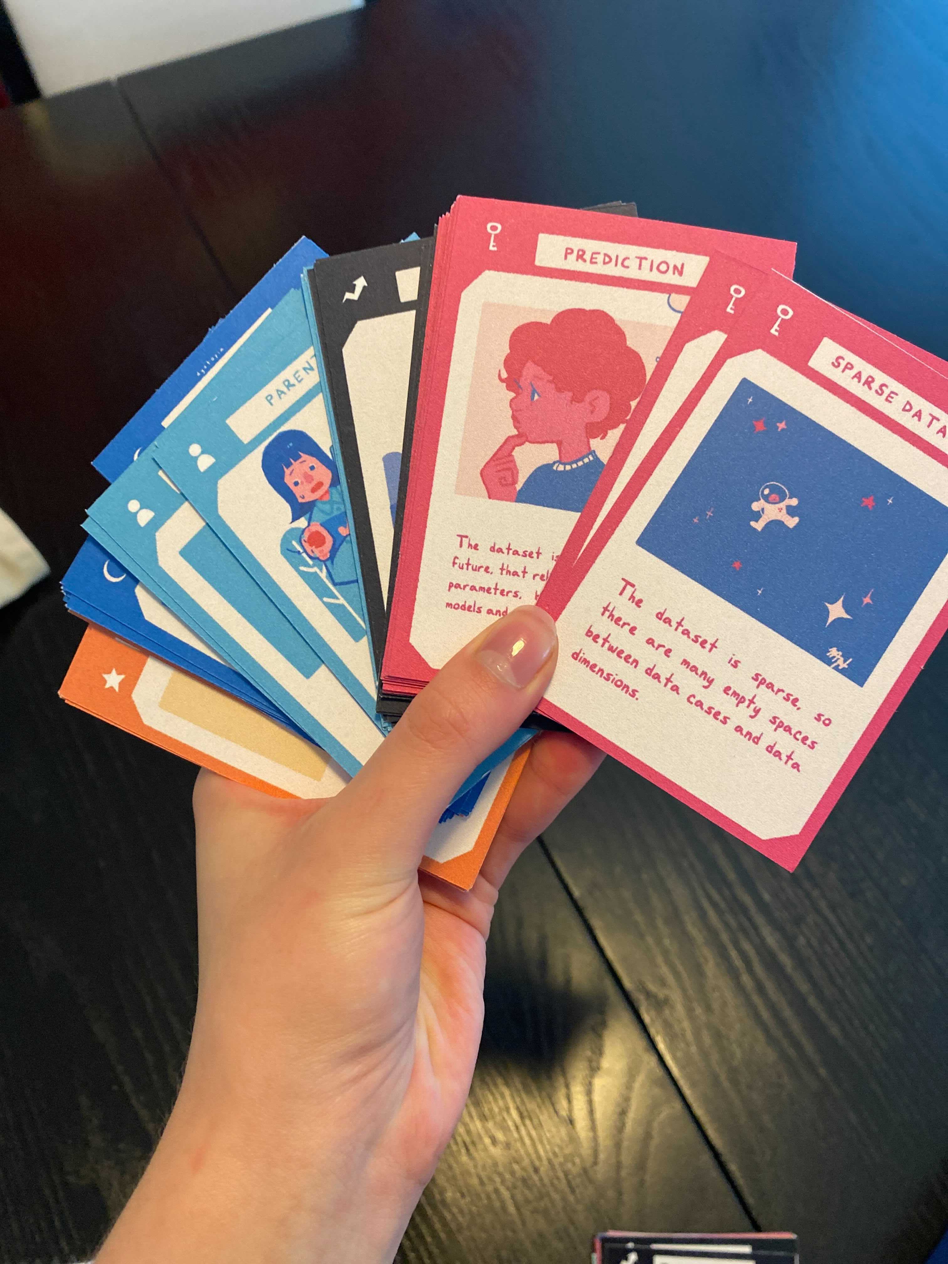
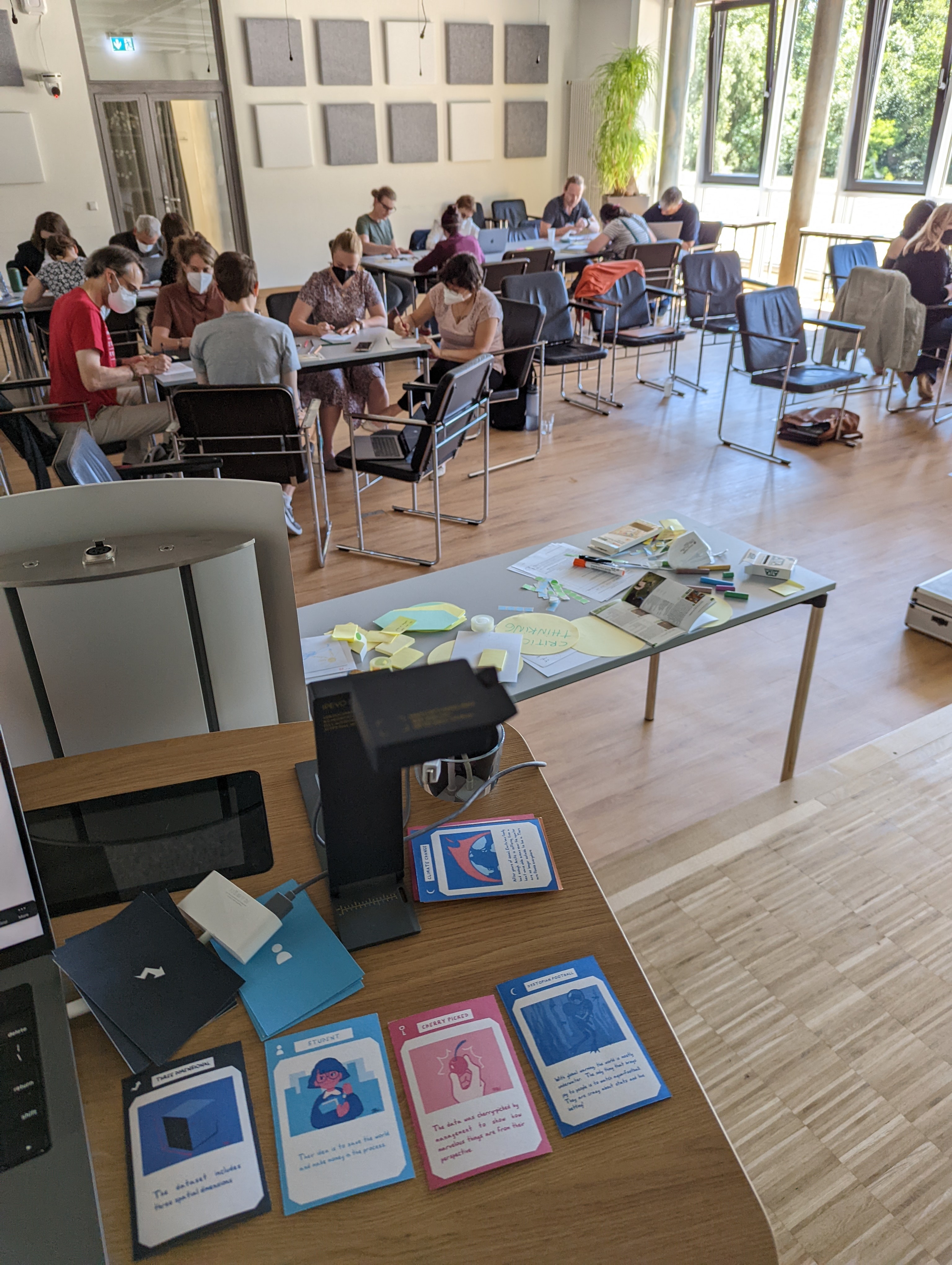

During the Dagstuhl Seminar, attendees participated in a play test using an in-progress version of the physical cards. In this version, players form teams of 3-5 players. A dealer then composes a sketching prompt by dealing one card from each of four decks – Audience, Data Type, Data Characteristics, Utopia/Dystopia. For example the prompts dealt at the beginning of the Dagstuhl activity included “Student” (Audience), “3D” (Data Type), “Cherry Picked” (Data Characteristics), and “Dystopian Football” (Dystopia). Players then have 5 minutes to independently imagine and sketch possible visualization designs based on the prompts. Afterwards, players share and discuss their designs.
At the end of the short session attendees shared a number of their creative designs and reflections, and offered a variety of constructive suggestions for adapting the gameplay to different audiences and settings. Attendees also voiced considerable enthusiasm for the arrival of the complete, playable card game in Fall 2022.
6.3 Classifying teaching activity in a design space
Samuel Huron (Institut Polytechnique de Paris, i3 – Palaiseau, France, samuel.huron@enst.fr)
License: Creative Commons BY 4.0 International license © Samuel Huron
As information visualization educators and teachers, we are all using a variety of activities to introduce, teach, familiarize students and other audiences with concepts relative to information visualization. Since now we have a poor overview of these types of information visualization activities teacher and workshop organizer are using. We wanted to reflect on these practices with the Dagstuhl Seminar participant in order, to have a better idea of the design space, of what are the meaning full categories to describe this space, what have been deeply explored, what has not been explored, and last what could be generated.
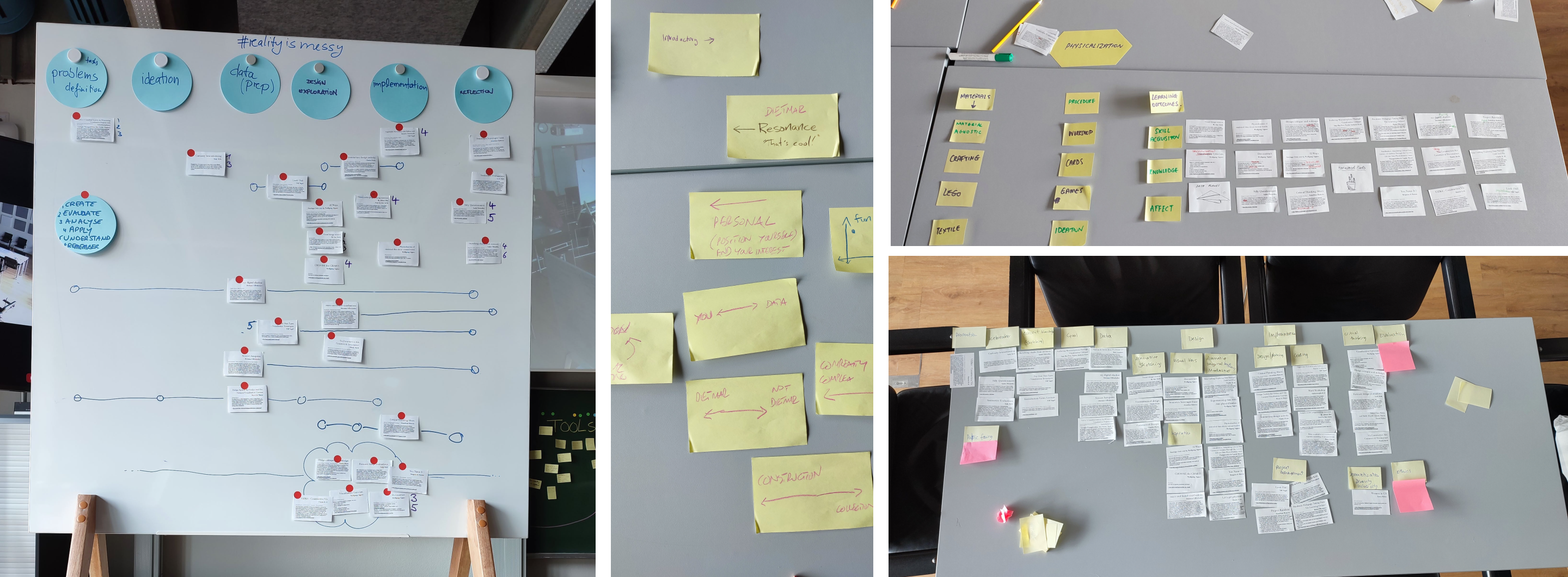
We collected 42 activities from more than 13 different authors gathered from three different sources: 1) the seminar participant and 2) IEEE VIS – VIS activities workshop 2020 [1], 2021 [1] and 3) few other ones we know. On this basis we generate a spreadsheet listing all these activities and created a card deck in which all activities are represented by one card. This card includes (title, author, description, keywords and URL to a document describing it). Each working group received a deck of 42 cards and the link to the spreadsheet.
The activity happened in two main steps 1) design space creation, 2) presentation & discussion. The prompts for the first step were the following “Categorize these activities in a design space from the focus of your group.” It will be in the room for local participants and on a Miro Board 999https://miro.com/app/board/uXjVOp4UJmI=/?share_link_id=161478137131 for remote participants. The prompt for the second step was “Present the design space and the dimensions, maybe the case that was problematic, and the rationale behind each dimensions”. They were asked that it would be totally fine to remove some cards if they do not fit the focus of their group, or even complete the card with activities that were not described in the data set by using a post-it notes or other papers. Last the participant was asked to use the cards as tokens and look for more details in the spreadsheet (images, descriptions, paper, links).
The activity last one hour and 30 minutes, the participant spend 40 minutes to create one design design space by the five groups, and we spent the rest of the time for presenting theses spaces and discussing them. Each group have been able to create meaningfull dimensions.
References
- [1] Huron, S., Bach, B., Panagiotidou, G., Keck, M., & Roberts, J., Carpendale (2021, October). 2nd IEEE VIS Workshop on Data Vis Activities to Facilitate Learning, Reflecting, Discussing and Designing In IEEE VIS 2021.
- [2] Huron, S., Bach, B., Hinrichs, U., Keck, M., & Roberts, J. (2020, October). IEEE VIS Workshop on Data Vis Activities to Facilitate Learning, Reflecting, Discussing, and Designing. In IEEE VIS 2020.
6.4 Activity : Cognitive Science of Representational Systems
Peter Cheng (University of Sussex, GB, p.c.h.cheng@sussex.ac.uk)
License: Creative Commons BY 4.0 International license © Peter Cheng
We contend that understanding users’ interpretations of visualizations is essential for anyone who wishes to teach about visualizations or to design visualizations for learning. Interpretations are the memory structures that users build as they read and interact with visualizations. This tutorial activity introduces an approach to modeling interpretations based on Representation Interpretive Structure Theory (RIST), which claims that interpretations of a representations depend upon four types of cognitive schemes and a small number of relations among them. Participants in the activity will learn the graphical notation (RISN) for building network models of such interpretations using a web-based graphical editor (RISE). We imagine that interpretation models may be built for many purposes. Instructors may construct a model of the conceptual structure of a representation in order to devise better explanations for learners of how a representation works. A visualization designer may build models to explore the consequences of expressiveness and cognitive demands of alternative visualization formats for a particular dataset. For researchers specializing in visualization, the approach potentially provides a coherent and rigorous approach for comparisons of representations across graphical formats and knowledge domains.
7 Summary
The week was an extraordinary energetic moment of encounters and intense discussion. Data visualization teaching and learning is an emerging domain that will need proper addressing in the years and decades to come. The Dagstuhl Seminar gave us the opportunity to place this topic onto the map and to create an early community with a strong agenda that will be remembered by the participants and organizers. The participants of the seminar generated a myriad of possible outcomes including books, scientific papers, workshop papers, online platforms, grant collaborations, a dedicated symposium proposal at our main conference IEEE VIS, and a potential follow up seminar in a few years time.
We thank Dagstuhl and its staff for providing the stage and the services in which incredible moment of fruitful collaboration can happen.
8 Participants
-
Jan Aerts – Amador Bioscience – Hasselt, Hasselt University & KU Leuven, BE
-
Fearn Bishop – BBC – Salford, GB
-
Peter C.-H. Cheng – University of Sussex – Brighton, GB
-
Alexandra Diehl – University of Zurich, CH
-
Jason Dykes – City – University of London, GB
-
Sarah Hayes – Munster Technological University – Cork, IE
-
Uta Hinrichs – University of Edinburgh, GB
-
Trevor Hogan – Munster Technological University – Cork, IE
-
Christoph Huber – Mannheim University of Applied Sciences, DE
-
Samuel Huron – Institut Polytechnique de Paris, FR
-
Mandy Keck – Univ. of Applied Sciences – Hagenberg, AT
-
Christoph Kinkeldey – HAW – Hamburg, DE
-
Søren Knudsen – IT University of Copenhagen, DK
-
Doris Kosminsky – University of Rio de Janeiro, BR
-
Tatiana Losev – Simon Fraser University – Burnaby, CA
-
Areti Manataki – University of St Andrews, GB
-
Isabel Meirelles – The Ontario College of Art and Design University, CA
-
Luiz Morais – INRIA – Bordeaux, FR
-
Till Nagel – Mannheim University of Applied Sciences, DE
-
Rebecca Noonan – Munster Technological University – Cork, IE
-
Georgia Panagiotidou – University College London, GB
-
Laura Pelchmann – University of Cologne, DE
-
Fateme Rajabiyazdi – Carleton University – Ottawa, CA
-
Jonathan C. Roberts – Bangor University, GB
-
Christina Stoiber – FH – St. Pölten, AT
-
Yagoda Walny – Canada Energy Regulator – Calgary, CA
-
Wesley J Willett – University of Calgary, CA
![[Uncaptioned image]](22261.jpg)
9 Remote Participants
-
Wolfgang Aigner – FH – St. Pölten, AT
-
Benjamin Bach – University of Edinburgh, GB
-
Magdalena Boucher – FH – St. Pölten, AT
-
Robert S. Laramee – University of Nottingham, GB
-
Andrew Manches – University of Edinburgh, GB
-
Alison Powell – London School of Economics, GB
-
Mashael Alkadi – University of Edinburgh, GB
-
Mine Çetinkaya-Rundel – DGBe University – Durham, US
-
Andy Kirk – Visualising Data – Leeds, GB
-
Fanny Chevalier – University of Toronto, CA
-
Nathalie Henry Riche – Microsoft Research – Redmond, US
-
Dietmar Offenhuber – Northeastern University – Boston, US
-
Sheelagh Carpendale – Simon Fraser University – Burnaby, CA
-
Marti Hearst – University of California – Berkeley, US
-
Charles Perin – University of Victoria, CA
-
Emeline Brulé – University of Sussex – Brighton, GB
![[Uncaptioned image]](22261.2.jpg)