Perception in Network Visualization
Abstract
Networks are used to model and represent data in many application areas from life sciences to social sciences. Visual network analysis is a crucial tool to improve the understanding of data sets and processes over many levels of complexity, such as different semantic, spatial and temporal granularities. While there is a great deal of work on the algorithmic aspects of network visualization and the computational complexity of the underlying problems, the role and limits of human perception are rarely explicitly investigated and taken into account when designing network visualizations. To address this issue, this Dagstuhl Seminar raised awareness in the network visualization community of the need for more extensive theoretical and empirical understanding of how people perceive and make sense of network visualizations and the significant potential for improving current solutions when perception-based strategies are employed. Likewise, the seminar increased awareness in the perception community that challenges in network research can drive new questions for perception research, for example, in identifying features and patterns in large, often time-varying networks. We brought together researchers from several different communities to initiate a dialogue, foster exchange, discuss the state of the art at this intersection and within the respective fields, identify promising research questions and directions, and start working on selected problems.
Keywords and phrases:
Network Visualization, Graph Drawing, Perception, CognitionSeminar:
January 29 – February 5, 2023 – https://www.dagstuhl.de/230512012 ACM Subject Classification:
Theory of computation Data structures and algorithms for data management ; Human-centered computing Human computer interaction (HCI)Copyright and License:
1 Executive Summary
Karsten Klein
Stephen Kobourov
Bernice E. Rogowitz
Danielle Szafir
License: ![]() Creative Commons BY 4.0 International license © Karsten Klein, Stephen Kobourov, Bernice E. Rogowitz, and Danielle Szafir
Creative Commons BY 4.0 International license © Karsten Klein, Stephen Kobourov, Bernice E. Rogowitz, and Danielle Szafir
The Dagstuhl Seminar “Perception in Network Visualization” addressed the issue that both established knowledge and current research on human perception are not represented well in network visualization research, and in particular not explicitly taken into account in the development of methods and measures for effective network representation.
A main goal of the seminar thus was to investigate the foundations of network visualization in the context of human perception and cognition. This included raising awareness in the network visualization community about potential gaps in the current state of the art, identifying specific research questions to fill these gaps, investigating the selected questions, and creating an agenda for future research. Similarly, we wanted to increase awareness in the perception community that challenges in network visualization research can drive new questions for perception research. An important purpose of the seminar was to engage network visualization researchers to increase the efforts to take into account knowledge on perception – its limits but also opportunities – when designing and evaluating network visualization approaches. The mechanisms and impact of specific perceptual phenomena are currently underexplored in network visualization research, and we wanted to put the investigation of these topics more prominently on the research agenda. To this end, the seminar initiated exchange between researchers in the network visualization community and researchers studying perception.
Perception can play an important role in nearly all aspects of network visualization. We aimed to cover diverse aspects in the topics investigated during the seminar, with the following short list serving as a starting point for further discussions:
-
Fundamentals of perception in relation to network visualization: Basic questions about how humans read network visualizations in the context of specific network characteristics and tasks are not yet well understood. We would like to investigate some of these questions, including: What are main features that humans recognize and memorize from different network representations? How well can these features be distinguished? How sensitive are people to changes in these features? What are the main features that support orientation and navigation in large networks? What are the relationships between insight generation, perception and interaction in interactive exploration scenarios?
-
Quality metrics and layout styles: Many quality metrics and optimization goals for different layout styles have been proposed (e.g., number of crossings, stress, number of bends). We want to investigate whether these metrics and goals are motivated or justified by modern theories of perception and align these metrics with relevant empirical evidence. Can the current knowledge on perception explain why certain approaches work better than others?
-
Experimental design: Investigating the above questions requires new experimental paradigms that consider the complex relationship between elements in network visualizations (e.g., nodes and edges) and the insights that people develop with such visualizations. Experimental methods must both investigate perceptual aspects of network visualization and provide meaningful evaluations of new metrics and approaches.
-
Guidelines: Network visualization covers more than algorithmic aspects, such as choosing different channels to represent data visually. Is it possible to develop guidelines that help steer the complex design process using perceptual principles?
Acknowledgments
We would like to thank all participants of the seminar for their contributions and lively discussions, and the scientific directorate of Dagstuhl for providing us with the opportunity to organize this seminar. Finally, the seminar would not have been possible without the amazing support by the staff of Dagstuhl.
2 Table of Contents
3 Overview of Talks
While most of the week at Dagstuhl was spent in smaller working groups, on Monday we had two overview talks about perception and network visualization, and two overview talks about graphs and graph drawing. The rest of the week included several lightening talks on topics requested by the participants. Abstracts of all these talks follow.
3.1 Visual Perception, Visualization, and Network Visualization
Cindy Xiong (University of Massachusetts Amherst, US, cindy.xiong@cs.umass.edu),
Danielle Szafir (University of North Carolina at Chapel Hill, US, danielle.szafir@cs.unc.edu)
License: ![]() Creative Commons BY 4.0 International license © Cindy Xiong, Danielle Szafir
Creative Commons BY 4.0 International license © Cindy Xiong, Danielle Szafir
Visualization has a long tradition of drawing on insights from human perception to inform effective design. In this talk, we review basic perceptual phenomena, including visual attention, visual search, and grouping, to highlight their basic mechanics and how they have been applied in past visualization design guidelines and experiments. We connect each phenomenon to past studies in network visualization to highlight key potential crossover between the fields and scaffold workshop discussion.
3.2 Introduction to Perception: the “Food Chain”
Bernice Rogowitz (Visual Perspectives – New York, US, bernice.e.rogowitz@gmail.com)
License: ![]() Creative Commons BY 4.0 International license © Bernice Rogowitz
Creative Commons BY 4.0 International license © Bernice Rogowitz
The term “perception” is used broadly in computer science, and can refer to a broad range of human behaviors. This talk painted an overview of the many, often parallel, processes involved when we interact with network representations, and with the world in general. Low level visual perception focuses on retinal processes such as sensing luminance and color variations, and the impact of differences in foveal and peripheral resolution. Early cortical processes provide binocular vision and enable low-level feature perception. The organization of these features into a unified whole is managed by processes of perceptual organization and attention. And cognitive processes imbue them with semantic meaning, enable memory, and support decision making. Emotion and aesthetic perception, often shaped by culture and experience, also contribute to our visual experience. Moreover, vision does not operate in a vacuum. We are simultaneously hearing, smelling, touching and moving through our world, guided by our intentions, tasks and desires. This is a “food chain,” in the sense that projections feed from sensors to cortex to higher centers, often called “bottom -up,” but it is really more of a network, with important “top down” feedback and modulation.
In this presentation, we reviewed key topics in early vision. The human visual system is designed to register variations in sensory stimuli. The absolute luminance is less important perceptually than the contrast, the difference between the highest and lowest luminance values, and our sensitivity to contrast depends on the way those luminance variations play out over space. In network visualization, there needs to be sufficient luminance contrast to make out nodes, edges, arrows and annotations, and the finer the spatial detail, the higher the required luminance contrast. Even for colored visualization features, like yellow or red edges on a gray background, legibility depends on luminance contrast.
Moving up the food chain, we can ask how visual information is organized perceptually. In the 1920, researchers from the Berlin School of Experimental Psychology developed a paradigm-shifting approach to studying perception. They focused not on bottom-up constructionist ideas of perception, but instead introduced the idea that top-down processes organized individual elements into Gestalts. The visual system actively constructs visual impression, causing us to perceive sets of elements as wholes. Principles such as proximity, continuity, symmetry and closure can be seen working when we extract perceive structures embedded in graphs. For small graphs, it may be easy to identify clusters or pick out embedded structures. But, how robust are these organizational forces when graphs become very large?
Humans are not passive recipients of visual information. We active move our bodies and our eyes to make sure that we can register important features. Some of these processes are bottom up. An object that has a different color from its surroundings or a different movement or orientation will attract our attention. Some types of low-level patterns are perceived instantly, no matter how many objects there are in the background. Others take time to suss out, and the more objects, the longer it takes to scrutinize the field to find them. In visualization, we can use these bottom-up cues to attract attention to features of interest. For example, marking a critical edge red will draw our attention to it automatically, marking all the nodes belonging to a class red will automatically group them together perceptually, even if they are not near each other spatially. There are so many visual cues bombarding our senses all the time that our perceptual system need mechanisms to segregate them into categories, and we can make use of these capabilities in network visualization to, for example, segregate sets of nodes by assigning them to a common color. We can even use hue to interactively “paint” a set of nodes in one network, and if that color is “brushed” onto corresponding nodes in another network, we see the correspondence immediately.
As we move up the food chain, we are struck by the powerful forces of top-down perception. As we said, we direct not only to low-level features that attract our attention, but to those objects that will give us information about the world. What we are trying to learn about the visual scene guides our gaze and our attention. This is especially important for high-level tasks like pattern recognition and decision-making. The layout of the graph will afford different types of visual observations, and different tasks will drive how we explore a visualization visually. Creating visualizations, thus, requires thinking about the intended audience, the task, and the multitude ways of representing data and relationships.
As we move up the food chain, individual differences play an increasing part in perception. The ability to detect and identify luminance, color, spatial, and movement is similar for everyone. However, where and how you look at a visualization, and what meaning you extract, depends on your training and experience. Some judgments, like naming colors, can depend on your cultural and linguistic background. The ability to perceive hidden shapes in a complex environment may not only reflect your spatial intelligence, but may even be tied to your personality. And at the top of the food chain, aesthetic judgments vary wildly from person to person, encompassing emotional and societal factors.
In network visualization, thus, we are not simply mapping data and relationships onto visual marks. These renderings are processed by the same mechanisms that have evolved to help us perceive and act in all the environments we encounter. Understanding how these mechanisms work, independently and together, can help guide the design of visualizations, and studying how human observers perceive and explore different visual metaphors can, likewise, help advance our understanding of visual perception.
3.3 Graphs and Their Visualizations
Giuseppe Liotta (University of Perugia, Italy, giuseppe.liotta@unipg.it)
License: ![]() Creative Commons BY 4.0 International license © Giuseppe Liotta
Creative Commons BY 4.0 International license © Giuseppe Liotta
Most datasets are relational in nature and can be conveniently modeled as graphs. Graph visualizations are a useful tool to extract knowledge from relational datasets. The talk briefly introduces some of the most common visualization metaphors and interaction paradigms. It also considers different approaches to identify the readability requirements for an effective graph visualization. Finally the talk proposes some research directions at the intersection of network visualization and perception, including multisensorial interaction user studies for non-planar networks, and experimental comparisons of different interaction paradigms.
3.4 Graph Drawing 101
Peter Eades (University of Sydney, Australia, peter.eades@sydney.edu.au)
License: ![]() Creative Commons BY 4.0 International license © Peter Eades
Creative Commons BY 4.0 International license © Peter Eades
The quality of a graph drawing can be measured in terms of its (1) faithfulness and (2) readability. There have been three kinds of algorithms proposed and deployed for graph drawing – planarity-based methods, force-directed methods, and layered drawing. The performance of these methods against faithfulness and readability requirements varies, especially with respect to scale – performance on large graphs differs from performance on small graphs. For large graphs, finding visual proofs of assertions seems to be a promising research direction.
3.5 Don’t Trust the Object
Claus-Christian Cardon (Universität Bamberg, Germany, ccc@uni-bamberg.de)
License: ![]() Creative Commons BY 4.0 International license © Claus-Christian Cardon
Creative Commons BY 4.0 International license © Claus-Christian Cardon
In our daily life, to perceive and correctly recognize objects is key. We have to quickly process food, have to decide whether it’s good or bad, healthy or lethal. We have to tell partners, friends and enemies apart. But looking behind the scenes of everyday perception we have to realize that the percept of an object is a mental construction. We cannot perceive the object, our cognitive apparatus makes believe we perceive a certain very determined object. Consequently we have to understand perception to understand how we perceive, asses and understand the object. Perception-based analysis will also help to understand emotional and personal reactions triggered by objects.
3.6 Embedding Neighborhoods Simultaneously by t-Distributed Stochastic Neighborhood Embedding (ENS-t-SNE)
Jacob Miller (University of Arizona – Tucson, US, jacobmiller1@arizona.edu)
License: ![]() Creative Commons BY 4.0 International license © Jacob Miller
Creative Commons BY 4.0 International license © Jacob Miller
When visualizing a high-dimensional dataset, dimension reduction techniques are commonly employed which provide a single 2 dimensional view of the data. We describe ENS-t-SNE: an algorithm for Embedding Neighborhoods Simultaneously that generalizes the t-Stochastic Neighborhood Embedding approach. By using different viewpoints in ENS-t-SNE’s 3D embedding, one can visualize different types of clusters within the same high-dimensional dataset. This enables the viewer to see and keep track of the different types of clusters, which is harder to do when providing multiple 2D embeddings, where corresponding points cannot be easily identified. We illustrate the utility of ENS-t-SNE with real-world applications and provide an extensive quantitative evaluation with datasets of different types and sizes.
3.7 Perception as an Educated Guess
Alexander Pastukhov (Universität Bamberg, Germany, Alexander.Pastukhov@uni-bamberg.de)
License: ![]() Creative Commons BY 4.0 International license © Alexander Pastukhov
Creative Commons BY 4.0 International license © Alexander Pastukhov
Our perception feels effortless and accurate, yet it relies on inputs that are intrinsically ambiguous and not faithful. The only way to solve an unsolvable problem is by using prior knowledge about statistical regularities of the world. This reverses the way inference is processed, which becomes an educated guess, guided by sensory evidence. Rules of reverse perception apply particularly for graph visualization, where patterns and context effects strongly override local features and optimalities.
3.8 Perception of Graph Sampling
Daniel Archambault (Swansea University, UK, D.W.Archambault@swansea.ac.uk)
License: ![]() Creative Commons BY 4.0 International license © Daniel Archambault
Creative Commons BY 4.0 International license © Daniel Archambault
In this talk I present perceptual factors that lead to a graph sample being representative of the original graph. Factors such as coverage, cluster quality, and high degree nodes were determined to be of importance here.
4 Working Groups
4.1 Visual Proofs of Network Properties
Tim Dwyer, Peter Eades, Henry Förster, Seok-Hee Hong, Felix Klesen, Stephen Kobourov, Giuseppe Liotta, Kazuo Misue, Fabrizio Montecchiani, Alexander Pastukhov, Falk Schreiber
License: ![]() Creative Commons BY 4.0 International license © Tim Dwyer, Peter Eades, Henry Förster, Seok-Hee Hong, Felix Klesen, Stephen Kobourov, Giuseppe Liotta, Kazuo Misue, Fabrizio Montecchiani, Alexander Pastukhov, and Falk Schreiber
Creative Commons BY 4.0 International license © Tim Dwyer, Peter Eades, Henry Förster, Seok-Hee Hong, Felix Klesen, Stephen Kobourov, Giuseppe Liotta, Kazuo Misue, Fabrizio Montecchiani, Alexander Pastukhov, and Falk Schreiber
Working group members: Tim Dwyer, Peter Eades, Henry Förster, Seok-Hee Hong, Felix Klesen, Stephen Kobourov, Giuseppe Liotta, Kazuo Misue, Fabrizio Montecchiani, Alexander Pastukhov, and Falk Schreiber
The working group discussed scenarios where it is necessary to convince an audience that a particular graph has some structural property. We assume that a prover already knows that the assertion is true. A visual proof is a visual representation used to convince a third party who does not know the proof. Visual proofs are commonly used in different areas of science to show the truth of a statement or to support an argument. Figure 1 provides on overview of our concept for visually proving an assertion about a given graph. The prosecution lawyer (prover) shows evidence for the assertion in a visual certificate drawing of the graph. In order to convince the judge (third party who does not know the proof), the visual proof must guide the judge’s perception to form a mental model that makes the assertion easy to understand and validate. In addition, the visual proof needs to be entirely trustworthy as otherwise a defense lawyer may raise doubts about the validity of the prosecution lawyer’s claims.
Visual proofs have some key differences to the standard motivations for network visualization. While typical network visualization approaches often seek a representation which shows as many graph properties as possible simultaneously, a visual proof may focus on showing optimally just one specific property. Also, common aesthetic criteria for network layout may not hold for specific visual proofs. A simple examples of a visual proof is proving that there is a cut vertex (i. e. that the graph is not biconnected). This is trivial: put the cut vertex in the middle and show that after removing there are two or more components. Figure 2 shows visual proofs for this property, the right drawing is better than the left drawing as it is clear there is no edge bypassing the cut vertex. We found a number of other easy examples initially, however, the problem turned out much more challenging quite quickly.
After initial discussions about the idea of visual proofs for network properties, the working group focused on two major areas: developing and formalizing the general concept of visual proofs for graph properties (see also Figure 1), and discussing and structuring examples for properties and related proofs. Research questions discussed included
-
How can we visually prove properties of graphs?
-
What does it mean to visually prove a property?
-
What makes a good visual proof?
-
What is a good formalization?
-
What layout (or other graphical representation) is optimal with respect to proving a particular property?
-
What is the relationship between visual complexity and complexity theory?
-
What classes of properties are visually provable?
-
When is the opposite of a property easy, when difficult to prove visually?


The working group continued after the Dagstuhl Seminar to further develop ideas, concept and examples, and recently submitted a paper describing the concept and applications of visual proofs of network properties.
4.2 Mapping Perception Mechanisms to Analytical Tasks in Network Visualization
Carsten Görg, Cindy Xiong, Danielle Szafir, Paul Rosen
License: ![]() Creative Commons BY 4.0 International license © Carsten Görg, Cindy Xiong, Danielle Szafir, and Paul Rosen
Creative Commons BY 4.0 International license © Carsten Görg, Cindy Xiong, Danielle Szafir, and Paul Rosen
Working group members: Carsten Görg, Cindy Xiong, Danielle Szafir, and Paul Rosen
4.2.1 Abstract
Network visualization is utilized in a variety of domains to analyze data, e.g., social network analysis, biological pathways, computer network analysis, etc. Researchers have designed a range of network representations to support data exploration and analysis, focusing on concepts such as faithfulness, a measurement of how well the visualization matches the data, and a number of heuristics, such as reducing edge crossings. However, visualization design can impact what people perceive and how, and therefore it is equally important to increase the readability of a network visualization by leveraging the way people see the world to help people optimally make sense of their data. Many other visualization types, e.g., scatterplots and bar charts, have been studied so people can design and optimize for underlying perceptual mechanisms to combat limitations in human perception and cognition.
While there exists some perceptually-oriented work that looked at specific aspects of design aesthetics, such as edge crossing and symmetry, and identified perceptual features that can harm or enhance the readability or memorability of network visualizations, most network visualizations lack the formal analysis regarding their perceptual features required to achieve this goal. As a result, most designs remain to largely rely on intuition, heuristics, and the outcomes of algorithmic processes optimized over a range of mathematical and visual parameters. We posit that network visualization design can and should be optimized based on perceptual principles.
There exist trade-offs between various perceptual mechanisms when people interpret network visualizations. For example, our visual system is optimized for spatial reasoning, while spatial information in a network visualization is not necessarily useful. The tension between these two paradigms can cause subtle biases or misleading features that may lead to poor task performance and undetected biases.
In this project, we focus on perceptual features in node-link diagrams and adjacency matrix visualizations of networks. The goal is to link the relevant literature to identify open questions about how people perform fundamental tasks with network visualizations and how our natural approaches to processing information may subtly mislead.
To do this, we derived an expanded taxonomy from Lee et al., characterized by visual workflows for completing analytic tasks. Example tasks include finding connected nodes, estimating the size of the graph, and follow a given path. We align these workflows with key perceptual tasks that may inform how people achieve these analytic tasks, such as scene perception object recognition, internal representation, perceptual organization, ensemble coding, low-level feature perception, visual search. We offer a connection between on-going research in visualization and perception to inspire future study. We plan to publish this taxonomy with connections to example systems and studies exemplifying core elements as a preliminary journal paper and apply for an NSF CISE Medium from the US National Science Foundation to fund a series of experiments quantifying the relations between analytical tasks, perceptual tasks, and visualization design.
By reconciling these fields, we hope to spur collaboration and innovation in both perception and network science to ultimately improve our abilities to make readily sense of network data.
4.2.2 Key Research Questions
-
What are the tasks that people want to do with networks?
-
Revisit past task taxonomies to figure out which connect to vision
-
How do we map known visualization theory to these tasks?
-
What are the gaps/new tasks that need to be understood?
-
What do we not know how about people complete these tasks?
-
Tasks for visualization (typically for smaller network exploration rather than bigger graphs) vs. Tasks for mathematical exploration
-
How do we walk the balance between control & ecological validity to provide actionable guidance for designers?
-
Can we identify methods/experimental design considerations/visual design considerations for designing for network tasks?
-
Where do we transition between precise/exact strategies to approximation strategies to “I give up”?
-
Where does the spatial optimality of vision help us? Hurt us?
-
The tasks may be broken down into more fine-grained components of tasks based on perception, can we find these low-level building blocks? (cognition/perceptual sensemaking achieve a bigger goal)
-
Does feature congestion make these tasks more difficult? E.g., metrics that measure visual clutters (take a look at Rosenholtz).
4.3 Perception-Based Framework for Measuring Quality of Graph Visualizations
Tamara Mchedlidze, Alexandru C. Telea, Marius H. Raab, Christophe Hurter, Natalia Melnik, Martin Nöllenburg, Bernice E. Rogowitz
License: ![]() Creative Commons BY 4.0 International license © Tamara Mchedlidze, Alexandru C. Telea, Marius H. Raab, Christophe Hurter, Natalia Melnik, Martin Nöllenburg, and Bernice E. Rogowitz
Creative Commons BY 4.0 International license © Tamara Mchedlidze, Alexandru C. Telea, Marius H. Raab, Christophe Hurter, Natalia Melnik, Martin Nöllenburg, and Bernice E. Rogowitz
Working group members: Tamara Mchedlidze, Alexandru C. Telea, Marius H. Raab, Christophe Hurter, Natalia Melnik, Martin Nöllenburg, and Bernice E. Rogowitz

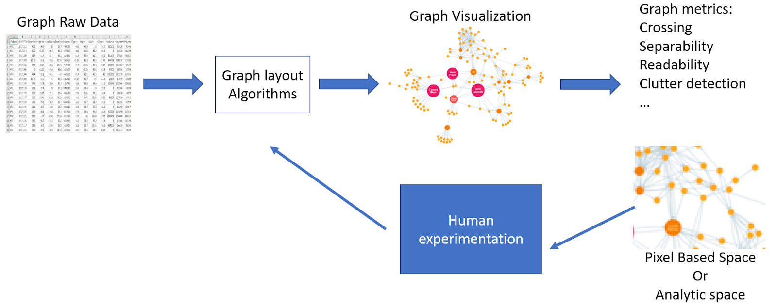
The quality of data visualizations is typically assessed through their conformance to drawing styles and conventions and by measuring quality metrics. Drawing styles and conventions aim to provide a certain quality standard of a graph drawing, but do not explicitly measure it, while quality metrics measure the quality aspect of a graph drawing without an algorithmic way to optimize it. Drawing styles and conventions and quality metrics originating from a variety of perspectives, are complementary tools, but are rarely systematic. Our working group discussed approaches to systematize and unify currently existing metrics and conventions in a single framework for assessing graph visualization quality. During this Dagstuhl Seminar, we discussed the possibilities of integrating the abilities and peculiarities of the human perceptual system (what we here refer to as “perceptual principles”) into a unified visualization pipeline (Figure 3).
Perception plays an important role in how humans judge and perceive visual information. One phenomenon that strongly affects one’s perception is grouping. Perceptual grouping refers to processes in which discrete elements (“parts”) are parsed into groups (“wholes”) by the visual system, following so-called Gestalt principles [7]. In a typical example, rows of dots positioned closer together are perceived as grouped together more than the rows of dots that are sparely positioned (i.e., proximity principle). Such grouping is, for instance, one of the targeted perception optimization for graph visualization [22]. However, some similarities between the graph drawing and perceptual grouping can be observed. For example, in graph drawing, in stress model [12], edges are shortened, so that the related nodes are placed closer together and thus appear as grouped together. While there are clear differences between the mechanisms behind Gestalt perception and graph drawings, the outcome product can be seen as analogous: the items appear as grouped.
From this starting point we made progress by analyzing specific drawing styles and conventions and quality metrics, relating them to a list of perception principles. Our initial focus included such Gestalt principles as proximity, symmetry, common fate, closure, similarity, common region, and good continuation, as well as such additional concepts as curvature, visual complexity and global aesthetics, and clutter. Our analysis revealed that drawing styles and conventions and quality metrics often rely on one or another perception principle, at least to some extent. For instance, global shape, bundling, and number of crossings reflect the Gestalt principle of similarity. We acknowledge that some of the metrics will reflect a complex combination of perception principles. However, we believe that they can nevertheless be formally described. After the description, the sample space of all possible variations of the metrics can be measured and new graph layouts can be computed. How to effectively measure the space and design quality metrics from the measured spaces, still remains an open question though. Our connecting of metrics with perceptual principles can help, e.g., people choosing sets of metrics to optimize simultaneously (because they relate to the same principle) or, alternatively, see which tasks will be helped when optimizing certain metrics.
We believe that quality metrics can be also ordered along a hierarchical spectrum (i.e., low, mid, and high), potentially adhering to the hierarchical spectrum of visual perception (low-, mid-, high-level vision). Generic attributes of the drawings, which are typically less data- and less task-specific (to give a few examples: number of bends, or number of crossings) and are easier to quantify and measure automatically, could correspond to low-level perception. Other quality measurements are more data- and task-specific, and can thus be seen as high(er) level. They are typically the ones quantified by user experiments. Interestingly, there is a problem: good low-level metrics values do not imply good high-level metric values, and conversely. For example, a drawing may have few crossings, but a path-following task might still be hard without monotonicity of the paths [15]. The other way round: A drawing might not be symmetric in a strictly mathematical sense, but might appear symmetric due to local regularities [9] or the global shape [8]. While the metrics near the endpoints of the spectrum are relatively easy to identify, how exactly to order the metrics at the mid-level (potentially symmetry, bundling quality, clutter, complexity) is an open question. Additionally, there is a need for ways to measure some higher-level quality properties, e.g., global aesthetics. The challenge is that it is unclear how to reduce these to easily measurable properties, e.g., curvature or shape. The end product could be to be able to derive an aesthetics function a(D, f(D)) from a good set of samples (D, f(D)) of graph drawings D and their corresponding lower-level metrics f(D).
To sum up, our working group proposed the first steps towards the creation of a framework that unifies quality metrics and drawing conventions based on human perception. We suggest that new metrics and drawing conventions can be developed for perceptual mechanisms which are not reflected by the current metrics or conventions. We hope that the connection between the perceptual principles and the metrics can aid in optimization of certain aspects that relate to the same perceptual principle or development of tasks in order to see which ones will be improved when optimizing certain metrics. We ended up the Dagstuhl week with the intention to further develop the framework and publish a paper related to it.
4.4 Spatio-temporal Networks – Visualizing Time-dependent Touristic Route Planning
Annika Bonerath, Claus-Christian Carbon, Silvia Miksch, Maurizio Patrignani, Alessandra Tappini
License: ![]() Creative Commons BY 4.0 International license © Annika Bonerath, Claus-Christian Carbon, Silvia Miksch, Maurizio Patrignani, and Alessandra Tappini
Creative Commons BY 4.0 International license © Annika Bonerath, Claus-Christian Carbon, Silvia Miksch, Maurizio Patrignani, and Alessandra Tappini
Working group members: Annika Bonerath, Claus-Christian Carbon, Silvia Miksch, Maurizio Patrignani, and Alessandra Tappini
Several user studies were performed to assess the ability of people to use maps, graphs, or other abstract representations of the relationship between objects in a spatial environment. In this report, we describe how a user study can be designed to address the complex scenario when the user has to cope with a network that is dynamic both with respect to nodes (that are “available” or “unavailable” in specific time windows) and with respect to edges (that change their congestion through time).
4.4.1 Introduction
Finding paths in networks is one of the tasks that are more challenging using a matrix-based representation rather than using a node-link representation of the network [13, 20]. The choice of the right path may be complicated by the fact that the network conditions may change over time, because the targets to reach may move from one place to another or because network congestion may discourage the choice of some paths during the day. Still, deciding the sequence of places to visit and the paths that allow us to reach them is an ordinary task in everyday life, and a good or a poor choice reflects on the time spent commuting, on pollution, on personal satisfaction, and on money.
Several user studies are available that address the ability of people of using node-link or matrix-based representations [13, 20]. Also, the domain of dynamic networks has been deeply studied (refer to [2] for a taxonomy of models and solutions). The most complex scenario is when a network is dynamic both with respect to space and with respect to time. This scenario is very rarely explored.
The purpose of our work is to design an experimental study to assess what is best to help the user to cope with a network that is dynamic both with respect to nodes (that are “available” or “unavailable” in specific time windows) and with respect to edges (that change their congestion through time).
This report is organized as follows. Section 4.4.2 describes the application scenario we address. Section 4.4.3 explores related work about network visualization and dynamic network exploration. Section 4.4.4 describes the visualization we would like to adopt in our experiments. Section 4.4.5 describes the experimental design. Finally, Section 4.4.6 is devoted to the next steps and a timeline for our work.
4.4.2 Application Scenario
The application scenario we address is the following. The user starts from a starting point in space and time, i.e., she is located at a specific node of the network at a specific time. Her purpose is to reach a certain number of targets, using the shortest time possible to commute among the targets. The scenario is dynamic: targets have a specific time window when they are available; edges have a traversal time that changes through the day. Our scenario is inspired by the real-world scenario of tourists planning a path through a city that they want to visit; see Figure 4.
4.4.3 Related Work
Network visualization provides meaningful representations of networks/graphs, which are abstract data structures to define as a set of data points and relationships between them. In a recent paper [11], Filipov et al. conducted a survey of surveys to provide researchers and practitioners a “roadmap” elaborating the current research trends in the field of network visualization. They categorize recent surveys and task taxonomies published in the context of network visualization.
Interacting with Networks
In [13] a taxonomy of generic graph-related tasks is described and an evaluation is performed aiming at assessing the readability of two representations of graphs: matrix-based representations and node-link diagrams. The study shows that matrix-based visualizations perform better than node-link diagrams on most tasks when graphs are bigger than twenty vertices. Only path-finding is consistently in favor of node-link diagrams throughout the evaluation.
In [10] it was investigated the usability of Overloaded Orthogonal Drawings against classical Orthogonal Drawings, Hierarchical Drawings, and Matrix-based Representations for performing a collection of basic user tasks on directed graphs. Directed graphs are also the subject of the crowd-sourced user study in [1], where node-link diagrams, adjacency matrices, and bipartite layouts are compared mainly focusing on overview tasks for large instances.
Dynamic Network Visualizations
Surveys about the representations of dynamic networks can be found in [16, 5]. The two main strategies for representing dynamic phenomena on a network are the time-to-space mapping and the time-to-time mapping [5]. The first strategy encodes the time dimension into some geometric object, i.e., into a space dimension. This kind of representation may be very challenging for some application domains. A common technique, which will be used in our experiments, is that of relying on small multiples, i.e., replicating the representation for different discrete times. The second strategy, maps the time dimension of the dataset into the time of the user, actually showing a dynamic view, where the changes of the dataset through time are animated in a simulated time. This kind of representation is also planned in our experiments. Similar to our setting is the work described by Saraiya et al. [23], where a node-link diagram with static positions is used and only node attributes are time-varying (in our case edge attributes are). Comparing an animated slider solution to an approach with small time-series visualizations inside each node, they observe better performance of participants for the animated approach when only one or two points in time are involved, while the reverse happens when tasks involve more time steps. Archambault and Purchase contrast animation and small multiples techniques for the visualization of dynamically evolving graphs and show that when the stability of the drawing is low and important nodes in the task cannot be highlighted throughout the time series, animation can improve task performance when compared to the use of small multiples [3]. As in the present paper, the tasks in [3] also involve paths, but the purpose there is that of recognizing a given path while the positions of the nodes changes, rather than finding paths with specific properties. Boyandin et al. focus on the qualitative differences between the types of findings users make with animations and small multiples [6]. They show that animation tends to reveal more findings on adjacent time steps while small multiples foster the discovery of patterns lasting over longer periods. Based on the above results [5] concludes that small-multiples approaches seem to be preferable for tasks involving more than two time steps.
Geospatial Network Visualizations
Geospatial network visualizations associate nodes and links with geographic locations either on Earth or other planets [24]. These visualizations are used to show, for example, trade and financial connections between countries and regions [4] or to display flight connections [21].
Schöttler et al. [24] present a systematic review of geospatial network visualization approaches by establishing a design space, which supports designers in building appropriate and effective visualization for this type of networked data. The proposed design space consists of the following dimensions: (i) geographical facet representation, (ii) network representation (for both nodes and edges), (iii) composition (how the topology and geography are combined in the visualization), and (iv) use of interaction. The geographical representation tackles how to encode geospatial information, which ranges from explicit (representations that use a cartographic map), to distorted (representations that use displacement of spatial positions according to some property of the network), to abstract (representations that use encodings not based on map projections). However, geospatial network visualization captures several open challenges, like handling co-located nodes, link density, and uncertainty in geospatial networks.
4.4.4 Visualization Concept/Approach
From previous research, it is well known, that for the task of finding paths in networks, the node-link visualization outperforms other representation techniques such as matrix-based representations [13, 20]. Since we consider a geospatial network, we visualize it on a map where each node is at its spatial location. The traversal time of an edge is encoded by its thickness in the drawing.
In the experiment, we explore the influence of interaction. Especially, for exploration tasks, interactive user interfaces perform better with respect to non-interactive visualizations [18].
We distinguish two levels: the non-interactive case, where we display the traversal times for all commuting time ranges next to each other; and the interactive case, where the user can interactively choose the time range for which we visualize the traversal times. We expect that for simple networks, the static visualization performs better, while for more complex networks, the interactive visualization is more convenient.
4.4.5 Experimental Design
4.4.5.1 Experimental Factors
Our experimental design consists of four fully crossed experimental factors; see Figure 5:
-
1.
Interactivity (non-interactive vs. interactive),
-
2.
NumAlt: Number of route alternatives (2 vs. 3),
-
3.
NumSites: Number of touristic sites to be visited (3 vs. 5), and
-
4.
NetSize: Size of the overall network (small vs. large).
We consider a scenario to be less complex than another scenario if NumAlt, NumSites, or NetSize is smaller.
4.4.5.2 Research Hypotheses
For our experiment, we formulate four research hypotheses.
- (H1)
-
For less complex scenarios, the non-interactive visualization leads to (a) shorter response time and (b) higher accuracy.
- (H2)
-
For more complex scenarios, the interactive visualization leads to (a) shorter response time and (b) higher accuracy.
Our intuition is that for a complex scenario, the non-interactive visualization is difficult for the participants since they need to find the sight locations over the different views.
- (H3)
-
For more complex scenarios, the memorability will be higher.
We base this hypothesis on the fact that users engage more with the data in complex scenarios.
- (H4)
-
The visualization that is perceived as more aesthetically appealing leads to better memorability.
4.4.5.3 Participants
The relevant hypothesis for the power analysis, which determined the sample size, was hypothesis (H1a/b). As we base our analyses on multilevel data analysis using linear mixed models, we will employ R package simR [14] for power calculation. The main statistical model we use is based on a repeated measures design. The effect in question is about the additional fixed effects of NumAlt, NumSites and NetSize on accuracy and was set to , , and , respectively, which represent a mixture of small up to medium effect sizes [19]. To observe that this effect explains a significant amount of variance compared to the null model with and a satisfactory test power 1- of 0.80, we aim to collect data from participants. As we expect a drop off of about 20% of the participants including persons who do not respond to the tasks adequately, we will recruit participants. We aim for recruiting participants without specific knowledge about routing in touristic scenarios but ordinary people that we can recruit online, e.g., volunteer workers recruited by specialist online recruiting companies such as Clickworker or Amazon Mechanical Turk (MTurk). Additionally, we will recruit student participants from the University of Bamberg.
4.4.5.4 Timeline of Experiment
The course of the experiment is as follows:
-
1.
Demographic data of the participants and instruction,
-
2.
Test phase 1 (T1): Exposure to the experimental stimuli one by another in a randomized order; participants are asked to find the most adequate route given certain time constraints,
-
3.
Intermediate phase to distract participants,
-
4.
Test phase 2 (T2): Exposure to the same stimuli from T1 plus the same number of stimuli matched for experimental design properties but being unfamiliar to the participants; the participants have to fulfill the same routing task as in T1 but preceded by a familiarity decision task and followed by ratings about a) aesthetic appeal and impression, b) perceived complexity, c) assessment of the experienced difficulty of solving the respective routing task, and (d) usefulness.
As we estimate the processing time of T1 to be approx. 1 hr and T2 to be 2 hr, we will split T1 and T2 and will operationalize the intermediate phase as a break of about one week – this assists the major aim to distract participants from the main task and to get back full attention at T2. The stimuli are node-link graphs with certain points of interest (POI) which are labeled as certain targets to get routed to. Additional nodes are added to the graph to increase complexity and to emulate typical complexities achieved by real-world touristic city maps (see Figure 4).
For each trial, participants are requested to route to a certain category of POI within a certain time window. The thickness of the links indicates the current traffic situation on the path between two nodes, i.e., two locations, which has an impact on travel times. The major task of the participants is to visit one instance of each category while maximizing the visiting time of all instances in sum.
4.4.5.5 Measures
We evaluate our experiments with quantitative measures: a) the response time, b) the correctness of the answer and c) the memorability in the second phase; and with qualitative measures from the ratings: a) aesthetic appeal and impression, b) perceived complexity, c) assessment of the experienced difficulty of solving the respective routing task, and (d) usefulness.
4.4.6 Outline
We aim with this project at a human-subject study. We want to publish our results at a conference on information visualization such as IEEE VIS or Graph Drawing, or in a journal in the field of spatial cognition or information visualization such as IEEE TVCG. Figure 6 illustrates the timeline of this project.
4.5 Matrix Path Exploration
Carolina Nobre, Daniel Archambault, Rita Borgo, Andreas Kerren
License: ![]() Creative Commons BY 4.0 International license © Carolina Nobre, Daniel Archambault, Rita Borgo, Andreas Kerren
Creative Commons BY 4.0 International license © Carolina Nobre, Daniel Archambault, Rita Borgo, Andreas Kerren
Working Group members: Carolina Nobre, Daniel Archambault, Rita Borgo, Andreas Kerren
4.5.1 Introduction
Data visualizations have long been used to amplify human cognition and help make sense of the vast amount of data in the world. Research has shown that the visual analysis process itself is not universal. User-adaptive visualizations can adapt to the characteristics and preferences of the user. A recent state-of-the-art survey by Yanez et al. [26] proposes a workflow for user adaptive visualization, including user input, adaptation logic, and visual interventions. However, deeper thoughts about the spectrum of visual adaptations for different visualization types have not been explored. Here we report on the group’s work exploring user adaptive visualization in the context of interactive network visualization as shown in Figure 7.

4.5.2 Discussions Over the Week
For the first part of the week, we provided further details around the conceptual framework (see Figure 7). In particular, we looked at visual interventions which applied more generally across populations and others that were more individual differences. We instantiated inputs and user representations in the context of network visualisation. The work also converged on three main research questions:
-
What types of user-adaptive approaches can support improved visual analytics for networks?
-
How can we assess if the adaptive approaches “work”, i.e improve the analysis process? (Cognitive load, graph readability tasks - accuracy and time)
-
How can we instantiate the user-adaptive visualizations model for network perception?
During Thursday, all of a sudden an interactive technique for matrix path exploration broke out (Figure 8). The approach is similar to bring & go [17] interactive technique. Instead, rows and columns of the matrix are pulled and placed around an overlay of a focus node. The history of repeated interactions is visualized through a thread that touches all visited edges and nodes through the diagonal.
The group was able to create a draft of the logic behind the algorithm, we however agreed more work was needed to implement the technique and perform stress testing on a wider rage of cases. This matches fully with Dagstuhl seminars vision of seeding new collaborative research.
4.5.3 Conclusions and Next Steps
Based on the Dagstuhl discussions, we plan to write an article on the proposed workflow for user adaptive network visualization that will be submitted to an established journal/magazine in the visualization community, such as Computer Graphics Applications (CG&A). Moreover, we plan to implement the proposed algorithm for matrix path exploration with the help of PhD students and use the implemented approach as the basis for instantiating a user-adaptive visualization process. The final approach should be evaluated and the results published as a conference publication and/or journal article.
As always, Schloss Dagstuhl proved to be an excellent venue to nurture new and exciting research ideas and collaborations. We would like to thank the organizers and the staff for making this a very successful event but also the Dagstuhl staff for providing a friendly and stimulating working environment.
4.6 Unintended Perceptual Inferences in Graph Drawing
Michael Aichem, Mohammad Ghoniem, Christophe Hurter, Karsten Klein, Oliver Kohlbacher, Mauro Martino, Jacob Miller, Helen C. Purchase, Bernice Rogowitz, Markus Wallinger, Hsiang-Yun Wu
License: ![]() Creative Commons BY 4.0 International license © Michael Aichem, Mohammad Ghoniem, Christophe Hurter, Karsten Klein, Oliver Kohlbacher, Mauro Martino, Jacob Miller, Helen C. Purchase, Bernice Rogowitz, Markus Wallinger, and Hsiang-Yun Wu
Creative Commons BY 4.0 International license © Michael Aichem, Mohammad Ghoniem, Christophe Hurter, Karsten Klein, Oliver Kohlbacher, Mauro Martino, Jacob Miller, Helen C. Purchase, Bernice Rogowitz, Markus Wallinger, and Hsiang-Yun Wu
Working group members: Michael Aichem, Mohammad Ghoniem, Christophe Hurter, Karsten Klein, Oliver Kohlbacher, Mauro Martino, Jacob Miller, Helen C. Purchase, Bernice Rogowitz, Markus Wallinger, and Hsiang-Yun Wu
Discussion.
Layout algorithms are often designed to support different analysis functions (e.g., to enhance the salience of clusters or to reveal specific features in the data). For example, lin-log was created in order to create better spatial spread in the 2-D plane, to help reveal clusters that might be difficult to observe when a layout is locally dense. Selecting an algorithm or the parameterization of a layout algorithm to achieve particular goals, however, is often a dark art. Algorithm designers and users rely on intuitions and experience to make these design decisions. Despite their best efforts, many layouts induce incorrect inferences about the true structure of the data. The goal of this research is to identify and characterize classes of incorrect inference, and to provide experimental research with human observers, which can guide more perceptually-faithful renderings.
In particular, we are focusing on layouts that produce misleading results because they interfere with Gestalt Principles of Organization. In a graph layout, human observers tend to see spatially-proximal points as belonging together (“Proximity”), which helps them perceive individual nodes as belonging to the same cluster. If this principle is disrupted when an algorithm draws unconnected nodes (e.g., no common edges) in the same proximity, this may lead to an incorrect inference about cluster membership. These Gestalt principles exert a very strong impact on how we organize the spatial world, and operate automatically, without conscious control. Some principles we plan to explore are (1) Proximity, (2) Closure, (3) Grouping, (4) Symmetry, and (5) Good Continuation.
Some research questions:
-
What types of incorrect inferences can occur in layouts?
-
Do these occur because they interfere with Gestalt Principles?
-
How important are these misinterpretations to understanding the structure in the data?
-
How prevalent are they?
-
How does the degree to which they mislead depend on the layout algorithm (e.g., vanilla force directed vs. lin-log), and their parameters?
-
What experiments with human observers can measure how the correct interpretation of the data depends on the layout? And on the degree to which Gestalt principles of organization are abrogated?
4.6.1 Discussion through a General Framework
One avenue for exploration was a general approach to categorizing and exploring unintended inferences in graph layouts. For each layout type (e.g.,node-link force directed or circular), there would be three stages: (1) identifying illustrative exemplars, (2a) creating a database of layout drawings for different algorithms and their parameters, (2b) computing the graph-drawing and image-processing (pixel-based) metrics for cases where unintended interpretations are produced, and (3) conducting experiments with human observers to measure the saliency and strength of different misleading (but data-faithful) renderings. This perceptual data would, in turn, feedback to inform layout algorithms and metrics.
4.6.2 Subgroup 1: Unintended Perceptual Inferences in Node-Link Diagrams
Michael Aichem, Christophe Hurter, Karsten Klein, Oliver Kohlbacher, Mauro Martino, Bernice Rogowitz, Markus Wallinger.
Discussion.
Subgroup 1 worked to designing the general framework, with special focus on unintended perceptual inferences arising from node-link diagrams, such as misjudging the size or density of a cluster. This group was motivated by two related issues. First, graph-drawing algorithms are not aware of human perception, and can create layouts that can lead the user to misinterpret the distribution, relationship, and density of nodes and edges. For example, the size of a cluster is related to the number of closely-connected nodes. If non-connected nodes are in the same spatial neighborhood, however, they may be mis-perceived as belonging to that cluster. This unintended inference would have been produced by a Gestalt Principle of Proximity. A layout algorithm could apply a constraint that more aggressively separates non-connected nodes in the spatial layout.
Second, there are many graph-drawing algorithms, with many parameters. Some are designed for a specific purpose, such as lin-log, whose objective is to spread the nodes apart so that internal structures can be more easily appreciated. However, there are no perceptual guidelines for selecting the right algorithm and the right parameterization. One goal of this research is to more closely couple the algorithms with their perceptual effects, so they can be more easily and intuitively selected and tuned. To this end, we have begun designing simple experiments that explore unintended inferences in node-link diagrams produced by different algorithms, and to measure their impact on spatial judgments in graphs of different sizes (small, medium and large). Insight into the size and scope of these mis-perceptions will deepen our understanding of the relationship between algorithm parameters, spatial rendering, and perception, which can provide an objective guide to future algorithm evaluation and development.


Experiments.
To provide perceptual feedback to layout algorithms, we would like to examine several tasks that may be prone to unintended lies, as a function of graph size. Hypothetical data are shown below for three tasks, finding clusters, counting clusters, and judging the size of clusters. In this mock-up of experimental results, judging cluster size is the most prone to error, and this error increases with graph size, since there is more opportunity for overstriking to obscure the estimation of the number of nodes involved.

Future Work.
Our goal is to continue conceptualizing this approach, which, if successful, will have deep implications for the design of graph layouts and will extend the powerful concepts of perceptual psychology in the graph visualization domain.
4.6.3 Subgroup 2: Pattern Matching
Jacob Miller, Mohammad Ghoniem, Helen C. Purchase, Hsiang-Yun Wu
Discussion.
We are interested in the phenomenon whereby small sub-graphs within a graph may be perceived to be identical when they are structurally dissimilar, or may be perceived to be dissimilar when they are identical. This primarily relates to the Gestalt principle of similarity, but may also include an element of symmetrical pattern-matching.

We believe that if sub-graphs are identical, they should be depicted identically; if they are nearly-identical, they should be depicted nearly-identically. While we are investigating this matter with abstract graphs, the principle is particularly important in domains where sub-structures hold meaning, and where their identification is important. For example, it may be important to identify all the five-node cliques in a social network, or the six-node cycles in a biological network.
We identified five sub-structures (which we call “motifs”): cliques, stars, double-cliques, bi-cliques, cycles. For each motif, we have defined variations on two dimensions – same or different structure, same or different shape. An example for the star motif is shown in Fig. 12.
We have developed an automatic means of creating larger random graphs which include two variants of a motif; the nodes of these motifs have fixed positions when the graph is laid out (see Fig. 13 for the cycle motif).

We have also created matrix and arc diagrams demonstrating the same same/different shape/structure phenomena for the same motifs. We ended our Dagstuhl week with the intention to conduct an experiment (or experiments) using these stimuli – testing the extent to which participants view the sub-structures as identical. Our preliminary expectations are expressed in Table 1.
| Same Structure | Different Structure | |
|---|---|---|
| Same Shape | This is simple rotation. It will be easy for symmetric motifs like cycles, cliques, but less easy for non-symmetric motifs like bi-cliques or double-cliques. | Pattern matching of the node positions in the same shape will make it easy to see where edges are missing or have been added. |
| Different Shape | The change in shape will make it hard to recognize that the motifs are the same structure. | The change in shape will make it hard to recognize that the motifs are different in structure. |
We would like to demonstrate that where the identification of sub-graphs is important, the algorithm used for the layout of the whole graph should ensure that the associated motifs are clearly depicted.
References
- [1] Moataz Abdelaal, Nathan D. Schiele, Katrin Angerbauer, Kuno Kurzhals, Michael Sedlmair, and Daniel Weiskopf. Comparative evaluation of bipartite, node-link, and matrix-based network representations. IEEE Transactions on Visualization and Computer Graphics, 29(1):896–906, 2023.
- [2] Jae-wook Ahn, Catherine Plaisant, and Ben Shneiderman. A task taxonomy for network evolution analysis. IEEE transactions on visualization and computer graphics, 20(3):365–376, 2013.
- [3] Daniel Archambault and Helen C. Purchase. Can animation support the visualisation of dynamic graphs? Information Sciences, 330:495–509, 2016. SI Visual Info Communication.
- [4] Alessio Arleo, Christos Tsigkanos, Roger A. Leite, Schahram Dustdar, Silvia Miksch, and Johannes Sorger. Visual Exploration of Financial Data with Incremental Domain Knowledge. Computer Graphics Forum, 41(2):101–116, 2023.
- [5] Fabian Beck, Michael Burch, Stephan Diehl, and Daniel Weiskopf. A taxonomy and survey of dynamic graph visualization. Computer Graphics Forum, 36(1):133–159, 2017.
- [6] Ilya Boyandin, Enrico Bertini, and Denis Lalanne. A qualitative study on the exploration of temporal changes in flow maps with animation and small-multiples. Computer Graphics Forum, 31(3pt2):1005–1014, 2012.
- [7] Joseph L. Brooks. Traditional and new principles of perceptual grouping. In The Oxford Handbook of Perceptual Organization. Oxford University Press, 08 2015.
- [8] Claus-Christian Carbon, Tamara Mchedlidze, Marius Hans Raab, and Hannes Wächter. The power of shape: How shape of node-link diagrams impacts aesthetic appreciation and triggers interest. i-Perception, 9(5):2041669518796851, 2018. PMID: 30210777.
- [9] Felice De Luca, Md. Iqbal Hossain, and Stephen Kobourov. Symmetry detection and classification in drawings of graphs. In Daniel Archambault and Csaba D. Tóth, editors, Graph Drawing and Network Visualization, pages 499–513, Cham, 2019. Springer International Publishing.
- [10] Walter Didimo, Fabrizio Montecchiani, Evangelos Pallas, and Ioannis G. Tollis. How to visualize directed graphs: A user study. In IISA 2014, The 5th International Conference on Information, Intelligence, Systems and Applications, pages 152–157, 2014.
- [11] Velitchko Filipov, Alessio Arleo, and Silvia Miksch. Are We There Yet? A Roadmap of Network Visualization from Surveys to Task Taxonomies. Computer Graphics Forum, page fothcomming, 2023.
- [12] Emden R. Gansner, Yehuda Koren, and Stephen North. Graph drawing by stress majorization. In János Pach, editor, Graph Drawing, pages 239–250, Berlin, Heidelberg, 2005. Springer Berlin Heidelberg.
- [13] M. Ghoniem, J.-D. Fekete, and P. Castagliola. A comparison of the readability of graphs using node-link and matrix-based representations. In IEEE Symposium on Information Visualization, pages 17–24, 2004.
- [14] Peter Green and Catriona J. MacLeod. SIMR: an R package for power analysis of generalized linear mixed models by simulation. Methods in Ecology and Evolution, 7(4):493–498, 2016.
- [15] Weidong Huang, Peter Eades, and Seok-Hee Hong. A graph reading behavior: Geodesic-path tendency. In 2009 IEEE Pacific Visualization Symposium, pages 137–144, 2009.
- [16] Othon Michail. An introduction to temporal graphs: An algorithmic perspective. Internet Mathematics, 12(4):239–280, 2016.
- [17] Tomer Moscovich, Fanny Chevalier, Nathalie Henry, Emmanuel Pietriga, and Jean-Daniel Fekete. Topology-aware navigation in large networks. In Proceedings of the 2009 CHI Conference on Human Factors in Computing Systems, CHI ’09, page 2319–2328, 2009.
- [18] Tamara Munzner. Visualization Analysis and Design. A K Peters/CRC Press Visualization Series. CRC Press, 2015.
- [19] P. Nieminen. Application of standardized regression coefficient in meta-analysis. BioMedInformatics, 2(3):434–458, 2022.
- [20] Mershack Okoe, Radu Jianu, and Stephen G. Kobourov. Node-link or adjacency matrices: Old question, new insights. IEEE Trans. Vis. Comput. Graph., 25(10):2940–2952, 2019.
- [21] Peter Rodgers. Chapter 7 - Graph Drawing Techniques for Geographic Visualization. In Exploring Geovisualization, pages 143–158. Elsevier, 2005.
- [22] Amalia Rusu, Andrew J. Fabian, Radu Jianu, and Adrian Rusu. Using the gestalt principle of closure to alleviate the edge crossing problem in graph drawings. In 2011 15th International Conference on Information Visualisation, pages 488–493, 2011.
- [23] Purvi Saraiya, P. Lee, and C. North. Visualization of graphs with associated timeseries data. In IEEE Symposium on Information Visualization, 2005. INFOVIS 2005., pages 225–232, 2005.
- [24] Sarah Schöttler, Yalong Yang, Hanspeter Pfister, and Benjamin Bach. Visualizing and Interacting with Geospatial Networks: A Survey and Design Space. Computer Graphics Forum, 40(6):5–33, 2021.
- [25] Frank Van Ham and Bernice Rogowitz. Perceptual organization in user-generated graph layouts. IEEE Transactions on Visualization and Computer Graphics, 14(6):1333–1339, 2008.
- [26] Fernando Yanez, Alvitta Ottley, Cristina Conati, and Carolina Nobre. The state of the art in user adaptive visualizations. Computer Graphics Forum (EuroVis 2023), Under Submission.
5 Participants
-
Michael Aichem – Universität Konstanz, DE
-
Daniel Archambault – Swansea University, GB
-
Annika Bonerath – Universität Bonn, DE
-
Rita Borgo – King’s College London, GB
-
Claus-Christian Carbon – Universität Bamberg, DE
-
Tim Dwyer – Monash University – Clayton, AU
-
Peter Eades – The University of Sydney, AU
-
Henry Förster – Universität Tübingen, DE
-
Mohammad Ghoniem – Luxembourg Inst. of Science & Technology, LU
-
Carsten Görg – University of Colorado – Aurora, US
-
Seok-Hee Hong – The University of Sydney, AU
-
Christophe Hurter – ENAC – Toulouse, FR
-
Andreas Kerren – Linköping University, SE
-
Karsten Klein – Universität Konstanz, DE
-
Felix Klesen – Universität Würzburg, DE
-
Stephen G. Kobourov – University of Arizona – Tucson, US
-
Oliver Kohlbacher – Universität Tübingen, DE
-
Giuseppe Liotta – University of Perugia, IT
-
Mauro Martino – MIT-IBM Watson AI Lab – Cambridge, US
-
Tamara Mchedlidze – Utrecht University, NL
-
Natalia Melnik – Otto-von-Guericke-Universität Magdeburg, DE
-
Silvia Miksch – TU Wien, AT
-
Jacob Miller – University of Arizona – Tucson, US
-
Kazuo Misue – University of Tsukuba, JP
-
Fabrizio Montecchiani – University of Perugia, IT
-
Carolina Nobre – University of Toronto, CA
-
Martin Nöllenburg – TU Wien, AT
-
Alexander Pastukhov – Universität Bamberg, DE
-
Maurizio Patrignani – University of Rome III, IT
-
Helen C. Purchase – Monash University – Clayton, AU
-
Marius Raab – Universität Bamberg, DE
-
Bernice E. Rogowitz – Visual Perspectives – New York, US
-
Paul Rosen – University of Utah – Salt Lake City, US
-
Falk Schreiber – Universität Konstanz, DE
-
Alessandra Tappini – University of Perugia, IT
-
Alexandru C. Telea – Utrecht University, NL
-
Markus Wallinger – TU Wien, AT
-
Hsiang-Yun Wu – FH – St. Pölten , AT
-
Cindy Xiong – University of Massachusetts – Amherst, US
![[Uncaptioned image]](x3.jpg)
6 Remote Participants
-
Danielle Szafir – University of North Carolina at Chapel Hill, US