Inclusive Data Visualization
Abstract
Data plays an increasingly important role in our lives, and data visualization pervades our world as a means not only to analyze and explore data but also to identify and communicate insights. Most existing data visualizations, however, remain out of reach for many people with disabilities as they are designed on implicit assumptions about people’s sensory, cognitive, and motor abilities. With an aim to tackle the significant equity issues posed by inaccessible data and data visualization, this Dagstuhl Seminar brought together researchers and practitioners from relevant fields, including visualization, accessibility, human-computer interaction, and health informatics. Five – both remote and in-person – invited talks gave participants an opportunity to understand barriers and challenges people with various disabilities currently face. With lightning talks and demos, participants shared their experiences and research relevant to inclusive data visualization. In addition, through brainstorming and discussion in break-out sessions combined with short report back presentations, participants identified research challenges and opportunities for inclusive data visualization.
Keywords and phrases:
Data Visualization, Information Visualization, Accessibility, Data Access, Human-Computer Interaction, Human-Data InteractionSeminar:
June 18–23, 2023 – https://www.dagstuhl.de/232522012 ACM Subject Classification:
Human-centered computing Visualization ; Human-centered computing Accessibility ; Human-centered computing Human computer interaction (HCI) ; Human-centered computing Interaction designCopyright and License:
![[Uncaptioned image]](x1.png) Except where otherwise noted, content of this report is licensed under a
Creative Commons BY 4.0 International license
Except where otherwise noted, content of this report is licensed under a
Creative Commons BY 4.0 International license
1 Executive Summary
Bongshin Lee (Microsoft Research – Redmond, US, bongshin@microsoft.com)
Kim Marriott (Monash University – Caulfield, AU, kim.marriott@monash.edu)
Danielle Szafir (University of North Carolina-Chapel Hill, US, dnszafir@cs.unc.edu)
Gerhard Weber (Technische Universität Dresden, DE, gerhard.weber@tu-dresden.de)
License: ![[Uncaptioned image]](x2.png) Creative Commons BY 4.0 International license © Bongshin Lee, Kim Marriott, Danielle Szafir, and Gerhard Weber
Creative Commons BY 4.0 International license © Bongshin Lee, Kim Marriott, Danielle Szafir, and Gerhard Weber
We live in a data-driven world, where copious data are generated and captured by computing devices and sensors on and around us, and critical decisions are made based on data. Experts and lay individuals alike have access to a large amount of data, and understanding data and sharing insights have become a core part of information work. Data visualization is a powerful means not only to analyze and explore data but also to identify and communicate data-driven insights. Most existing data visualizations, however, are designed on implicit assumptions about people’s sensory, cognitive, and motor abilities. A lack of access to visualizations and their underlying data resulting from the differences in such abilities impacts people’s education, work, lifestyle, and health, posing a significant equity issue. To address this important issue, visualization, accessibility, and other HCI researchers should work together to develop guidelines, methods, and techniques for increasing visualization accessibility.
One of the main goals of this Dagstuhl Seminar was to build partnerships and develop a shared understanding of this important research topic. This seminar helped us bring together researchers and practitioners from relevant fields, including data visualization, accessibility and assistive technologies, mobile and tangible interaction, human-computer interaction, health informatics, and vision science. It also provided opportunities to hear from representatives from disability support organizations and people with lived experience of disability. Furthermore, the unique setting of Schloss Dagstuhl helped us have an interactive dialog, facilitating the exchange of information and experiences, stimulating discussion and brainstorming, kickstarting collaborations, and identifying novel ideas around inclusive data visualization.
The main outcomes from the activities and discussions in this five-day seminar, which will be described below (The Week at a Glance), are:
-
The establishment of a community around inclusive data visualization.
-
The identification of open problems and challenges required to establish a rigorous foundation for inclusive data visualization.
-
The development of an initial research agenda and plans for future activities in inclusive data visualization.
-
The collaborations across different disciplines, including increased awareness of accessibility in the data visualization community and expanded awareness of data visualization in the accessibility community.
These outcomes will provide the impetus for a critical overarching goal: making data and visualization accessible to a broad range of people.
The Week at a Glance
Monday.
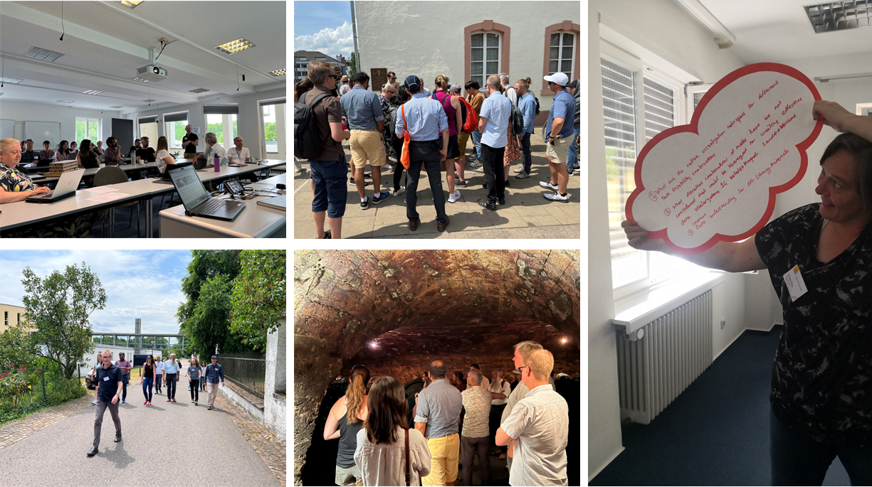
The seminar started with a brief introduction by the organizers about the main goals, topics, and structure of the seminar. This introduction was followed by the first invited talk, which was scheduled before participants’ self-introduction to accommodate the timezone of Louisa Willoughby, a remote speaker from Monash University in Australia. The organizers planned the total of five invited talks on Monday to help seminar participants understand the main challenges people with different disabilities (e.g., cognitive, motor, and vision impairments) face. Afterwards, participants introduced themselves describing their main interests and expertise along with their aims for the seminar, with a short single-slide presentation (Figure 1 top left), and then had the morning coffee break. The morning session ended with two invited talks: one by Kirsten Ellis from Monash University and the other by Eun Kyoung Choe from University of Maryland at College Park.
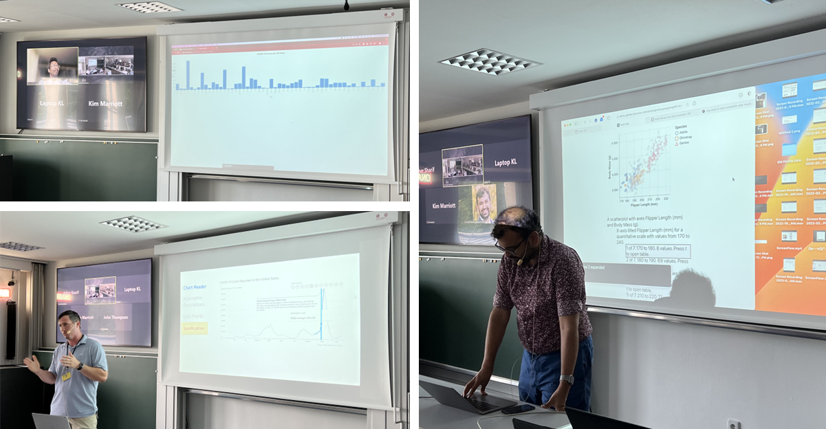
After having lunch and a group of participants taking a walk outside (Figure 1 bottom left), the afternoon started with a brainstorming activity, where we – all participants – discussed seminar goals and outcomes we wanted to achieve together. This was followed by the fourth invited talk by JooYoung Seo from University of Illinois at Ulbana-Champaign. After having the afternoon coffee break, we continued the brainstorming activity for 30 minutes. Then, the last invited talk was given by Shea Tanis, a remote speaker from University of Kansas in the United States. Finally, the first day ended with three invited demos (Figure 3): one by Ather Sharif, a remote presenter from University of Washington in the United States, the second by Arvind Satyanarayan from MIT, and the third by John Thompson from Microsoft Research at Redmond.
Tuesday.
The organizers called for volunteers who would like to share interesting work, including research outcomes (artifacts, systems, study findings, etc.) and viewpoints, relevant to inclusive data visualization through short lightening demos and talks. The Tuesday morning session started with four demos and talks:
-
Haptification of Maps and Data by Gerhard Weber and Meinhardt Branig
-
Audio-tactile Access to Floor Plans by Karin Müller
-
Tactile Graphic Formats through Time and Their Varied Affordances for Inclusive Data Visualisation by Leona Holloway
-
Designing Accessible Visualizations for People with Intellectual and Developmental Disabilities (IDD) by Keke Wu
Before having the morning coffee break, we finalized the brainstorming activity on the seminar goals and outcomes, and then initiated the process of identifying topics for breakout groups. After the coffee break, we discussed and decided breakout groups along with the logistics and plans for working group activities. We initially identified eight topics, but considering participants’ availability, schedule, and relation between topics, we later merged two of them into others, resulting in six topics. The rest of the day was devoted to breakout group discussions on the first three topics: user needs and abilities, authoring and tools, and technologies and information displays.
Wednesday.
Wednesday morning was mainly devoted to discussion in breakout groups to enable participants to further delve into their discussion topics, which was followed by the report back from each of the three groups. Right before lunch, Jason Dykes shared thought-provoking viewpoints to consider visualization as Visual Data Design: with this lens, other materials, modes, and approach can be considered as various Data Designs, such as Textual, Haptic, Audio, and Edible Data Design.
Following the Dagstuhl Seminar tradition, Wednesday afternoon was set aside for social activities. After having a guided group tour in Trier (Figure 1 center top), we visited the “von Nell” Winery to have a winery tour (Figure 1 center bottom) followed by wine tasting and dinner. This social event facilitated personal conversations and fostered the discussion on research collaboration opportunities and deeper networking in a more relaxed setting.
Thursday.
The Thursday morning session started with the following six lightning demos and talks:
-
Accessibility in the Context of India by Anirudha Joshi
-
Action Audio by Cagatay Goncu
-
Soundception: Multimodal Access to Depth in Images for Blind People by Helen Petrie
-
3D Printing to Support Access to Graphical Content by People Who are Blind or Have Low Vision by Matthew Butler
-
Physicalization Platforms as Possible Media for Accessible Data Representation by Danielle Szafir
-
Making for All: Including People Living with Disabilities by Kirsten Ellis
For the remainder of the day, we devoted the time for breakout group discussions, for the remaining three topics: data representations, education and literacy, and research methods. The day ended with the report back from each of the three groups.
Friday.
Friday started with one lightning talk, Machine-learning based Dysgraphia Detection in Children Handwritings by Simone Marinai. Next, for the most of the morning, we worked as a group with an aim to identify the 10 grand challenges for inclusive data visualization. Then before lunch we briefly discussed next steps and how to build the community. This includes developing a website containing resources for inclusive data visualization and holding workshops and panels at relevant conferences. The day ended at lunch as participants left to make their way back home.
2 Table of Contents
3 Overview of Invited Talks and Demos
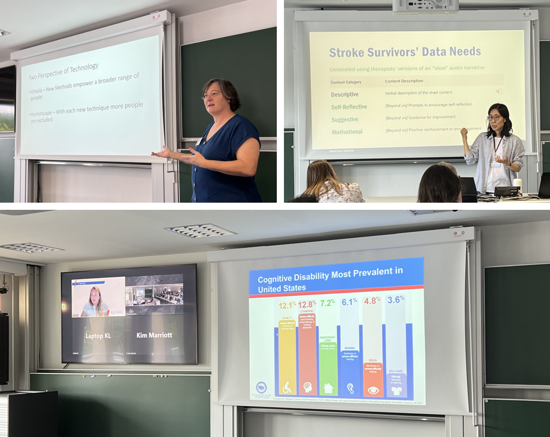
To provide an overview of the main challenges people with different disabilities (e.g., cognitive, motor, and vision impairments) face on the first day, the organizers planned five invited talks (Figure 2). In addition, to highlight some of the recent achievements in inclusive data visualization for blind or low-vision people, the organizers invited three demos of accessible visualization experiences for screen reader users (Figure 3). Three of the presenters could not attend the seminar in-person, and thus gave a talk via Zoom.
3.1 Introduction to Deafblind Communication
Louisa Willoughby (Monash University – Clayton, AU, louisa.willoughby@monash.edu)
License: Creative Commons BY 4.0 International license © Louisa Willoughby
In this talk, I will discuss the various kinds of deafblindness and the ways in which people who are deafblind communicate. I will also discuss two barriers deafblind people are currently facing. The first is the independent use of technology such as computers. The second is gaining information about the objects in their immediate environment and navigating through this space. Finally, I will discuss how tactile maps drawn on the body are used to provide spatial information.
3.2 Accessible Visualization for Physical Disabilities
Kirsten Ellis (Monash University – Clayton, AU, kirsten.ellis@monash.edu)
License: Creative Commons BY 4.0 International license © Kirsten Ellis
Accessible visualization for physical disability is an under-researched area that is often invisible in discussions of making data visualizations accessible. Physical disabilities include fine and gross motor movement and can be congenital, acquired, progressive or temporary so methods for accessibility may need to be adapted dynamically. There are three roles that people can take in the visualization process: passive viewer, active user and creator. In the role of passive viewer people with physical disabilities face minimal barriers to access but as soon as interactions are required to access or create content the barriers can be significant. The modalities used to design and use data visualization can significantly impact the ability of people with physical disabilities experience with visualization but research has not been conducted that establishes best practice for this group.
3.3 Stroke Care: A Rich Canvas for HCI Research
Eun Kyoung Choe (University of Maryland – College Park, US, choe@umd.edu)
License: Creative Commons BY 4.0 International license © Eun Kyoung Choe
Stroke, an injury to the brain from disrupted blood flow, often leads to lasting impairments such as speech difficulties (aphasia), one-sided weakness (hemiparesis), and cognitive issues. These changes can complicate daily tasks. A large body of work exists for stroke rehabilitation, designed to enhance stroke survivors’ functional recovery. Of particular interest to the visualization community is mobile self-tracking interventions that show personal data to motivate people to engage in rehabilitation. Wearable sensors capture limb performance, providing metrics like use intensity, active arm use duration, and use ratio. Displaying such data in conjunction with personalized goals may encourage patients to utilize the affected limb in their everyday living. I propose multimodal feedback that transcends descriptive data, integrating self-reflective questions, suggestions, and motivational messages, presented via visual and audio narratives. This multimodal approach could enhance an understanding of the data and provide therapeutic support for stroke survivors.
3.4 Perceiving Beyond Vision: My Journey Through Dreamscapes, Numerical Cognition, and a Blind Critique of Inclusive Data Visualization
JooYoung Seo (University of Illinois Urbana-Champaign, US, jseo1005@illinois.edu)
License: Creative Commons BY 4.0 International license © JooYoung Seo
In this personal narrative, I offer a unique perspective on life beyond the visual realm, delving into the nature of dreams, the intricacies of mental math, and the concept of “inclusive data visualization” through my lived experience as a blind individual. I invite you to explore the uncharted landscapes of my dreams, where the absence of sight gives rise to a distinct, immersive experience that challenges typical perceptions. I further share my unique approach to mental arithmetic, demonstrating the adaptive, versatile nature of human cognition in the absence of visual cues. From my vantage point, I critically assess the prevailing concept of “inclusive data visualization,” questioning its true inclusivity for the visually impaired community. Join me in this journey, as we rethink the boundaries of perception and inclusivity in our predominantly visual world.
3.5 Cognitive Disability
Shea Tanis (University of Kansas – Lawrence, US, tanis@ku.edu)
License: Creative Commons BY 4.0 International license © Shea Tanis
In 2023, the United States Centers for Disease Control and Prevention, identified cognitive disability as the most prevalent disability across the nation, touching 12.8% of the population surpassing mobility disabilities (12.1%). As datafication of our world proliferates, understanding equity in knowledge translation and access to data visualizations becomes increasingly important. In 2018, the State of the States in Intellectual and Developmental Disabilities Ongoing Longitudinal Data Project of National Significance, partnered with the VisuaLab to validate anecdotal evidence and understand further cognitive accessibility of data visualizations. This research, the first of its kind, established guidelines for making visualizations more meaningful to users with cognitive disabilities. The presentation provided an overview of the partnership, community demands for equity, user-design approaches, and future research topics.
3.6 VoxLens: An Interactive JavaScript Library to Make Online Data Visualizations Accessible to Screen-Reader Users
Ather Sharif (University of Washington – Seattle, US, asharif@cs.washington.edu)
License: Creative Commons BY 4.0 International license © Ather Sharif
JavaScript visualization libraries are widely used to create online data visualizations but provide limited access to their information for screen-reader users. Building on prior findings about the experiences of screen-reader users with online data visualizations, in this demonstration, we present VoxLens, an open-source JavaScript plug-in that – with a single line of code – improves the accessibility of online data visualizations for screen-reader users using a multimodal approach. Specifically, VoxLens enables screen-reader users to obtain a holistic summary of presented information, play sonified versions of the data, and interact with visualizations in a “drill-down” manner using voice-based information querying.
3.7 Olli: An Extensible Visualization Library for Screen Reader Accessibility
Arvind Satyanarayan (MIT – Cambridge, US, arvindsatya@mit.edu)
License: Creative Commons BY 4.0 International license © Arvind Satyanarayan
Olli, an open source library that converts visualizations into a keyboard-navigable structure accessible to screen readers. Using an extensible adapter design pattern, Olli is agnostic to the specific toolkit used to author the visualization. Olli renders a chart as an accessible tree view following the HTML Accessible Rich Internet Applications (ARIA) standard. The fields participating in the visualization serve as branches of the tree, and levels of the tree correspond to different granularities of data (e.g., major axis regions, minor axis regions, individual data values). Users can navigate up and down the tree using the up/down arrow keys, or move between sibling nodes using the left/right arrow keys. Users can also jump to specific positions in the tree via a series of drop down menus, or press the “T” key to invoke a data table view for more traditional row-by-row, column-by-column navigation.
3.8 Chart Reader: Accessible Visualization Experiences Designed with Screen Reader Users
John Thompson (Microsoft Research – Redmond, US, johnthompson@microsoft.com)
License: Creative Commons BY 4.0 International license © John Thompson
We demonstrate Chart Reader, an accessibility engine that renders web visualizations optimized for screen reader access. By designing and developing Chart Reader during a five-month iterative co-design study with 10 blind or low vision people, we aim to improve accessible visualization experiences. Our approach, realized through three sequentially designed and developed prototypes, allows users to interrogate visualizations using keyboard interactions, resulting in multimodal audio (announcements and sonification) of the chart. The web-based accessibility engine generates bar charts, stacked bar charts, and single-/multi- series line charts.
4 Overview of Lightning Demos and Talks
Encouraged and inspired by the invited talks and demos given on Monday, some of the seminar participants wanted an opportunity to share their work and research. The organizers thus called for volunteers who would like to share interesting work and ideas, including research outcomes (artifacts, systems, study findings, etc.) and viewpoints, relevant to inclusive data visualization through short lightening demos and talks.
4.1 Haptification of Maps and Data
Gerhard Weber (TU Dresden, DE, gerhard.weber@tu-dresden.de)
Meinhardt Branig (TU Dresden, DE, meinhardt.branig@tu-dresden.de)
License: Creative Commons BY 4.0 International license © Gerhard Weber, Meinhardt Branig
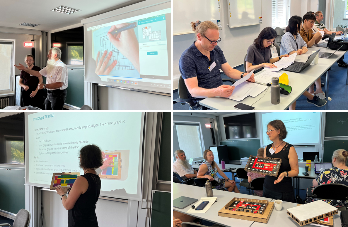
Tactile media can be produced in various ways including embossers for braille and dynamic tactile displays. We demonstrate embossed tactile renderings of SVGPlot, a tool we developed and is itself accessible. In our evaluations bar graphs and scatter plots are identified as being suitable for exploration by blind people. Embossed tactile graphics can be turned into multimodal systems by a low cost pen with audio feedback (TipToi). We demonstrate a new version of an affordable Hyberbraille dynamic tactile display (portable, lowered height and reduced weight). As an extension for OpenStreetMap we show as a result of project AccessibleMaps maps of indoor buildings that are rendered both tactile aiming at blind people as well as for people with low vision through high contrast colors. The dynamic display is touch sensitive and also provides audio feedback for room names and barriers we identified in user surveys.
4.2 Audio-tactile Access to Floor Plans
Karin Müller (Karlsruhe Institute of Technology, DE, karin.e.mueller@kit.edu)
License: Creative Commons BY 4.0 International license © Karin Müller
Visualization of information is a way to present data in a compact and clear way. People with blindness have access to this visual information only if it is provided by alternative forms of presentation such as audio-tactile. The TPad is a standard hardware, i.e., an iPad pro integrated in a frame made with a laser cutter. By using the frame a tactile graphic can be fixed. An app enables access to the additional digital information stored on the iPad via the audio-tactile system. A study with users with blindness showed that the system is useful to explore audio-tactile building plans and allows an intuitive access to this information.
4.3 Tactile Graphic Formats through Time and Their Varied Affordances for Inclusive Data Visualisation
Leona Holloway (Monash University – Clayton, AU, leona.holloway@monash.edu)
License: Creative Commons BY 4.0 International license © Leona Holloway
Tactile graphics, also known as raised line drawings, are best practice for the representation of 2D graphics to convey spatial relationships for people who are blind or have low vision. Tactile graphics can be created using a variety of methods, each with its own advantages and disadvantages. These include pressed paper, collage and other handcrafting, thermoform, swell or microcapsule paper, refreshable tactile displays and 3D printing on paper. Graphics must be simplified and redesigned for tactile reading, however little research has been conducted on the design of the many different data visualisations and their presentation using the various tactile graphic methods.

4.4 Designing Accessible Visualizations for People with Intellectual and Developmental Disabilities (IDD)
Keke Wu (University of North Carolina at Chapel Hill, US, kekewu@cs.unc.edu)
License: Creative Commons BY 4.0 International license © Keke Wu
Visualization amplifies cognition and helps a viewer see the trends, patterns, and outliers in data. However, conventional visualization tools and guidelines do not actively consider the unique needs and abilities of people with Intellectual and Developmental Disabilities (IDD), leaving them excluded from data-driven activities and vulnerable to ethical issues in everyday life. This work explores the challenges and opportunities of cognitively accessible visualization. Through mixed-method approaches and close collaboration with people with IDD, our group ran experiments and developed guidelines to improve current visualizations. We interviewed people with IDD and gained initial understandings of their daily data experiences, and we are currently in the process of running a participatory design workshop to create accessible visualizations for and with this population. We hope to further expand our knowledge of cognitively accessible visualization, translating what we have learned into a graphical user interface that supports people with IDD with better data analytics, and finally make this population more visible in the inclusive data visualization space.
4.5 Visual Data Design
Jason Dykes (City, Univerity of London, UK, J.Dykes@city.ac.uk)
License: Creative Commons BY 4.0 International license © Jason Dykes
I showed some knitted Selbu mittens from Norway. Noeska Smit used these to inspire her Data Knitualization, in which she uses wool (material) and knitting needles (technology) to encode information in physical form. She knits abstract representations – line graphs, and woollen models of real structures (body organs). I did so to differentiate between material, technology and data artefact, which we might consider to be a technology enabled manipulation of material that encodes data. This process is subjective, and so I like the notion of exposing this with the explicit use of the term “Design.” It’s a human process that involves intent. I forget who described “Design” as imagining a better World and doing something about it. But I like that perspective. I think it’s what we try to do. So I wonder whether knitualization is PHYSICAL Data Design? Or perhaps we think about the material and consider this to be WOOL Data Design? So is visualisation VISUAL Data Design, and can we then think about alternative materials, modes, approaches and characterise these as: TEXTUAL, HAPTIC, EDIBLE, OLFACTORY, AUDIO, etc. Data Design? All of these can be interactive, collaborative, and combined in artefacts and analytical environments.
It feels to me as though this perspective has some advantages:
-
it exposes the SUBJECTIVITY of the encoding and the artefact
-
it reduces the cultural DOMINANCE of visualization among other forms of data depiction & representation
-
it encourages MULTIMODAL designs and alternative encodings – why not do PHYSICAL WOOL Data Design or EDIBLE AUDIO Data Design?
These seem to be good things for reliable (consistent?) interpretation and accessible data. Many modes, many representations, many senses, many perspectives. But I look forward to hearing about disadvantages. Subsequently, I wonder whether Visual Data Design is actually a process in which we use light, and technologies that manipulate it to help us engage in Light Data Design to Data Design with Light. Maybe I have discovered that I am a Light Designer, and I use materials and technology that interact with light to depict data that represent aspects of the World. I hadn’t thought of that before. Useful?
I also wonder whether Inclusive Data Visualization is achievable or even what we want to do. What we may really want to do is provide inclusive (diverse, comparable) Access to Data, and perhaps what this is really about is Access to Decision Making Processes and Influence, Empowerment.
4.6 Accessibility in the Context of India
Anirudha Joshi (IIT Bombay, IN, anirudha@iitb.ac.in)
License: Creative Commons BY 4.0 International license © Anirudha Joshi
I presented a study and showed two demos in the context of visually impaired Indian users. The first was a study that aimed to improve the accessibility of bar graphs. In this study we compared the speeds and accuracy of four techniques of auditory bar graphs of two lengths, namely Parallel-Tone, Parallel-Speech, Serial-Tone and Serial-Speech. The study included both sighted and visually impaired users. I also showed another demo of a 3D printable, modular tool that visually impaired people can use to both create and consume line charts. Lastly, I showed a demo of an accessible interaction technique that enables visually impaired users to enter numerical passwords without the need for using headphones. The technique was found to be shoulder-surfing-proof and can allow visually impaired users to confidently enter passwords in a public place. I skipped a demo on an accessible text input mechanism in Indian languages because that was a bit off-topic for this seminar, but it is available in the slides.
4.7 Action Audio
Cagatay Goncu (Tennis Australia – Melbourne, AU, cagatay.goncu@gmail.com)
License: Creative Commons BY 4.0 International license © Cagatay Goncu
Billions of people in the world watch sport media broadcasts to follow their favourite sport. They enjoy the actions captured by cameras and microphones on and around the fields. They socialise with other fans at home, at a local club, in a stadium and on social media. However, if you are blind or have low-vision (BLV), your overall experience is limited. While TV is providing the state of the art experience for sighted people, BLV need to tune in to radio broadcasts. Although used widely by BLV, radio can not provide all the actions in real time, in particular the movement of the objects such as the ball, puck, and players. Action Audio is a world-first system designed for the BLV to watch games in a broadcasting environment that is augmented with 3D sound. It provides alternative modalities to allow BLV access all the actions on sports broadcasting as well as live events in sport venues.
4.8 Soundception: Multimodal Access to Depth in Images for Blind People
Helen Petrie (University of York, UK, helen.petrie@york.ac.uk)
License: Creative Commons BY 4.0 International license © Helen Petrie
Joint work of: Helen Petrie, Anna Bramwell-Dicks
We conducted an exploratory study with four blind people about the possibility of representing depth in images through variations in pitch and loudness of a tone. The blind participants were able to explore an image on the touchscreen of an iPad. Three sound conditions to represent depth were investigated: pitch variation; loudness variation; a fusion of pitch and loudness. All four blind participants strongly preferred the fusion option. As this was an initial exploratory study, more objective measures such as time and errors were not taken. However, these results are very encouraging and we will continue with this line of research.
4.9 3D Printing to Support Access to Graphical Content by People Who are Blind or Have Low Vision
Matthew Butler (Monash University – Clayton, AU, matthew.butler@monash.edu)
License: Creative Commons BY 4.0 International license © Matthew Butler
Access to visual information is compromised for people who are blind or have low vision. This impacts not only information access but general engagement with day-to-day activities that most take for granted. 3D printing has the potential to provide access to content that can be difficult with traditional tactile graphics. This demonstration provides an overview of work undertaken exploring how 3D printing can be used to convey traditionally visual content in the contexts of education, orientation and mobility, and cultural institutions. It hopes to inspire data visualisation designers to think about how this technology can be useful in creating accessible data visualisations.
4.10 Physicalization Platforms as Possible Media for Accessible Data Representation
Danielle Szafir (University of North Carolina at Chapel Hill, US, dnszafir@cs.unc.edu)
License: Creative Commons BY 4.0 International license © Danielle Szafir
This talk presents two project, led by Sandra Bae in collaboration with Ellen Do, Michael Rivera, and Danielle Szafir, that offer potentially interesting physical platforms for accessible data representation. The first, the Data-Is-Yours toolkit, is a toolkit made from everyday materials (paper, mirrors, and cardboard) coupled with a cell phone to create basic interactive hybrid physical-digital visualizations. The goal of the toolkit is to leverage constructionist principles to inform data literacy in children through making; however, the hybrid physical-digital platform may also support accessible literacy programs as well as collaborative sensemaking through data. The second, sensing networks, provides a integrated pipeline for fabricating capacitive touch responsive node-link diagrams using 3D printing. The work enables people to readily construct physical models which can be immediately integrated into existing visualizations to provide a tangible input device grounded in data.
4.11 Making for All: Including People Living with Disabilities
Kirsten Ellis (Monash University – Clayton, AU, kirsten.ellis@monash.edu)
License: Creative Commons BY 4.0 International license © Kirsten Ellis
Makerspaces enable people to create digital items for themselves. They also provide the opportunity to build creative thinking and problem solving skills. Unfortunately people with disabilites are often excluded from participating because they are inaccessible. Research into how to make Makerspaces more inclusive is required for people with a range of different skills and abilities. An example of an inclusive circuit making activity is TapeBlocks which consists of chunky foam blocks wrapped in conductive tape with electronic components inserted under or on top. People with physical disabilities can push them together; blind people can feel the vibration and fan versions and people with intellectual disabilities can learn how to make them. TronicBoard are a flat version of TapeBlocks that enable a wider range of activities because they are easier to build into artifacts. There are lots of opportunities to make Making more inclusive but we need research to create and evaluate accessible tools.
4.12 Machine-learning Based Dysgraphia Detection in Children Handwritings
Simone Marinai (University of Florence, IT, simone.marinai@unifi.it)
License: Creative Commons BY 4.0 International license © Simone Marinai
The most common approach to identify dysgraphia in children is based on an interview with the pupil made by an expert in the field, who manually analyzes handwritten sentences. To this purpose, one widely adopted evaluation is based on the Brave Handwriting Kinder (BHK) test that takes into account features of handwriting produced by children that are manually annotated by an examiner. One important factor to consider is that during the test execution, the examiner can take into account the way the handwriting is produced (e.g., the posture of the pupils or how they handle the pen). However, the analysis of the handwritten specimen can be time-consuming and subjective, posing challenges in accurate and efficient diagnosis. In our recent research, we used smart-pens to perform the test and machine-learning based approaches to assess the dysgraphia level. The smart-pen allows us to capture features related to the speed of writing and pressure on the pen, in addition to the writing trajectory. Concerning the handwriting analysis, we implemented an algorithmic version of the BHK test and compared its performances with those achieved by an approach relying on deep-learning architectures. The children’s handwritings have been also analyzed and scored, according to their potential level of dysgraphia by elementary school teachers.
5 Working Groups
One of the main activities during the seminar was to have in-depth discussions around the key topics through breakout groups. We first identified topics of interests through a group discussion and voting. We then had a series of break out group sessions for the six major topics we identified.
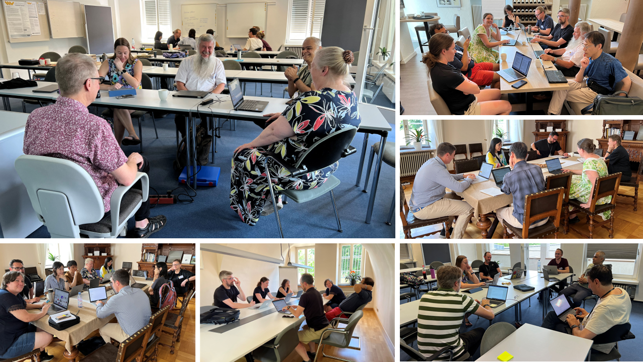
5.1 Understanding the Needs and Challenges for People with Disabilities to Use and Create Data Visualizations
John Thompson (Microsoft Research – Redmond, US, johnthompson@microsoft.com)
Eun Kyoung Choe (University of Maryland – College Park, US, choe@umd.edu)
Soyoung Choi (University of Illinois at Urbana-Champaign, US, soyoung@illinois.edu)
Kirsten Ellis (Monash University – Clayton, AU, kirsten.ellis@monash.edu)
Cagatay Goncu (Tennis Australia – Melbourne/Monash University – Clayton, AU,
chatai.goncu@tennis.com.au)
Bongshin Lee (Microsoft Research – Redmong, US, bongshin@microsoft.com)
Helen Petrie (University of York, UK, helen.petrie@york.ac.uk)
JooYoung Seo (University of Illinois at Urbana-Champaign, US, jseo1005@illinois.edu)
Stephanie Wilson (City, University of London, UK, s.m.wilson@city.ac.uk)
Keke Wu (University of North Carolina at Chapel Hill, US, kekewu@cs.unc.edu)
License: Creative Commons BY 4.0 International license © John Thompson, Eun Kyoung Choe, Soyoung Choi, Kirsten Ellis, Cagatay Goncu, Bongshin Lee, Helen Petrie, JooYoung Seo, Stephanie Wilson, Keke Wu
This research direction delves into the crucial intersection of user needs and abilities for crafting inclusive data visualizations. It addresses a comprehensive spectrum of disabilities, spanning visual, cognitive, physical, and auditory impairments, while also considering broader user preferences and individual lived experiences. Future research should recognize the inadvertent biases and exclusions in current practices that often arise from an assumption that individuals with disabilities are solely consumers, rather than potential producers of data and visualizations. Future research should address these problems by focusing on the following key dimensions: (1) Scrutinize unique and common requirements of diverse disability groups, aiming to uncover shared needs and barriers across the spectrum. Research is needed to identify tasks users want to accomplish and the challenges they encounter, thereby fostering an understanding of potential synergies among user groups. (2) Explore where and how individuals with disabilities interact with data, eliciting meaningful tasks while addressing systemic barriers. (3) Amplify user participation by advocating for the involvement of diverse user groups through co-design methods and community outreach. Research should also balance the broader needs of user groups with individual lived experiences by incorporating personalization.
5.2 Technologies for Inclusive Data Visualizations
Kim Marriott (Monash University – Caulfield, AU, kim.marriott@monash.edu)
Jason Dykes (City, University of London, UK, J.Dykes@city.ac.uk)
Christian Frisson (Carleton University – Ottawa, CA, christianfrisson@cunet.carleton.ca)
Leona Holloway (Monash University – Clayton, AU, leona.holloway@monash.edu)
Karin Müller (Karlsruher Institut für Technologie, DE, karin.e.mueller@kit.edu)
Arvind Satyanarayan (MIT – Cambridge, US, arvindsatya@mit.edu)
Danielle Szafir (University of North Carolina at Chapel Hill, US, dnszafir@cs.unc.edu)
Tetsuya Watanabe (University of Niigata, JP, t2.nabe@eng.niigata-u.ac.jp)
Gerhard Weber (TU Dresden, DE, gerhard.weber@tu-dresden.de)
License: Creative Commons BY 4.0 International license © Kim Marriott, Jason Dykes, Christian Frisson, Leona Holloway, Karin Müller, Arvind Satyanarayan, Danielle Szafir, Tetsuya Watanabe, Gerhard Weber
The working group took some time to finalize the scope of this working group as the initial discussion focused on modalities and associated sensory channels/variables which overlapped with the working group on Representation. One interesting point was that variables may be multisensory, e.g. smoothness is a mix of haptic and visual [1]. We then decided to focus more on the underlying technologies.
We identified the following presentation technologies to support more inclusive data visualization: speech, sonification, magnification/image enhancement, dynamic tactile displays, tactile graphics, 3D models and data physicalization inc dynamic and shape-changing materials, force-feedback/vibrotactile/ultrasound haptic interfaces, tactiles and 3D models with audio-labels, making with everyday materials. The interaction technologies were: gesture/touch, speech, keyboard, mouse/joystick, multimodal combinations.
We discussed the requirements/characteristics of technology and perception (resolution both spatial and temporal, transparency, dynamicity, dimensionality (1-, 2-, 3-D) and the factors impacting technology use/choice (individual abilities, social acceptability, cost, availability, use context).
We recognized that lots had been done in sonification, physiology of haptic perception, color vision deficiencies but still much to do in these areas. The open questions/grand challenges list was huge ranging from how to provide sign language labels for Deaf users, choice of language for IDD users to exploring shape-changing technologies, use of making and dynamic tactile displays. A particular focus was multimodality. Concrete research questions that could/should be addressed now included:
-
What is a “grammar of graphics” but for multimodal representations? (What’re the defaults, what is shared between modalities, what is modality specific)?
-
How can multimodal representations help sighted and PWDs collaboratively analyze data.
-
How do we understand the crossmodal perceptual trade-offs necessary to support effective sensemaking? How might these trade-offs map to different technologies?
-
Do physical representations of (personal) data help people with IDD express themselves|think with data?
-
How do we design interactions for dynamic tactile displays (zooming, filtering etc) that preserve mental model and make changes salient
References
- [1] Yvonne Jansen et al., Opportunities and Challenges for Data Physicalization, In Proceedings of the 33rd Annual ACM Conference on Human Factors in Computing Systems (CHI ’15), 2015. Association for Computing Machinery, New York, NY, USA, 3227–3236.
5.3 Accessible Authoring Tools and Production Methods for Inclusive Visualisation
Matt Butler (Monash University – Clayton, AU, matthew.butler@monash.edu)
Catie Baker (Creighton University – Omaha, US, catherinebaker@creighton.edu)
Meinhardt Branig (TU Dresden, DE, meinhardt.branig@tu-dresden.de)
Leona Holloway (Monash University – Clayton, AU, leona.holloway@monash.edu)
Anirudha Joshi (IIT Bombay, IND, anirudha@iitb.ac.in)
Simone Marinai (University of Florence, IT, simone.marinai@unifi.it)
Karin Müller (Karlsruher Institut für Technologie, DE, karin.e.mueller@kit.edu)
Arvind Satyanarayan (MIT – Cambridge, US, arvindsatya@mit.edu)
Danielle Szafir (University of North Carolina at Chapel Hill, US, dnszafir@cs.unc.edu)
Benjamin Weyers (Trier University, DE, weyers@uni-trier.de)
License: Creative Commons BY 4.0 International license © Matt Butler, Catie Baker, Meinhardt Branig, Leona Holloway, Anirudha Joshi, Simone Marinai, Karin Müller, Arvind Satyanarayan, Danielle Szafir, Benjamin Weyers
Traditional authoring tools and production methods for data visualisations often do not consider accessibility and inclusion. This may be with regard to the format of the visualisation, agency of the end user of the visualisation as part of the design process, and how accessible design tools are to people with different disabilities. As a result, people with disabilities have greatly reduced access to data and visualisations that are an increasing part of everyday life, as well as not developing key data literacy skills or being involved in data analysis activities.
This is an incredibly complex and challenging area. It encompasses process and tools, and requires expertise from the visualisation and accessibility communities. This paper seeks to capture the current state of data visualisation design and production, along with the tools used, and consider them in the context of inclusion and accessibility. The scope is articulated through an abstraction of the production process for accessible materials, along with the roles of key stakeholders in the design and production process. From here, grand challenges and key research questions are presented, including how people with different abilities can produce data visualizations for consumption by all, how to facilitate “born accessible” creation of inclusive data visualizations, and how emerging technologies can facilitate faster translation from existing graphics to inclusive data visualizations.
5.4 Beyond Visual Representations for Accessible Data Analysis and Communication
Arvind Satyanarayan (MIT – Cambridge, US, arvindsatya@mit.edu)
Meinhardt Branig (TU Dresden, DE, meinhardt.branig@tu-dresden.de)
Eun Kyoung Choe (University of Maryland – College Park, US, choe@umd.edu)
Soyoung Choi (University of Illinois at Urbana-Champaign, US, soyoung@illinois.edu)
Jason Dykes (City, University of London, UK, J.Dykes@city.ac.uk)
Christian Frisson (Carleton University – Ottawa, CA, christianfrisson@cunet.carleton.ca)
Cagatay Goncu (Tennis Australia – Melbourne/Monash University – Clayton, AU,
chatai.goncu@tennis.com.au)
Bongshin Lee (Microsoft Research – Redmond, US, bongshin@microsoft.com)
Kim Marriott (Monash University – Caulfield, AU, kim.marriott@monash.edu)
Helen Petrie (University of York, UK, helen.petrie@york.ac.uk)
JooYoung Seo (University of Illinois at Urbana-Champaign, US, jseo1005@illinois.edu)
Danielle Szafir (University of North Carolina at Chapel Hill, US, dnszafir@cs.unc.edu)
John Thompson (Microsoft Research – Redmond, US, johnthompson@microsoft.com)
License: Creative Commons BY 4.0 International license © Arvind Satyanarayan, Meinhardt Branig, Eun Kyoung Choe, Soyoung Choi, Jason Dykes, Christian Frisson, Cagatay Goncu, Bongshin Lee, Kim Marriott, Helen Petrie, JooYoung Seo, Danielle Szafir, John Thompson
This research direction investigates how to formalize the study and development of alternate (non-visual) representations of data for analysis and communication. Participants began by drawing two analogies to visualization: top-down and bottom-up formalisms.
First, participants identified that “visual idioms” (also known as chart types) play a formative role in how everyday people conceptualize the visualization design space, and remain perhaps the most commonly used mechanism for creating visualizations (e.g., through tools such as Microsoft Excel, Google Sheets, etc.). Participants noted that these idioms shape the mental models people have about visualizations—including what sorts of hypotheses a given visualization is suitable for answering, and the types of interactive analysis one can perform on a visualization. Thus, participants wondered what an equivalent set of idioms would be for non-visual modalities. At a more fundamental level, participants pointed to visualization’s grammatical formalisms that break idioms down into more atomic components: graphical shapes called “marks” whose properties, often called “visual variables” are determined by data. While participants identified that much prior work has identified candidate non-visual primitives (e.g., pitch, volume, timbre, etc. for sound or frequency, intensity, magnitude for haptics, etc.), it remains unclear how these primitives should be composed together. Moreover, while visualization grammars have yielded a large body of graphical perception studies (starting with Cleveland & McGill’s seminal paper), there is a dearth of similar studies for non-visual modalities.
Participants brainstormed methods for answering these questions, identifying that co-design workshops were perhaps the most compelling approach. Such workshops would invite people with disabilities to create, design, and manipulate audio, haptic, visual, and tactile artifacts to accomplish a series of analysis and communicative goals. However, participants also noted that there were several seemingly foundational questions that are entangled with how such a workshop would be run. These questions include what should be the goal of non-visual data representations: should they replicate the affordances of visual representations, or should they focus on only specific tasks and be part of a multimodal ensemble? Similarly, what is the role of interaction in non-visual representation: should it maintain parallelism with its visual counterparts, and should that parallelism be maintained at the level of the “how” (i.e., the mechanics/operations) or the “what” (i.e., the insights that people gain as a result of performing the interaction).
5.5 Teaching and Learning How to Design and Make Sense of Inclusive Visualisations
Catie Baker (Creighton University – Ottawa, US, catherinebaker@creighton.edu)
Kirsten Ellis (Monash University – Clayton, AU, Kirsten.Ellis@monash.edu)
Anirudha Joshi (IIT Bombay, IN, anirudha@iitb.ac.in)
Simone Marinai (University of Florence, IT, simone.marinai@unifi.it)
Karin Müller (KIT – Karlsruher Institut für Technologie, DE, karin.e.mueller@kit.edu)
Gerhard Weber (TU Dresden, DE, gerhard.weber@tu-dresden.de)
Benjamin Weyers (Trier University, DE, weyers@uni-trier.de)
Keke Wu (University of North Carolina at Chapel Hill, US, kekewu@cs.unc.edu )
License: Creative Commons BY 4.0 International license © Catie Baker, Kirsten Ellis, Anirudha Joshi, Simone Marinai, Karin Müller, Gerhard Weber, Benjamin Weyers, Keke Wu
We are a group of visualization and accessibility researchers from different countries, disciplines and generations. We discussed “inclusive information visualisation” in the context of teaching and learning in visualization to identify best practices and materials for three main purposes: (i) teaching designers to create inclusive visualizations, (ii) teaching end users to make sense of inclusive visualizations and (iii) provide material and curriculum for “teaching teachers to teach”. Such empowerment of learners was also the aim of a previous Dagstuhl Seminar on learning of and teaching about data visualisation [1].
Beyond people without a disability, inclusive information visualization addresses people to the widest extent possible. Several human abilities and needs have to be considered. In various contexts of learning such as school, university, or daily activities, learner’s existing data literacy sets the starting point for achieving more advanced competences for analysis of data through multimodal (sequentially or in parallel) visualisations, both with respect as a designer and as a consumer of visualisations.
We discussed as an example the learned competences needed to design tactile graphics, verbalisations and auditory labels for bar charts as demonstrated by some of the participants earlier in the week, and how to become competent in designing with these technologies more abstract representations of visualisations such as box plots. We agreed, simulations of disability do not help to understand the needs of the targeted groups precisely, but for sensitising learners, it might help with the use of simulations to become competent in understanding consumer needs. Inspired by this process, we created scenarios that help visualization educators to assess success of learners. More such scenarios need to be developed and made available to educators showing good and bad approaches.
Consumers (blind people, people with low vision, deaf people, and neurodivergent people) can learn to interpret such scenario-based inclusive design of visualisations for the analysis of tabular data by specifying tasks already well known from earlier work on data visualisation, but which may require different ways to represent data e.g. by assistive technologies such as screen readers, sign language labels, sonification, or for instance by data videos, comics 3D visualizations and finding new ways to convey information.
We agreed, teaching inclusive data visualisation requires to solve grand challenges in each of the three main purposes and planned to develop a joint publication to identify them more clearly.
References
- [1] Benjamin Bach et al., Visualisation Empowerment: How to Teach and Learn Data Visualization, Dagstuhl Reports, 12:6, 83–111, 2023.
5.6 Research Methods for Inclusive Data Visualization
Leona Holloway (Monash University – Clayton, AU, leona.holloway@monash.edu)
Matt Butler (Monash University – Clayton, AU, matthew.butler@monash.edu)
Cagatay Goncu (Tennis Australia – Melbourne, AU, cagatay.goncu@gmail.com)
Tetsuya Watanabe (Niigata University, JP, t2.nabe@eng.niigata-u.ac.jp)
Stephanie Wilson (University of London, UK, S.M.Wilson@city.ac.uk)
License: Creative Commons BY 4.0 International license © Leona Holloway, Matt Butler, Cagatay Goncu, Tetsuya Watanabe, Stephanie Wilson
While both are rooted in the broad field of Human-Computer Interaction, the data visualization and accessibility research communities have differed in their use of research methods as a result of being driven by differences in aims and user populations. In bringing the two fields of data visualization and accessibility together to address the need for inclusive data visualizations that meet the needs of people with disabilities, there is now a need to examine these differences in methodologies and expectations to find a unified path forward. Here, we consider what we already know about accessibility and data visualization research, any gaps or differences, and the key priorities for a shared understanding. We also provide information and examples of existing best practice to assist researchers entering the new field of inclusive data visualization. Ultimately, the methodologies for inclusive data visualization research must aim to achieve rigor whilst also maintaining the principles of respect and inclusion.
6 Grand Challenges
On the last day, our main focus was to identify 10 grand challenges for inclusive data visualization. We broke into four groups, each of which was tasked to identify their top three challenges: after each participant individually came up with the top three challenges (Figure 7), each group synthesized the group’s top three or four from the grand challenges their group members identified. Fourteen challenges were identified which could be grouped under six themes described below. We note that the boundaries of these themes are not necessarily clear. For challenges that could belong to multiple themes, we put them under the theme that has the strongest relation.

Needs
As a first step the inclusive data visualization community needs to better understand the real-world needs of people with disabilities. Currently, we lack an understanding of when people with disabilities would like to use data visualization and for what tasks as well as the current challenges.
-
What are the actual data related needs, challenges, and difficulties that people with disabilities face to achieve tasks?
-
Finding common needs and solutions that serve diverse abilities and draw upon diverse senses and datasets?
-
What do diverse people value about data visualization and what challenges do they face when creating and using data visualizations?
Accessible Design
We do not yet know how to design accessible data visualizations.
-
What is the design space for accessible multimodal data visualizations?
-
Investigating the optimal visualization techniques for different tasks, disabilities, and combinations, including the introduction of new disruptive techniques.
Empowerment
Inclusive data visualization so far has been mainly focusing on providing access to other people’s visualizations, but this is not enough. People with disabilities must be able to create their own data visualizations.
-
How can end users of accessible representations be the primary designers and creators of accessible data vis, through supporting methods and tools?
-
How can we empower people with a diverse range of abilities to become authors of their own inclusive data visualizations? This will include the need to improve data literacy in people with disabilities?
Technology and Tools
We need better, cheaper accessible display technologies and tools that allow anybody to create accessible data visualizations that cater for individual requirements and preferences.
-
Engineering high-fidelity interactive multimodal “displays”
-
Tools that make it easier for everyone to create born accessible multimodal data visualizations that are accessible to people with a wide range of abilities
-
Constructing and communicating and personalizing multimodal data interaction mappings (“Representation”)
Education
It is important to ensure that people of all abilities could learn the skills needed to create and understand accessible visualizations.
-
How do we expand the education of creators and consumers with different abilities so that they have appropriate skills to create and use accessible visualizations?
-
This [empowering people with diverse abilities to become authors] will include the need to improve data literacy in people with disabilities.
Community Building
Accessible data visualization requires collaboration between the data visualization and accessibility research communities.
-
How can we bring together the data visualization and accessibility communities to pursue sustainable action research?
-
How can we align best practices and guidelines from accessibility and visualization communities?
7 Summary
Through this 5-day Dagstuhl Seminar, we increased awareness of the importance of inclusive data visualization research, facilitated the exchange of ideas and experiences, and discussed several important topics that for inclusive data visualization. Recognizing this is just a successful first step, we will continue to build a community around inclusive data visualization. All of our participants now joined to the Inclusive DataVis Slack workspace, inclusivedatavis.slack.com.
Another important outcome of the seminar is several possible next steps. We plan to create a website as a digital hub for inclusive data visualization. In addition to sharing relevant materials from the seminar, we aim to collect and propagate useful resources from the broader community, including actionable guidance for visualization designers, developers, and researchers. We also want to refine and share the outcome from group activities. For example, we desire to refine and publish the grand challenges to encourage and inspire the community to pursue. We hope to continue the effort and momentum through follow-up workshops or panels, as well as a special issue in a journal.
Acknowledgements
The organizers would like to thank Dagstuhl for hosting our seminar and providing their great facilities, and three remote speakers for their time, effort, and great presentations.
8 Participants
-
Catie Baker – Creighton University – Omaha, US
-
Meinhardt Branig – TU Dresden, DE
-
Matthew Butler – Monash University, AU
-
Eun Kyoung Choe – University of Maryland – College Park, US
-
Soyoung Choi – University of Illinois Urbana-Champaign, US
-
Jason Dykes – City, Univerity of London, UK
-
Kirsten Ellis – Monash University – Clayton, AU
-
Christian Frisson – Carleton University – Ottawa, CA
-
Cagatay Goncu – Tennis Australia – Melbourne, AU
-
Leona Holloway – Monash University – CLayton, AU
-
Anirudha Joshi – IIT Bombay, IN
-
Bongshin Lee – Microsoft Research – Redmond, US
-
Simone Marinai – University of Florence, IT
-
Kim Marriott – Monash University – Caulfield, AU
-
Karin Müller – Karlsruhe Institute of Technology, DE
-
Helen Petrie – University of York, UK
-
Arvind Satyanarayan – MIT – Cambridge, US
-
Jooyoung Seo – University of Illinois Urbana-Champaign, US
-
Danielle Szafir – University of North Carolina at Chapel Hill, US
-
John Thompson – Microsoft Research – Redmond, US
-
Tetsuya Watanabe – Niigata University, JP
-
Gerhard Weber – TU Dresden, DE
-
Benjamin Weyers – University of Trier, DE
-
Stephanie Wilson – City, Univerity of London, UK
-
Keke Wu – University of North Carolina at Chapel Hill, US
![[Uncaptioned image]](x3.jpg)
9 Remote Participants
-
Ather Sharif – University of Washington – Seattle, US
-
Shea Tanis – University of Kansas – Lawrence, US
-
Louisa Willoughby – Monash University – Clayton, AU