Visualization of Biomedical Data – Shaping the Future and Building Bridges
Abstract
The last decades of advancements in biology and medicine and their interplay with the visualization domain proved that these fields are naturally tightly connected. Visualization plays an irreplaceable role in making, understanding, and communicating biological and medical discoveries. The goal of Dagstuhl Seminar 23451 was to serve as an interdisciplinary platform for a collective approach to the contemporary and emerging future scientific and societal challenges at the intersection of visualization, biology, and medicine in the context of increasing complexity in data, data analytics, and data-intensive science communication. Building on the success of the previous seminars and our ongoing community efforts, participants of this seminar critically tackled highly relevant scientific questions of interest to the bioinformatics, medical informatics, and visualization communities. These challenges include the increasing complexity and amount of data that are produced in biomedical research, the role of visualization in supporting interdisciplinary research and in communicating biological and medical discoveries to experts and broader audiences, and visualization for a user-centric and trustworthy explainable AI in biomedical applications. The seminar was an important step towards strengthening and widening a sustainable and vibrant interdisciplinary community of biological, medical, and visualization researchers from both academia and industry through an in-depth, comprehensive, and inclusive exchange of ideas, experiences, and perspectives. The identified key topics span methodological, technical, infrastructural, and societal challenges. The discussions and exchange of ideas revolved around the most pressing problems among the biological and biomedical domains and how these problems could be approached through data visualization, thus opening up room for innovation in designs and methodologies.
Keywords and phrases:
biology, computational biology, interdisciplinary, medicine, visualizationSeminar:
November 5–10, 2023 – https://www.dagstuhl.de/234512012 ACM Subject Classification:
Applied computing Bioinformatics ; Applied computing Health informatics ; Human-centered computing Scientific visualization ; Human-centered computing Visual analytics ; Human-centered computing Information visualization ; Human-centered computing Visualization theory, concepts and paradigms ; Human-centered computing Visualization design and evaluation methods ; Computing methodologies Neural networksCopyright and License:
![[Uncaptioned image]](x1.png) Except where otherwise noted, content of this report is licensed under a
Creative Commons BY 4.0 International license
Except where otherwise noted, content of this report is licensed under a
Creative Commons BY 4.0 International license
1 Executive Summary
Barbora Kozlíková (Masaryk University – Brno, CZ)
Katja Bühler (VRVis – Wien, AT)
Michael Krone (Universität Tübingen, DE)
Cagatay Turkay (University of Warwick – Coventry, GB)
License: ![[Uncaptioned image]](x2.png) Creative Commons BY 4.0 International license © Barbora Kozlíková, Katja Bühler, Michael Krone, and Cagatay Turkay
Creative Commons BY 4.0 International license © Barbora Kozlíková, Katja Bühler, Michael Krone, and Cagatay Turkay
The goal of this seminar was to tackle pivotal challenges concerning the future of visualization for biology and medicine. Emphasizing a collaborative and interdisciplinary approach, the seminar brought together 36 leading experts and emerging researchers from academia, media, and industry covering the fields of bioinformatics, biological, and medical visualization. The seminar endeavored to delve into the multifaceted role of biomedical visualization in science communication and interactive exploratory analysis. This involves navigating the increasing complexity of biomedical data that can be acquired today, with a spotlight on integrating information from diverse sources and modalities. Examples are visualizing multi-omics data, facilitating within- and across-cohort analysis, and illustrating dynamic cellular processes. Additionally, there is an intersection of visualization with artificial intelligence in biomedical visual analytics applications, exploring how to make Artificial Intelligence (AI) outcomes comprehensible and actionable in critical decision-making processes. The seminar focused on four key topics vital to the intersection of visualization, biology, and medicine:
-
the role of biomedical visualization in communicating complex processes to both expert and broad audiences,
-
the challenge of mastering the complexity and multi-modality of biomedical data, emphasizing integrative approaches that can help bridge various scales and data modalities from diverse sources,
-
the synergy between visualization and AI in biomedical applications, and
-
shaping curricula for biological and medical visualization and the definition of content, structure, and goals for a future educational platform.
During the first day of the seminar, these topics were further developed through joint brainstorming, taking into account the interests of the participants and the need to keep up with the fast-paced developments in the field of AI and its increasing influence on biomedical visualization and related research fields.

Six working groups emerged from this process, working over the next four days of the seminar accompanied by daily summary sessions in the plenum:
-
1.
Bridging Scales, Data, and Modalities to discuss the changing nature of biological visualization adapting to the needs of biologists as a result of the massive increase in the scale of the data and the increasing need to cross traditional domain boundaries.
-
2.
The Role of Data Visualization in Instigating Behavior Change (to Promote Healthy Lifestyles) to discuss how data visualizations can be used in a dialogue between medical practitioners, researchers, and the public as a fundamental component in preventive healthcare.
-
3.
A Rollercoaster Ride into the Future: AI-in-the-loop for Visual Workflows in Biomedical Data Analytics to discuss opportunities and challenges that recent developments in AI present for the visual analysis of biomedical data.
-
4.
Components of a Syllabus for Life Science Data Visualization to discuss topics related to education and educational platforms.
-
5.
Beyond the Desktop: Leveraging Immersive Environments for Biomedical Data Analysis – Challenges, Vision, and Guidelines to discuss challenges in immersive analytics in biomedical analysis scenarios.
-
6.
Spatio-Textual Interaction in Visualization to experimentally explore the capabilities of current large language models for spatial interaction with data.
Five lightning talks complemented the group work and acted as inspirational prompts to spark discussions:
-
Exploring Relations among Topics in Neuroscience Literature using Augmented Reality, by Lynda Hardman, CWI – Amsterdam, NL & Utrecht University, NL
-
Is that right? Visualizations for scientific data quality control, by Devin Lange, University of Utah
-
Can ML/AI be Taught in Schools? by Blaz Zupan, University of Ljubljana
-
Visualization building blocks for analysis, not the end of pipelines, by Trevor Manz, Harvard Medical School
-
How to design data visualizations for a (very) broad audience, by Matthias Stahl, Der Spiegel
The seminar stimulated lively discussions on the future of biomedical visualization research and education in response to the increasing data complexity and related demands on interactive data analytics systems and the impact of AI on our field. All working groups are planning follow-up activities, including meetings and joint publications based on the insights gained.
Overall the seminar was a great experience bringing together researchers from different academic and non-academic backgrounds, experience and interests bridging from life science to medical applications to communication and media and from visualization technology to display technology and recent development in AI. We envision that the outcomes from the working groups will foster the links between these areas and help establish a consolidated research agenda to approach the challenges that lie ahead.
2 Table of Contents
3 Overview of Talks
3.1 Exploring Relations among Topics in Neuroscience Literature in Augmented Reality
Lynda Hardman (CWI – Amsterdam, NL Utrecht University, NL)
License: Creative Commons BY 4.0 International license © Lynda Hardman
Maintaining an overview of publications in the neuroscientific field is challenging, in particular in tasks such as investigating relations between brain regions and brain diseases. To support neuroscientists in this challenge, we investigate whether using Augmented Reality can make analyses of literature more accessible and integrate them into current work practices. We explore a number of questions, such as whether interaction with a large body of literature using topics provides a useful way for neuroscientists to explore and understand specific relationships. Our assumption is that by providing overviews of the correlations among concepts, these will allow neuroscientists to better understand the gaps in the literature and more quickly identify suitable experiments to carry out. We currently provide functionality to visualize and filter direct and indirect relations and to compare the results of queries. Our visualization work is based on an analysis of the neuroscience publications in PubMed. This provides an association graph among topics involving cognitive functions, genes, proteins, brain diseases and brain regions. We describe our prototype 3D AR implementation DatAR and challenges we face.
3.2 Is that right? Data visualization for quality control
Devin Lange (University of Utah – Salt Lake City, US)
License: Creative Commons BY 4.0 International license © Devin Lange
Data quality control does not always excite visualization researchers. But why? High quality data is critical for high quality research. In this case, quantitative phase imaging is being explored for improving the creation of treatment plans for cancer patients. We developed Loon, a visualization system that uses exemplars to combine different data sources to aid in data quality control.
3.3 Visualization building blocks for analysis, not the end of pipelines
Trevor Manz (Harvard University – Boston, US)
License: Creative Commons BY 4.0 International license © Trevor Manz
Many visualization tools do not directly integrate into popular computational notebook environments. This introduces an overhead to visualization, delegating purpose-buit visualizations for the end of pipelines rather than integrating within familiar workflows. We developed anywidget, an open-source toolkit to simplify extending Jupyter notebooks with custom interactive visualizations. We demonstrate the use of our toolkit to integrate a genome browser, HiGlass, into computational notebooks to enable new interactive analysis workflows.
3.4 How to design data visualizations for a (very) broad audience
Matthias Stahl (DER SPIEGEL – Hamburg, DE)
License: Creative Commons BY 4.0 International license © Matthias Stahl
Broad audiences are hard to define and have multidimensional interests. However, a well characterized audience is necessary to design and craft effective data visualizations. During my journey in data journalism and visualization in the newsroom of DER SPIEGEL, I got to know two simple tricks how to approach this dilemma.
-
1.
Show the raw data
-
2.
Tell at least one story
-
1.
Show the raw data
In many cases it’s a good choice to not show aggregated data like means, medians and standard deviations. It is more feasible to show the original data than the more abstract and unemotional aggregates see Fig. 2.
Figure 2: Poll of polls showing the polls of every institute. -
2.
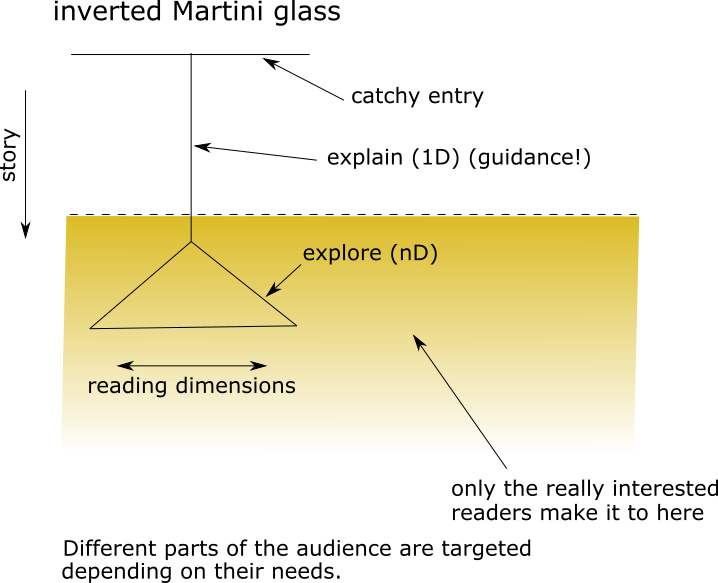
Tell at least one story and explain a lot as shown in Fig. 3
3.5 Can ML/AI be taught in schools?
Blaz Zupan (University of Ljubljana, SI)
License: Creative Commons BY 4.0 International license © Blaz Zupan
We should democratize teaching and knowledge about machine learning to the point where children in schools understand conceptually what is happening. I present a case of analyzing the positional (geo) data of surnames in Slovenia and how we trained over a thousand kids from primary and secondary schools in machine learning and data literacy using this data. The training included workshops for teachers, the production of video introductions for kids, and the design of quizzes of other written material (see https://orangedatamining.comandhttp://pumice.si/en).
4 Working groups
4.1 A Rollercoaster Ride into the Future: AI-in-the-loop for Visual Workflows in Biomedical Data Analytics
Thomas Höllt (TU Delft, NL), Jan Aerts (Amador Bioscience – Hasselt, BE), Marc Baaden (Laboratoire de Biochimie Théorique – Paris, FR), Stefan Bruckner (Universität Rostock, DE), Katja Bühler (VRVis – Wien, AT), Mennatallah El-Assady (ETH Zürich, CH), Zeynep Gümüs (Icahn School of Medicine at Mount Sinai – New York, US), Tobias Isenberg (INRIA Saclay – Orsay, FR), Renata Georgia Raidou (TU Wien, AT), Timo Ropinski (Universität Ulm, DE), Thomas Schultz (Universität Bonn, DE), and Pere-Pau Vazquez (UPC Barcelona Tech, ES)
License: Creative Commons BY 4.0 International license © Thomas Höllt, Jan Aerts, Marc Baaden, Stefan Bruckner, Katja Bühler, Mennatallah El-Assady, Zeynep Gümüs, Tobias Isenberg, Renata Georgia Raidou, Timo Ropinski, Thomas Schultz, and Pere-Pau Vazquez
We discussed the opportunities that recent developments in artificial intelligence (AI), including foundation models, generative AI, and an increasing ability to integrate multi-modal data, present for the visual analysis of biomedical data, and what novel needs for visual interaction might arise from an increased use of such techniques within biomedical workflows. In particular, we covered the following aspects:
-
Large language models (LLMs) and other multimodal foundation models facilitate the translation of domain-specific questions and requirements into the generation, modification, and interpretation of visual representations, and might contribute to more user-adaptive and contextualized visualization systems. Initial proof-of-concepts exist to comprehensively support the visual analytics workflow through LLMs. However, they are currently limited to individual and relatively small datasets, while biomedical applications typically require the analysis of large, complex, heterogeneous, and interconnected datasets.
-
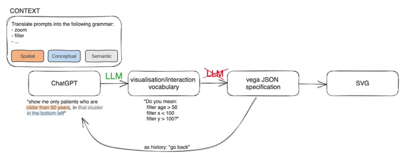
In a specialized subgroup during our breakout session, we delved into the potential applications of LLMs in comprehending and replacing various aspects of data visualizations, including spatial inputs, operations, semantics, and contextual information. The versatility of LLMs has made them suitable for a wide range of natural language processing tasks, with a notable example being ChatGPT. To this end, we conducted a preliminary investigation of the usefulness of conversational interfaces provided by ChatGPT to steer users through data visualizations, extract insights, and potentially enhance or substitute visualization components. We specifically investigated the capacity of ChatGPT to alter the conceptual (e.g., data aspects), spatial (e.g., layouting or positional relationships within the visualization canvas), or semantic (e.g., meaning and interconnections between data elements) context of visualizations. A pilot study employing a simple scatterplot (2D+color) illuminated how ChatGPT could unveil or emphasize patterns and selections within the data, such as instructing to “highlight the green data points with a value of feature x higher than the average” or “order the blue data points from left to right and bottom to top” or “highlight the data points that have been selected within the rectangle.” Our preliminary findings suggest that integrating LLMs into Visual Analytics solutions holds promise for generative AI-driven Visual Analytics and guiding users through data visualizations. Looking ahead, it would be intriguing to explore whether conversational interfaces can contribute to supporting, enhancing, or altering the interpretability of visualizations. Subsequent research could delve into more nuanced interactions with complex datasets, such as investigating visualization semantics (e.g., ontologies, visual metaphors, and abstractions), exploring user feedback mechanisms for iterative improvements (e.g., semantic zooming) and the provenance of such mechanisms, or scrutinizing further language-related semantics (e.g., labeling, descriptions, and textual elements). Finally, it is imperative to consider the ethical implications associated with relying on LLMs to shape data visualization experiences.
-
Machine learning approaches are already established in practice for specific subtasks, such as dimensionality reduction of -omics data, or medical image segmentation. However, the limitations of these methods, especially when trained with the limited amount of data that is available in many biomedical applications, are still not sufficiently understood. For example, most deep learning techniques that are used today do not provide an accurate indication of the uncertainty in their estimates, and cannot detect whether a given input is sufficiently similar to their training data to be reliably processed. Even after the deployment of automated systems, continuous quality control remains essential, and is best facilitated by suitable visual interfaces.
-
Explaining the predictions and outputs of machine learning methods is not only helpful for the development of such methods, but is often also a requirement for integrating them into scientific workflows (which ultimately aim for mechanistic understanding, not just predictive power) or clinical decision processes that require human experts to weight evidence from various data sources. However, the computations within machine learning methods and available model level explanations do not usually map directly to human mental models. Therefore, it is non-trivial to design explanations in such a way that humans will actually understand why the model generated a specific output, as opposed to rationalizing the proposed explanation in terms of their own mental model. We believe that future explanations should go beyond the attribution maps that are commonly presented in current work, and should combine multiple modalities, such as images and text.
-
How to communicate model outputs in a way that experts and, where applicable, also the general public, will make rational and informed decisions based on them, has still not been sufficiently studied.
4.2 Components of a syllabus for life science data visualization
Barbora Kozlíková (Masaryk University – Brno, CZ), Jan Aerts (Amador Bioscience – Hasselt, BE), Marc Baaden (Laboratoire de Biochimie Théorique – Paris, FR), Helena Jambor (Universitätsklinikum TU Dresden, DE), Georgeta Elisabeta Marai (University of Illinois – Chicago, US), Kay Katja Nieselt (Universität Tübingen, DE), James Procter (University of Dundee, GB), Renata Georgia Raidou (TU Wien, AT), Matthias Stahl (DER SPIEGEL – Hamburg, DE), and Blaz Zupan (University of Ljubljana, SI)
License: Creative Commons BY 4.0 International license © Barbora Kozlíková, Jan Aerts, Marc Baaden, Helena Jambor, Georgeta Elisabeta Marai, Kay Katja Nieselt, James Procter, Renata Georgia Raidou, Matthias Stahl, and Blaz Zupan
Abstract
The working group on building the basic components of a syllabus for teaching life science data visualization to diverse target audiences was formed at the beginning of the seminar and collaborated throughout the whole week. The group participants came from diverse fields (both in academia and industry), which made the discussions very productive. The main objectives and goals of the working group that were set up at the very beginning can be summarized as:
-
Recapitulation of past syllabus planning activities and attempts at building the syllabus;
-
Discussion about the immediate steps that can lead to a tangible output of these efforts;
-
Preparation of a prototype syllabus, including learning outcomes, and drafting an educational publication that summarizes the challenges and recommendations we identified;
-
Setting up a repository for the participants of the seminar to share teaching materials in the context of the syllabus.
Recapitulation of past activities and discussion of the next steps
Within the BioVis Dagstuhl Seminar series, where this seminar is already the fourth one, participants addressed the issue of missing guidelines and syllabi for teaching visualization in life sciences several times. There were two main outputs coming from these efforts: the categorization of the existing techniques and methods into a complex table (see Dagstuhl Seminar no. 21401 report), structured according to the scale (spanning from atoms through tissues to populations, see Fig.5).

The table with techniques and methods then formed the basis for the second initiative, the Spring School on Biomedical Data Visualization (https://biomedvis.github.io), where experts from selected fields prepared a talk on a given topic, derived from the table. Although this school has been running already for three years (https://biomedvis.github.io/2021/, https://biomedvis.github.io/2022/, https://biomedvis.github.io/2023/) and collects study materials that were then made freely available, it is still lacking the systematic construction of a syllabus for teaching life sciences visualization that can be shared and followed.
Thus, within this Dagstuhl Seminar, we decided to focus specifically on the challenge of creating such a syllabus. We did a first pass through the literature search to get inspiration from other disciplines or from teaching visualization in general [1]. We identified the main target audience of the teaching activities, and then used that information to determine the direction of the syllabus construction. We summarized the expected core competencies and minimal prerequisites, and then we prepared the target learning outcomes and the syllabus itself.
Learning outcomes
The learning outcomes and therefore core competencies are modeled using the terminology and concepts of Bloom’s taxonomy [2]. When designing the syllabus, the following overall learning objective was considered: General DataVis literacy with a focus on bio-medical data. The students should gain the skills to read, analyze, and understand the visual representations used in biomedical domains. By these skills, they understand the relationship between visual analysis and the application domains from biology and medicine. Furthermore, students will be able
-
to use the principles of human perception and cognition in visual biological and medical data analysis;
-
to understand and use visual design principles;
-
to know the basics and do’s and don’ts of visualization (including best practices);
-
to critically evaluate visual representations of bio-medical data and suggest improvements and refinements;
-
to apply a structured design process to create effective visualizations;
-
to create low-level prototypes for bio-medical data visualizations;
-
to create simple interactive (web-based) visualizations;
-
to communicate visualizations (orally or written).
The syllabus consists of the following elements:
-
1.
Introduction: What is data visualization; Why do it; History
-
2.
Data types in vis (as abstractions, using bio examples)
-
3.
Color and perception
-
4.
Marks and channels
-
5.
Visual design principles and layouts
-
6.
Visual scalability (as abstraction, using bio examples)
-
7.
(Biology) data types
-
(a)
Genes and Genomes
-
(b)
Omics (quantitative data)
-
(c)
Phylogenetic Trees and Hierarchies
-
(d)
(Biological) Networks
-
(e)
Molecular Structures (3D and 2D abstraction)
-
(f)
Images (Medical images, Light and Electron Microscopy images, Gels and Plates, photos)
-
(a)
-
8.
Interaction and faceting (e.g., brushing and linking)
-
9.
Low-fidelity Prototyping
-
10.
High-fidelity Prototyping (e.g. with Observable)
-
11.
Evaluation
-
12.
Ethics
-
13.
Data-Driven Storytelling
-
14.
BioVis software tools (Circos, Cytoscape etc.) and critique
Preparation of a publication
Already within the seminar week, the participants started to sketch the first version of the educational publication and discussed potential publication venues (for example, PLOS Computational Biology Education). Therefore, finalizing and submitting this publication will be one of the main priorities after the seminar.
Setting up a teaching material repository
The repository to share teaching material among participants of the Dagstuhl Seminar was set up using the mini-MOOC software of the Biolab group of Blaz Zupan. The repository is hosted under http://books.biolab.si/books/biomedvis. The overall repository is classified as CC BY-NC-SA 4.0, however, each contributor should also make sure that the copyrights of the shared material are clearly marked.
Last but not least, we discussed a possible future direction or extension of our working group, which is the creation of an interactive, open textbook. This book could encompass the following additional materials and approaches:
-
lecture notes for each component of the syllabus,
-
short accompanying videos,
-
interactive content, including
-
–
quizzes with progress monitoring and authentication, where needed,
-
–
text-based answers with AI answer verification, hints, and critique,
-
–
gamification,
-
–
-
proposals for group activities during teaching.
References
- [1] Bach et al., Challenges and Opportunities in Data Visualization Education: A Call to Action, https://doi.org/10.48550/arXiv.2308.07703, to appear in IEEE TVCG (paper at VIS 2023).
- [2] Bloom, Benjamin S and Krathwohl, David R, Taxonomy of educational objectives: The classification of educational goals. Book 1, Cognitive domain. Longmans 1956.
4.3 Beyond the Desktop: Leveraging Immersive Environments for Biomedical Data Analysis – Challenges, Vision, and Guidelines
Michael Krone (Universität Tübingen, DE), Jillian Aurisano (University of Cincinnati, US), Marc Baaden (Laboratoire de Biochimie Théorique – Paris, FR), Nadezhda T. Doncheva (University of Copenhagen, DK), Zeynep Gümüs (Icahn School of Medicine at Mount Sinai – New York, US), Ingrid Hotz (Linköping University, SE), Tobias Isenberg (INRIA Saclay – Orsay, FR), Karsten Klein (Universität Konstanz, DE), Torsten Kuhlen (RWTH Aachen, DE), Trevor Manz (Harvard University – Boston, US), Scooter Morris (University of California – San Francisco, US), Bruno Pinaud (University of Bordeaux, FR), Falk Schreiber (Universität Konstanz, DE), and Anders Ynnerman (Linköping University, SE)
License: Creative Commons BY 4.0 International license © Michael Krone, Jillian Aurisano, Marc Baaden, Nadezhda T. Doncheva, Zeynep Gümüs, Ingrid Hotz, Tobias Isenberg, Karsten Klein, Torsten Kuhlen, Trevor Manz, Scooter Morris, Bruno Pinaud, Falk Schreiber, and Anders Ynnerman
Our group included participants with extensive experience collaborating with domain scientists in designing visualization applications and environments for biomedical applications. Participants also had extensive experience creating and running visualization facilities with diverse display platforms (CAVEs/CAVE2, display walls, DOMEs, touch-tables, VR headsets, AR-capable devices).
This subgroup discussed challenges in immersive analytics and honed in on a specific and compelling challenge that is relevant for many biomedical analysis scenarios: integration of visualizations of abstract data- often represented in 2-dimensions- along with visualizations of spatial data- often represented in 3-dimensional views and potentially within display platforms capable of stereoscopic 3D and immersive presentation and exploration (e.g., see Fig. 6. These immersive platforms include (but are not limited to) VR headsets, CAVEs/CAVE2, stand-alone stereoscopic monitors or display walls, and AR-capable devices, as well as multimodal devices making use of haptic feedback and other diverse interaction modalities. From our experience running visualization facilities and collaborating with domain scientists, we have noticed a benefit for viewing this data in 3D-stereoscopic environments. However, there are challenges that currently limit design and development in this space. These include interaction design that addresses the unique affordances of 2D and immersive environments, coherently linking abstract and spatial data and in supporting realistic workflows. In addition, evidence on the quality and usability of approaches and designs is scarce and not yet organized well in the context of the design space. This hinders comparison between different approaches and to draw insights from existing designs for the development of new designs for differing but potentially related use-cases.
We proposed proceeding from biomedical use-cases which featured a need for tasks that spanned abstract and spatial data at the same time. We intend to characterize a visualization design space to address the common needs and challenges across these use cases. We intend to analyze three different groups of use cases in more detail
-
Visual analysis of molecular structures requiring advanced interaction including a variety of 2 dimensional representations as statistical plots or networks.
-
Visualization and analysis of Cell models including Metabolic/PPI network
-
Visualization of brain imaging data in relation to different diseases/conditions integrating existing knowledge about e.g. brain atlas. Such data frequently includes a large variety of clinical data e.g. questionnaires, and blood samples.
These use cases were selected because they involve abstract and spatial data, diverse users, large scales and high complexity. These focused use-cases will enable us to bring to the surface critical challenges for visualization design and development that integrates abstract and spatial data, within 2D and 3D views.
The concepts we intend to consider include transitional and hybrid interfaces as well as a single unified environment (e.g. to bring the 2D into 3D views such as VR, or in a Dome setup) that combines modalities as design options. In these considerations it is important to factor in specific constraints related to the use case, for instance on readability of the 2D content if text is involved. Our group arrived at a consensus that for this proposed work we will not focus on one platform. Different platforms present trade-offs for users and developers. Rather than explore the design space for one platform, we intend to help designers, developers and users consider when, where and how to use different platforms for different cases.

We intend to explore design space options for tasks in BioMedVis that span 2D and 3D views. Preliminary design space divisions include where to present 2D content in relation to 3D content. Some options include bringing 2D content into a 3D space- either by overlaying 2D content on the 3D content through visual channels or interactions- or presenting 2D content adjacent to 3D content on a 2D plane. A second option involves juxtaposing 2D views with 3D views, on separate devices and then considering interactions to support integration. A different design space consideration involves roles for 3D views and 2D view, such as 2D views supporting interactive selections, application of filters, scales and aggregations which modulates what is presented in 3D views.
4.4 Bridging Scales, Data, and Modalities
Michael Krone (Universität Tübingen, DE), Jan Aerts (Amador Bioscience – Hasselt, BE), Jillian Aurisano (University of Cincinnati, US), Marc Baaden (Laboratoire de Biochimie Théorique – Paris, FR), Nadezhda T. Doncheva (University of Copenhagen, DK), Zeynep Gümüs (Icahn School of Medicine at Mount Sinai – New York, US), Thomas Höllt (TU Delft, NL), Ingrid Hotz (Linköping University, SE), Karsten Klein (Universität Konstanz, DE), Torsten Kuhlen (RWTH Aachen, DE), Devin Lange (University of Utah – Salt Lake City, US), Trevor Manz (Harvard University – Boston, US), Scooter Morris (University of California – San Francisco, US), Ramasamy Pathmanaban (Ghent University, BE), Bruno Pinaud (University of Bordeaux, FR), and Falk Schreiber (Universität Konstanz, DE)
License: Creative Commons BY 4.0 International license © Michael Krone, Jan Aerts, Jillian Aurisano, Marc Baaden, Nadezhda T. Doncheva, Zeynep Gümüs, Thomas Höllt, Ingrid Hotz, Karsten Klein, Torsten Kuhlen, Devin Lange, Trevor Manz, Scooter Morris, Ramasamy Pathmanaban, Bruno Pinaud, and Falk Schreiber
The bridging scales group met to discuss the changing nature of biological visualization. Given the Nature Methods [1, 2, 3, 4, 5, 6] series of papers on Visualizing Biological Data in 2010 as a starting point one can observe that the needs of biologists have changed, both as a result of the massive increase in the scale of the data and the increasing need to cross traditional domain boundaries. The discussion started with reviewing the current landscape of needs for visualization in the biomedical domain. This included a brief overview of data types and scale dimensions where complexity increases:
Biomedical Data Types (can vary with condition and time):
-
Structures (e.g., protein structure)
-
Omics
-
Imaging / Fields
-
Clinical data
-
–
Catch-all for many types of data
-
–
Text
-
–
Patient data
-
–
Just call it “metadata”?
-
–
-
Interactions / Connections
-
Time series (A “continuous” signal over time, e.g., heart beat)
-
Text
Scales:
-
Spatial
-
Hierarchical level
-
Temporal
-
# Items
-
# Dimensions
-
Heterogeneity (of different data modalities)
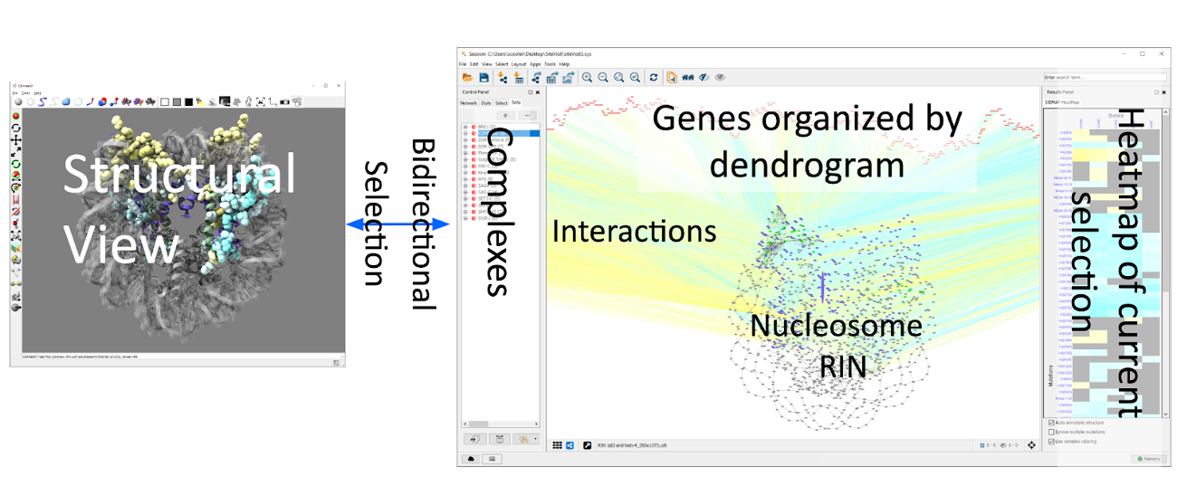
In order to make the discussions more concrete, we discussed some example use cases, including the interaction between molecular visualization (structures) and networks (e.g. contact networks); Heatmaps (Omics) that vary over time; and pE-Maps (interaction between gene knockouts and point mutations – see image). While discussing the example use cases, the issue of how to approach visualization solutions to these challenges was discussed. This highlighted the issue of developing one-off specialized solutions, potentially multiple times targeting the same challenge, and the tendency for visualization researchers to work in isolation from potential interdisciplinary collaborators. We recognize that having visualization experts is ideal, but there are practical limitations which make it infeasible to make this expertise ubiquitous across biological labs. We discussed mechanisms to spread visualization expertise, such as a centralized visualization service. Additionally we identified our role as a community in educating (e.g., sharing interaction techniques) and designing reusable tools which may be composed by bioinformaticians to tailor custom built applications.
We then focused on the necessity of visualization expertise to create tools that can handle complex data integration, recognizing a general lack of understanding about the importance of visualization in the broader scientific community. It was felt that future publications should emphasize the role of visualization in exploratory analysis and the importance of specialized visualization knowledge during analysis.
This allowed us to focus on what we wanted to produce as an outcome and we decided to focus on a possible update to the Nature Methods series, including a perspectives article and a series of short pieces focusing on practical advice on how challenging examples of complex data from imaging, omics, and computational methods can be visualized and interactively explored. We’ve written an initial abstract and will be reaching out to the editors of Nature Methods to determine the level of interest.
References
- [1] O’Donoghue SI, Goodsell DS, Frangakis AS, Jossinet F, Laskowski RA, Nilges M, et al. Visualization of macromolecular structures. Nat Methods. 2010;7: 42.
- [2] Gehlenborg N, O’Donoghue SI, Baliga NS, Goesmann A, Hibbs MA, Kitano H, et al. Visualization of omics data for systems biology. Nat Methods. 2010;7: S56–68.
- [3] Walter T, Shattuck DW, Baldock R, Bastin ME, Carpenter AE, Duce S, et al. Visualization of image data from cells to organisms. Nat Methods. 2010;7: S26–41.
- [4] Procter JB, Thompson J, Letunic I, Creevey C, Jossinet F, Barton GJ. Visualization of multiple alignments, phylogenies and gene family evolution. Nat Methods. 2010;7: S16–25.
- [5] Nielsen CB, Cantor M, Dubchak I, Gordon D, Wang T. Visualizing genomes: techniques and challenges. Nat Methods. 2010;7: S5–S15.
- [6] O’Donoghue SI, Gavin A-C, Gehlenborg N, Goodsell DS, Hériché J-K, Nielsen CB, et al. Visualizing biological data–now and in the future. Nat Methods. 2010;7: S2–S4.
4.5 The Role of Data Visualization in Instigating Behavior Change to Promote Healthy Lifestyles
Cagatay Turkay (University of Warwick – Coventry, GB), Carsten Görg (University of Colorado – Aurora, US), Lynda Hardman (CWI – Amsterdam, NL & Utrecht University, NL), Devin Lange (University of Utah – Salt Lake City, US), Trevor Manz (Harvard University – Boston, US), Georgeta Elisabeta Marai (University of Illinois – Chicago, US), Anders Ynnerman (Linköping University, SE), and Xiaoru Yuan (Peking University, CN)
License: Creative Commons BY 4.0 International license © Cagatay Turkay, Carsten Görg, Lynda Hardman, Devin Lange, Trevor Manz, Georgeta Elisabeta Marai, Anders Ynnerman, and Xiaoru Yuan
Theme of the discussion
A common problem is that people may not want to adapt their lifestyle in a way that would benefit their health. They could be unwilling for different reasons, such as an unwillingness to believe the evidence, or may have difficulty understanding it. Perhaps they are convinced but have difficulty maintaining the required lifestyle changes long term.
Our approach is to consider how data visualizations can be used in a dialogue with individuals as a fundamental component in preventive healthcare. We envisage a process where people are first able to express their concerns, then gradually explore data visualizations that allow them to discover and understand how specific lifestyle changes influence health. As a secondary topic, we are interested in how longer term engagement can be promoted through data visualizations tailored to individuals and their context.
Our goal is to produce a position paper to be published in a venue with a broad design audience, such as Transactions on Visualisation in Computer Graphics or Computer Graphics and Applications. The paper will draw inspiration from four main fields:
-
Factors that influence behavior change and visualizations that can promote this
-
Visual communication that can engage and influence skeptical audiences
-
Visual communication in public health applications
-
Storytelling using data visualizations
Our contributions are a set of considerations that we deem helpful to designers who are faced with the task of designing an application for a specific group of users. We use the considerations to describe a few examples of existing projects where the goal is to change the mindset and/or behavior of the audience. Based on our discussion we provide recommendations for the considerations we identified.
Visualization Design Considerations
Facilitating behavior change is difficult in any setting and in particular in public health. Visualizations often play a role in these types of communications. But to what extent and how they do so is a difficult question to untangle. We have developed an initial set of considerations when developing visualizations for behavior change within public health. These considerations are not exhaustive but are intended as a starting point for aiding in the development of these visualizations. These considerations are described as if they are independent, however in reality, many are tightly interconnected and cannot be separated.
For example, there are various storytelling strategies for encouraging behavior change. Some stories may choose to say directly what the desired behavior change would be and back up that claim with data. Alternatively, data, and a means to explore it, may be provided up front with the hope that readers will draw their own conclusions. We don’t claim that there is always a correct strategy, but rather this is a consideration to be taken into account when constructing visualizations. This decision often will depend on other considerations, such as the communication medium (static image, interactive application, short-form video), as well as the desired change in readers (get vaccinated or reduce risk of diabetes through diet/exercise).
Ultimately, these considerations should inform visualization design decisions. However, there may not be simple rules that can be applied. Visualization designers may need to review and synthesize all of these considerations when making design decisions (which they already do). However, our goal is to provide some additional structure so that designers can use these to think through these considerations more systematically and can serve to inform and educate new visualizations designers.
5 Participants
-
Jan Aerts – Amador Bioscience – Hasselt, BE
-
Jillian Aurisano – University of Cincinnati, US
-
Marc Baaden – Laboratoire de Biochimie Théorique – Paris, FR
-
Stefan Bruckner – Universität Rostock, DE
-
Katja Bühler – VRVis – Wien, AT
-
Nadezhda T. Doncheva – University of Copenhagen, DK
-
Mennatallah El-Assady – ETH Zürich, CH
-
Carsten Görg – University of Colorado – Aurora, US
-
Zeynep Gümüs – Icahn School of Medicine at Mount Sinai – New York, US
-
Lynda Hardman – CWI – Amsterdam, NL & Utrecht University, NL
-
Thomas Höllt – TU Delft, NL
-
Ingrid Hotz – Linköping University, SE
-
Tobias Isenberg – INRIA Saclay – Orsay, FR
-
Helena Jambor – Universitätsklinikum TU Dresden, DE
-
Karsten Klein – Universität Konstanz, DE
-
Barbora Kozlíková – Masaryk University – Brno, CZ
-
Michael Krone – Universität Tübingen, DE
-
Torsten Kuhlen – RWTH Aachen, DE
-
Devin Lange – University of Utah – Salt Lake City, US
-
Trevor Manz – Harvard University – Boston, US
-
Georgeta Elisabeta Marai – University of Illinois – Chicago, US
-
Scooter Morris – University of California – San Francisco, US
-
Kay Katja Nieselt – Universität Tübingen, DE
-
Ramasamy Pathmanaban – Ghent University, BE
-
Bruno Pinaud – University of Bordeaux, FR
-
James Procter – University of Dundee, GB
-
Renata Georgia Raidou – TU Wien, AT
-
Timo Ropinski – Universität Ulm, DE
-
Falk Schreiber – Universität Konstanz, DE
-
Thomas Schultz – Universität Bonn, DE
-
Matthias Stahl – DER SPIEGEL – Hamburg, DE
-
Cagatay Turkay – University of Warwick – Coventry, GB
-
Pere-Pau Vazquez – UPC Barcelona Tech, ES
-
Anders Ynnerman – Linköping University, SE
-
Xiaoru Yuan – Peking University, CN
-
Blaz Zupan – University of Ljubljana, SI
![[Uncaptioned image]](x3.jpg)